In this article we will build a ReactJS Table Example. ReactJS has shot to fame and has become the front end library of choice. We look at how we can build a table with a set of components and keep it as flexible and configurable as possible. We will add features like styling and sorting to our table component and provide a rich component that can be reused across applications.
So without further delay let us get down to it and start off with our implementation. We will use the following set of tools for our example in this article. Some of these are optional and can be replaced with your favorites.
This is a helpful tool from the folks at Facebook to help us quickly generate the boilerplate code for a React application. We will use here to quickly get off the blocks.
As the name of this article suggests we will be working with latest version of ReactJS. Just a not we will be using the brand new React Hooks and creating components as functions. React Hooks enable us to do all that was earlier only possible with class components.
This is my favorite IDE but of course you are free to choose your own to work with.
1. Application Structure
We use the below command to generate the initial application structure for this example.
>npx create-react-app react-table .
This command uses the npx tool to download a temporary copy of create-react-app and run it using the parameters passed. Once done the create-react-app package is disposed of. The generated application structure should look like below:
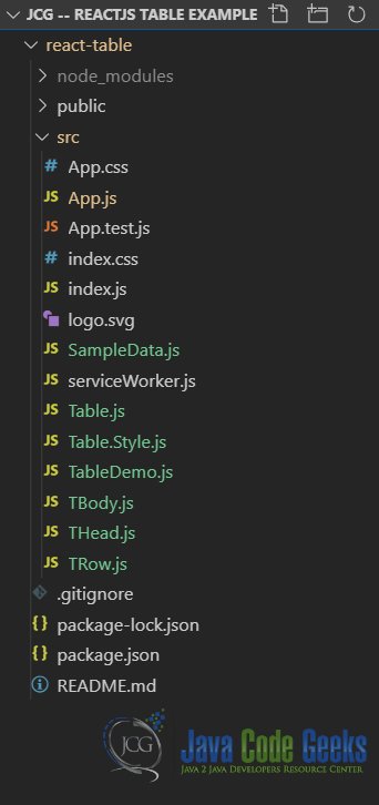
I will discuss each of the components seen in the above screen grab in the following sections. As we build our own table component in ReactJS.
2. Components
To begin with our design I will take a top down approach. As in starting with the top level components and diving down into the components at the bottom doing the grunt work.
2.1 Table Component
This component will render a table as well as two child components we will build later. First of these will be THead and the second TBody. For the purpose of illustration I have created some sample data containing a list of some of the articles I have written over the years and links to them. This sample data resides in the SampleData.js file. We import it in the Table component and pass it down to child components responsible for displaying the data.
Our code for the Table component will look like below:
Table.js
import React, { useState } from 'react';
import THead from './THead';
import TBody from './TBody';
import { columns, sampleData } from './SampleData';
import { theme } from './Table.Style';

function Table(props) {
    const [currenttheme, setCurrentTheme] = useState(theme.light);
    const customRenderer = (row) => {
        return <a href={row.url}>{row.title}</a>;
    };
    const columnRenderer = (column) => {
        return column.slice(0, 1).toUpperCase() +
               column.slice(1, column.length);
    }
    const switchTheme = ({ target }) => {
        if (target.innerText.toUpperCase() === "LIGHT") {
            setCurrentTheme(theme.light);
        } else if (target.innerText.toUpperCase() === "DARK") {
            setCurrentTheme(theme.dark);
        }
    }
    return <><div>
        <button style={currenttheme.button}
onClick={switchTheme}>Light</button>
        <button style={currenttheme.button}
onClick={switchTheme}>Dark</button>
    </div>
        <table style={currenttheme.table}>
            <THead theme={currenttheme}
columnRenderer={columnRenderer} columns={columns}></THead>
            <TBody theme={currenttheme}
customRenderer={customRenderer} columns={columns} rows={sampleData}
            ></TBody>
        </table></>;

}
export default Table;
As you can see in the code above we will be theming our table based on user selection. Also an advanced feature to allow the consumer of our component to provide a custom renderer for columns marked as such.
2.2 THead Component
This component will render the headers of our table. It also accepts a customRenderer that is a method which is invoked for each header cell. The code of our THead component looks like below:
THead.js
import React from "react";
function THead(props) {
    return <thead>
        <tr style={props.theme.column}>
            {props.columns.map(col => <th style={props.theme.cell}
key={col.name}>{props.columnRenderer(col.name)}</th>)}
        </tr>
    </thead>
}
export default THead;
This simple component renders a thead with a table row. We loop over the columns passed in as props to generate individual column headers. Of note is the fact that we call the columnRenderer passed in through props with the column name parameter. In the column renderer passed in we process column headers to make the initial letter capital. The sample data deliberately has column names in all small letters for this demonstration.
The sample column data passed into this component looks like below:
SampleData.js
export const columns = [
    {
        name: "#",
        type: "string"
    }, {
        name: "title",
        type: "string"
    }, {
        name: "author",
        type: "string"
    }, {
        name: "published",
        type: "string",
    }, {
        name: "url",
        type: "custom"
    }];
2.3 TBody Component
This is the component where our data gets rendered, it takes help from another component down the hierarchy called the TRow. We will discuss this component next but the code for the TBody component looks like below:
TBody.js
import React from 'react';
import TRow from './TRow';

function TBody(props) {
    return <tbody>
        {props.rows.map((row, ndx) => <TRow rowIndex={ndx}
theme={props.theme} key={row.url} customRenderer={props.customRenderer}
columns={props.columns} row={row}></TRow>)}
    </tbody>;
}
export default TBody;
This component iterates over the rows of data passed in using props and renders a TRow component per row of data. It also passes down the theme and the customRenderer for rows down to the TRow component that invokes them for individual rows.
2.4 TRow Component
This is the final component in our component hierarchy and renders the individual rows in the tbody of our table. the code for this component looks like below:
TRow.js
import React, { useState } from 'react';

function TRow(props) {
    const [hover, setHover] = useState(false);
    const onHover = () => {
        setHover(!hover);
    }
    return <tr onMouseEnter={onHover} onMouseLeave={onHover}
        style={hover ? { backgroundColor: "#c0c0c0" } :
props.rowIndex % 2 === 0 ? props.theme.rowEven : props.theme.rowOdd}>
        <td key={0} style={props.theme.cell}>{props.rowIndex + 1}</td>

        {Object.keys(props.row).map((cell, ndx) => {

            if (props.columns[ndx + 1].type === "custom") {
                return <td key={ndx + 1}
style={props.theme.cell}>{props.customRenderer(props.row)}</td>;
            } else {
                return <td key={ndx + 1}
style={props.theme.cell}>{props.row[cell]}</td>;
            }
        })}
    </tr>;
}
export default TRow;
This component does a few things firstly it handles the mouse enter and mouse leave events of each row. And flips the hover flag on and off which enables us to highlight the row. Otherwise the row displays according to theme as a even row or odd row. This gives our table a striped look as we will see. This function component also makes use of state, yes function components can now have state, using React useState hook. One final note on this component, it calls the custom renderer on each row cell passing in the row. This is only for columns marked custom. We make use of this to render links to the articles as hyperlinks in the cell.
The sample data passed into this component looks like below:
SampleData.js
export const sampleData = [
    {
        title: "Bootstrap Autocomplete Example",
        author: "Siddharth Seth",
        published: "June 21st 2017",
        url: "https://www.webcodegeeks.com/css/bootstrap/bootstrap-autocomplete-example/"
    }, {
        title: "Bootstrap Calendar Example",
        author: "Siddharth Seth",
        published: "June 30th 2017",
        url: "https://www.webcodegeeks.com/css/bootstrap/bootstrap-calendar-example/"
    }, {
        title: "Bootstrap Thumbnails Example",
        author: "Siddharth Seth",
        published: "July 05th 2017",
        url: "https://www.webcodegeeks.com/css/bootstrap/bootstrap-thumbnails-example/"
    }
…
];
3. Styling
We use a JavaScript object to style our table. There is support for two themes a light one and a dark one. The styles for each component, viz., the table, rows, cells, columns are defined as below:
Table.Style.js
export const theme = {
    light: {
        column: {
            backgroundColor: '#c0c0c0',
            color: '#000',
            border: '2px solid #f0f0f0'
        },
        rowEven: {
            backgroundColor: '#e5e5e5',
            color: '#010101'
        },
        rowOdd: {
            backgroundColor: '#f0f0f0',
            color: '#010101'
        },
        cell: {
            textAlign: 'left',
            fontSize: '.75rem',
            padding: '5px'
        },
        table: {
            border: '2px solid #f0f0f0',
            borderCollapse: 'collapse'
        },
        button: {
            display: 'inline-block',
            color: '#010101',
            backgroundColor: '#c0c0c0',
            border: '2px solid #c0c0c0',
            fontWeight: 'bold'
        }
    },
    dark: {
        column: {
            backgroundColor: '#666',
            color: 'whitesmoke',
            border: '2px solid #666'
        },
        rowEven: {
            backgroundColor: '#555',
            color: '#ccc'
        },
        rowOdd: {
            backgroundColor: '#666',
            color: '#ccc'
        },
        cell: {
            textAlign: 'left',
            fontSize: '.75rem',
            padding: '5px'
        },
        table: {
            border: '2px solid #666',
            borderCollapse: 'collapse'
        },
        button: {
            display: 'inline-block',
            color: '#ccc',
            backgroundColor: '#888',
            border: '2px solid #888',
            fontWeight: 'bold'
        }
    }
};
We add two buttons to the top of our Table with labels, Light and Dark. On click of either one we switch to the corresponding theme. To see this in action let us now run our application by executing the below on command line at the root of our application.
>npm start
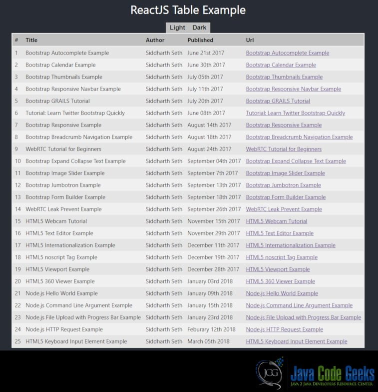
Navigating to the URL http://localhost:3000 should show the below output.
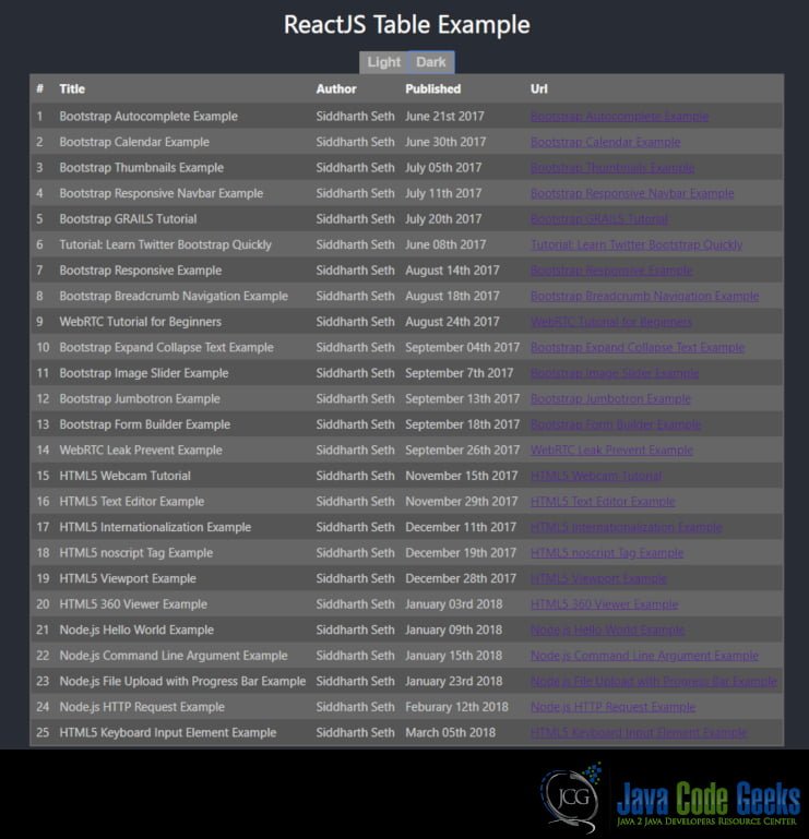
Now on clicking the Dark theme button the table will switch themes and will display as below:
This wraps up our look at ReactJS Table Example. Hope this was helpful.
4. Download the Source Code
You can download the full source code of this example here: ReactJS Table Example
