In this article, we build a reusable ReactJS Button Component. ReactJS has grown in popularity and has become the go-to library for front end development. We use it here to display its prowess when it comes to building flexible and reusable, batteries included, components for front end development.
The approach we use here is applicable to the development of all types of components using ReactJS. We cover styling and functionality which will make it flexible enough to be used in different scenarios with ease.
Let’s get started!
1. Tools and Technologies
For the example component we build in this article I have used the following:
create-react-app is a package that quickly generates a barebones ReactJS application. We use it as the starting point for our example. It uses and pulls down the latest version of ReactJS. Visual Studio Code is my favorite IDE for front end development and it is free. Although you are free to follow along in any editor or IDE of your choice.
2. Application Structure
Now to start off we run the below command to generate our initial application structure:
>npx create-react-app my-app
npx is a tool that comes with more recent versions of NodeJS. It downloads a temporary copy of the specified package and executes it with supplied arguments. This prevents the pollution of global package space with less frequently used tools. This command generates the application structure that should look like below:
3. Button Component
Now that we are set up let us start off creating our Button component. We do so in a file named Button.js and place the corresponding styles in the file named Button.css.
3.1 Style Options
Our component will support the following styling props:
Size
This setting takes the values of either small or large. Which refers to a size smaller than normal or larger than a normal button.
Type
This setting takes values of info, danger, and success. Each has a corresponding background-color.
Border
This setting takes the value of no-outline, outline, and round. With corresponding behavior applied.
Shadow
This setting applies a shadow to the button if present and true else no shadow is rendered.
The CSS to apply the above effects to our component looks like below:
Button.css
.shadow {
  box-shadow: 0px 3px 5px #aaaaaa;
}
.small {
  font-size: 0.75rem;
}
.large {
  font-size: 1.45rem;
}
.outline {
  border: 1px solid black;
  background-color: white;
  color: black;
}
.no-outline {
  border: none;
}
.danger {
  background-color: crimson;
  color: whitesmoke;
}
.info {
  background-color: blue;
  color: whitesmoke;
}
.success {
  background-color: green;
  color: whitesmoke;
}
.text-color {
  color: whitesmoke;
}
.round {
  border-radius: 4px;
  border: 1px solid lightgrey;
}
3.2 Button Component Implementation
Now that we have our styling stuff set up we write our component. The component renders an HTML button tag with appropriate classes supplied via props to our component. The code for our component looks like below:
Button.js
import React, { useEffect, useState } from "react";
import "./Button.css";
function Button(props) {
    const [classes, setClasses] = useState('');
    const { size, type, border, shadow } = props;
    useEffect(() => {
        let cls = '';
        if (size) {
            cls = `${cls} ${size}`;
        }
        if (type) {
            cls = `${cls} ${type}`;
        }
        if (border) {
            cls = `${cls} ${border}`;
        }
        if (shadow) {
            cls = `${cls} shadow`;
        }
        setClasses(`${cls}`);
    }, [size, border, type, shadow]);

    return <>
        <span>{
            `Size: ${props.size},
             Shadow: ${props.shadow},
             Type: ${props.type},
             Border: ${props.border}`
        }</span>
        <button className={classes} {...props}></button>
    </>;
}

export default Button;
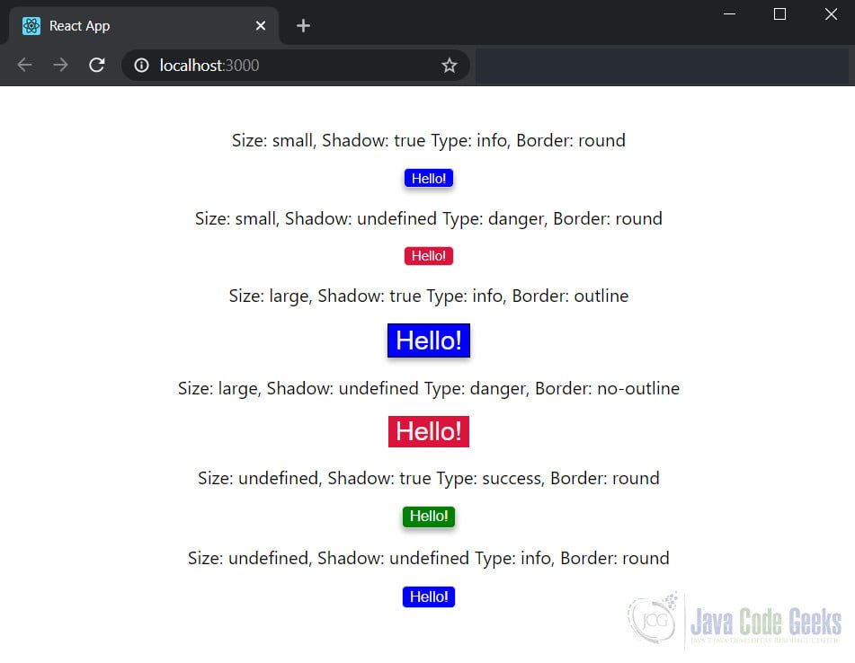
4. Using our Button Component
This wraps up our Button Component, let us now use it to see it in action. We modify the auto-generated index.js file to use our Button component. The modified code for the index.js file is as below:
index.js
import React from 'react';
import ReactDOM from 'react-dom';
import './index.css';
import Button from './Button';
import * as serviceWorker from './serviceWorker';

const sayHello = () => {
  alert('Hello from JCG!');
}

ReactDOM.render(
  <React.StrictMode>
    <div className='center-content'>
      <Button onClick={sayHello} shadow="true" type="info"
border="round" size="small">Hello!</Button>
      <Button onClick={sayHello} type="danger" border="round"
size="small">Hello!</Button>
      <Button onClick={sayHello} shadow="true" type="info"
border="outline" size="large">Hello!</Button>
      <Button onClick={sayHello} type="danger" border="no-outline"
size="large">Hello!</Button>
      <Button onClick={sayHello} shadow="true" type="success"
border="round">Hello!</Button>
      <Button onClick={sayHello} type="info"
border="round">Hello!</Button>

    </div>
  </React.StrictMode>,
  document.getElementById('root')
);

// If you want your app to work offline and
// load faster, you can change
// unregister() to register() below.
// Note this comes with some pitfalls.
// Learn more about service workers:
// https://bit.ly/CRA-PWA
serviceWorker.unregister();
Let us now run the application and see our Button component in action. We run the below command to launch the application in the default browser. The results look like below:
>npm start
This wraps up our example on creating a ReactJS Button Component.
5. Download the Source Code
You can download the full source code of this example here: ReactJS Button Component Example
