In this article we take a look at some of the best free React UI Components. These are picked based on my experience over the years using widget libraries with various front end frameworks. The widgets or UI Components that we will take a look are available for free to use them in your projects. So lets saddle up and get started on the ride.
First up we create a simple React Application before getting into details of UI Components. I have used the create-react-app npm package to generate a skeletal project. To do it yourself, run the following command.
> npx create-react-app my-react-app
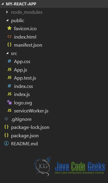
The structure of our application generated using above command looks like below:
I will use Visual Studio Code IDE to work through the example in this code. But you are free to use any editor of your choice. Lets move on to take a look at the first UI Components library.
1. React Bootstrap Dialog
React Bootstrap Dialog Component is a replacement for window.alert, window.confirm and window.prompt dialogs. To use this component we can pull it from npm using the below command:
> npm i react-bootstrap-dialog --save
In addition to the above we need to install react-bootstrap and bootstrap itself. We can do that by executing below command
> npm i react-bootstrap bootstrap --save
Now we are all set to use this component. Let us create a new component called DialogDemo in a file named Dialog.js as below:
Dialog.js
import Dialog from 'react-bootstrap-dialog';
import React from 'react';
import { Button } from 'react-bootstrap';

class DialogDemo extends React.Component {
    dialogComponent;
    constructor(props) {
        super(props);
    }
    showDialog = () => {
        this.dialogComponent.show({
            title: 'JavaCodeGeeks',
            body: 'Hello there! How are you?',
            actions: [
              Dialog.CancelAction(),
              Dialog.OKAction()
            ],
            bsSize: 'medium',
            onHide: (dialog) => {
              dialog.hide();
            }
          });
    }
    showAlert = () => {
        this.dialogComponent.showAlert('Hello from JavaCodeGeeks!');
    }
    render = () => {
        return <div className="container" >
            <h2>React Dialog Demo</h2>
            <Button onClick={this.showDialog}>Show Dialog</Button>
            <Button onClick={this.showAlert}>Show Alert</Button>
            <Dialog ref={(ele) => {this.dialogComponent = ele }} />
            </div>;
    }
}
export default DialogDemo;
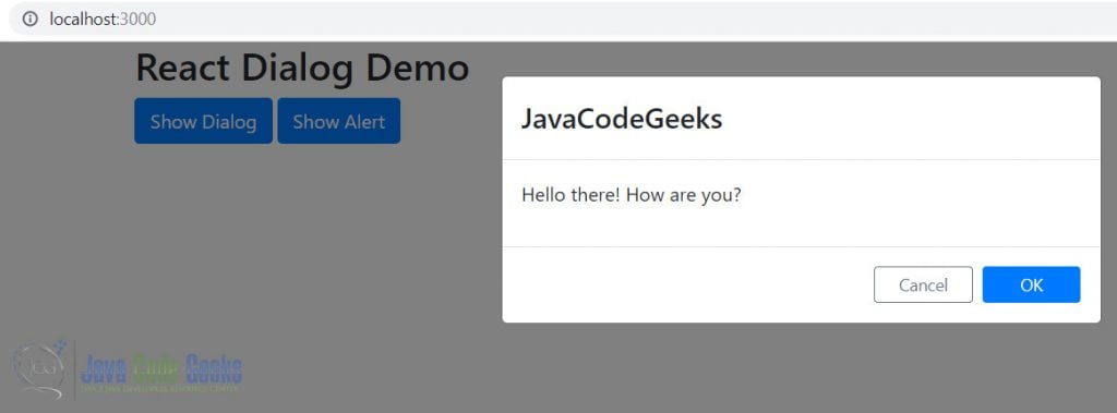
Now running our project and clicking Show Dialog and Show Alert buttons yields the below results:

2. React Autosuggest
To start using React Autosuggest component we need to pull it down from npm using the below command:
> npm install react-autosuggest --save
Once done, We start using it in an example by creating a file with the below code:
AutoSuggest.js
import Autosuggest from 'react-autosuggest';
import React from 'react';
const languages = [{
    name: 'German',
    greeting: 'Hallo'
}, {
    name: 'French',
    greeting: 'Bonjour'
}, {
    name: 'English',
    greeting: 'Hello'
}, {
    name: 'Spanish',
    greeting: 'Hola'
}];
// Teach Autosuggest how to calculate suggestions for any given input value.
const getSuggestions = (value) => {
    const inputValue = value.trim().toLowerCase();
    const inputLength = inputValue.length;

    return inputLength === 0 ? [] : languages.filter(lang =>
        lang.name.toLowerCase().slice(0, inputLength) === inputValue
    );
};

// When suggestion is clicked, Autosuggest needs to populate the input
// based on the clicked suggestion. Teach Autosuggest how to calculate the
// input value for every given suggestion.
const getSuggestionValue = suggestion => suggestion.name;

// Use your imagination to render suggestions.
const renderSuggestion = suggestion => (
   <span>{ suggestion.name }</span>
);
class AutoSuggestDemo extends React.Component {
    constructor(props) {
        super(props);
        this.state = { greeting: '', language: '', suggestions: [] };
    }
    onChange = (event, { newValue }) => {
        this.setState({
            language: newValue,
            greeting: getSuggestions(newValue)[0] ?
getSuggestions(newValue)[0].greeting: ''
        });
    };
    // Autosuggest will call this function every time you need to update suggestions.
    // You already implemented this logic above, so just use it.
    onSuggestionsFetchRequested = ({ value }) => {
        this.setState({
            suggestions: getSuggestions(value)
        });
    };

    // Autosuggest will call this function every time you need to clear suggestions.
    onSuggestionsClearRequested = () => {
        this.setState({
            suggestions: [],
            greeting: ''
        });
    };
    render = () => {
        const { language, suggestions, greeting } = this.state;

        // Autosuggest will pass through all these props to the input.
        const inputProps = {
            placeholder: 'Type a programming language',
            value: language,
            onChange: this.onChange
        };
        return <div> <Autosuggest
            suggestions={suggestions}
            onSuggestionsFetchRequested={this.onSuggestionsFetchRequested}
            onSuggestionsClearRequested={this.onSuggestionsClearRequested}
            getSuggestionValue={getSuggestionValue}
            renderSuggestion={renderSuggestion}
            inputProps={inputProps}
        /><span>{greeting}</span></div>
    }
}
export default AutoSuggestDemo;
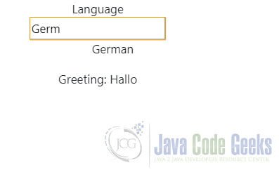
We can now run our code and see the below output in the browser:
3. ReactJS Datepicker
As the name suggests ReactJS Datepicker is a Date Picker component for React Applications. We will pull this down using npm command below:
> npm install react-datepicker --save
Now we will build a sample menu using this component in our sample application. Like previously we will place our code in a separate module for this example as well. The code would look like below:
Datepicker.js
import React from 'react';
import DatePicker from 'react-datepicker';
import "react-datepicker/dist/react-datepicker.css";

class DatepickerDemo extends React.Component {
    constructor(props) {
        super(props);
        this.state = {
            startDate: new Date()
        }
    }
    render = () => {
        return <DatePicker selected={this.state.startDate}
        onChange={this.handleChange}  />;
    }
    handleChange = (value) => {
        this.setState({
            startDate: value
        });
    }
}
export default DatepickerDemo;
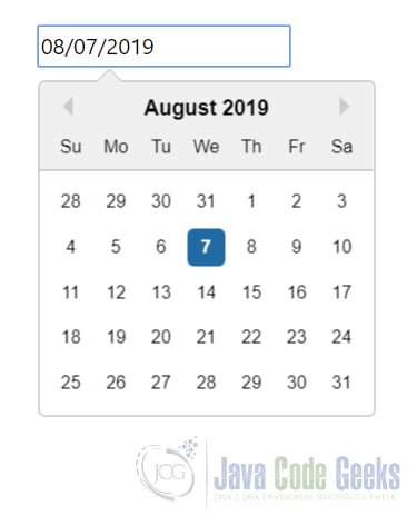
Now when we run the application we can see the datepicker in action like below:
4. React DnD
React Drag N Drop is a library to enable drag and drop features in a React Application. We pull the precompiled version of this library like below:
> npm install --save react-dnd
> npm install --save react-dnd-html5-backend
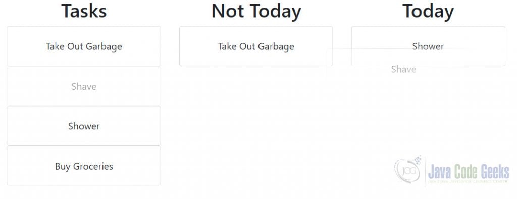
Post installation, we would create a Todo Board application, wherein we will drag tasks to Today list or Not Today list. We use a sample dataset that looks like below:
const Tasks = [{
    id: 'TaskList-1',
    desc: 'Tasks',
    tasks: [{
        id: 'Task-1',
        desc: 'Take Out Garbage'
    }, {
        id: 'Task-2',
        desc: 'Shave'
    }, {
        id: 'Task-3',
        desc: 'Shower'
    }, {
        id: 'Task-4',
        desc: 'Buy Groceries'
    }
    ]
}, {
    id: 'TaskList-2',
    desc: 'Not Today',
    tasks: []
}, {
    id: 'TaskList-3',
    desc: 'Today',
    tasks: []
}];
We display the above dataset using three instances of our TaskList component. One each for every TaskList object. Furthermore each TaskList displays an instance of Task for every task in the tasks array. Our components and the code to enable drag n drop using React Drag And Drop library looks like below:
reactdnd.tsx
import React from 'react';
import TaskList from './DnDTaskList';
import { DndProvider } from 'react-dnd';
import Html5Backend from 'react-dnd-html5-backend';
const Tasks = [{
    id: 'TaskList-1',
    desc: 'Tasks',
    tasks: [{
        id: 'Task-1',
        desc: 'Take Out Garbage'
    }, {
        id: 'Task-2',
        desc: 'Shave'
    }, {
        id: 'Task-3',
        desc: 'Shower'
    }, {
        id: 'Task-4',
        desc: 'Buy Groceries'
    }
    ]
}, {
    id: 'TaskList-2',
    desc: 'Not Today',
    tasks: []
}, {
    id: 'TaskList-3',
    desc: 'Today',
    tasks: []
}];

function ReactDnDDemo() {

    return <DndProvider backend={Html5Backend}><div className="row">{Tasks.map(t =>

        <div className="col-3" key={t.id}>
            <TaskList title={t.desc} task={t} tasks={t.tasks}
 onMove={(item: any, tasks: Array<any>) => {
                tasks = tasks.filter(tk => tk.id !== item.id);
            }}
            />
        </div>
    )}</div>
    </DndProvider>;

}
export default ReactDnDDemo;
In the above component we loop over the tasklist array and create an instance of TaskList component for each object. Additionally we pass the tasks array to the component through props. This would be used by individual TaskList component to render its tasks as we will see below:
DnDTaskList.tsx
import React from 'react';
import Task from './DnDTask';
import { useDrop } from 'react-dnd';
import { ItemTypes } from './CONSTANTS';

function TaskList(props: any) {
    const [collectedProps, drop] = useDrop({
        accept: ItemTypes.TASKS,
        collect: monitor => ({
            isOver: !!monitor.isOver(),
        }),
        drop: (task: any) => {
            props.tasks.push(task.task);
        }
    });

    return <div ref={drop}>

        <h2>{props.title}</h2>{
            props.tasks.map((t: any) =>

                <Task key={t.id} id={t.id} task={t} parentTask={props.task} onMove={(item: any, parentTask: any) => {
                    for(let k = 0; k < parentTask.tasks.length; k++) {
                        if(parentTask.tasks[k].id === item.id) {
                            parentTask.tasks.splice(k, 1);
                            return;
                        }
                    }
                }}>

                </Task>
            )}
    </div>;

}
export default TaskList;
The TaskList component above renders a its description and in addition a Task Component for each task under tasks prop passed to it. Passing the details of the task to the individual Task component instances. This component is made droppable using React Drag n Drop library and it accepts objects of type TASKS.
DnDTask.tsx
import React from 'react';
import { ItemTypes } from './CONSTANTS';
import { useDrag } from 'react-dnd';
function Task(props: any) {
    const [{ isDragging }, drag] = useDrag({
        item: { type: ItemTypes.TASKS, task: props.task },
        collect: monitor => ({
            isDragging: !!monitor.isDragging(),
        }),
        end: (dropResult: any) => {
            props.onMove(dropResult.task, props.parentTask);
        }
    });

    return <div className="card" ref={drag} style={{
        opacity: isDragging ? 0.5 : 1,
        cursor: 'move'
    }} >
        <div className="card-body">
            {props.task.desc}
        </div>
    </div>;
}
export default Task;
This is the Task object and it displays the description of the task. We have made this item draggable using React Drag n Drop.
The above code allows us to drag tasks between lists and move them like below:
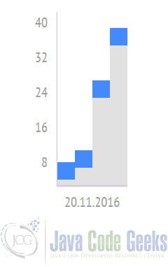
5. Chartify
Chartify is a lightweight charting component for React Application. So, lets learn to use it in our applications. First we need to pull it down from npm using
> npm install chartify --save
Now that we have it installed lets get down to creating our first chart with chartify. Our new chart component would as usual reside in a separate file and it would look like below:
/*import './chartify';*/
import Chartify from 'chartify';
import React from 'react';

let data = [{
    xValue: '20.11.2016',
    yValue: 5,
    title: '001'
}, {
    xValue: '12.03.2019',
    yValue: 8,
    title: '002'
}, {
    xValue: '20.11.2016',
    yValue: 25,
    title: '003'
} ,{
    xValue: '20.11.2016',
    yValue: 35,
    title: '004'
}];

let config = {
    theme: 'blue',
    width: 1450,
    height: 10,
    boxSize: 20,
    isLineChart: false,
    bordered: false
};
class ChartDemo extends React.Component {
    render = () => {
        return
    }
}
export default ChartDemo;
6. Download the Source Code
You can download the full source code of this example here: React UI Components Example
