This article is part of our Academy Course titled Android UI Design – Basics.
In this course, you will get a look at the fundamentals of Android UI design. You will understand user input, views and layouts, as well as adapters and fragments. Check it out here!
Table Of Contents
1. Introduction
In the previous articles, we talked about layout and how we can organize our Views so that we can create appealing user interfaces. We saw there are several layout managers and Viewslayout managers and Views. We also talked about drawable, which is very useful when we want to customize some widget.
In this article we will describe how we can use style and theme. This is an important aspect when developing an app because using style and theme we can brand our app and have an harmonious look.
While the layout and the Views specify the structure of the user interface, styles and themes define their look. What is a theme in Android?
A theme is a set of styles and can be applied to the whole app or to a single Activity. It helps to create an appealing user interface. A style, on the other hand, specifies a set of properties that have effects on how a View or Window looks like. These properties specify the font size, the font family, the background color, font color and so on. We can imagine that a style is like a CSS in a web page, it separates the content structure from how it is displayed on the screen.
When we create a layout in XML we use layout managers and Views. When using Views we could specify for example the background color, the font color, View size and so on. For example let us suppose we have a simple TextView like the one shown below:
<TextView
    android:layout_width="wrap_content"
    android:layout_height="wrap_content"
    android:background="#FF0000"
    android:text="Hello style"
    android:textColor="#FFFFFF"
    android:textSize=""14sp"" >

</TextView>
Looking at the code above we notice there are some mistakes: we added to the View not only the information regarding its content but also information about how it looks like and we hard-coded it directly. This is a very bad practice, because if we want to change the text color we should look for each TextView in our user interface definition.
Moreover, in a consistent and appealing user interface where text messages have all the same size, we will have to replicate the text size information for each TextView in our layout. This is a classic example where using a style would avoid duplication of data, separate the layout structure from its appearance and improve the XML file readability.
Styles and themes are very similar concepts: when we apply a style to an Activity or an application, instead of applying it to a single View, we call it a theme. In this case every property of a View that belongs to the Activity/application will be specified by the Activity/application style. For example we could define text size and color in a style and apply it to an Activity. In this way all the texts will look like as defined in the style.
2. Style definition
Now that we know what a style is, we have to define it inside our app. To do this, we have to create an XML file under res/values. We can choose the file name as we prefer but it must have the .xml extension. A style is defined inside the resource tag. So we have:
<resources xmlns:android="http://schemas.android.com/apk/res/android" >

    <style
        name="MyTextStyle"
        parent="@android:style/TextAppearance" >

        <item name="android:textColor">#FF0000</item>

        <item name="android:textSize">14sp</item>
    </style>

</resources>
In this way we have defined a new style called MyTextStyle and we have defined some properties as specified in item tags. Notice that in the style definition we used the parent attribute. This is an optional attribute which can be usedf if we want the defined style to inherit its properties from the parent style. Then, inside the style definition, we can override the parent properties. Under the style tag we defined two items so we specified two properties.
An item tag has a name attribute that defines the property name. This is the name of the property we want to apply the style, and the tag content is the property value. In our case, we defined a property called android:textColor assigning to it the value #FF0000 and another one called android:textSize and we assigned the value 14sp.
2.1. Inheritance
As we have seen before, style can inherit from a parent style, using parent attribute in style tag. So we can create an hierarchical structure with styles. There is another way to implement an hierarchical structure inside the same XML style file: we can simply use . notation.
For example, we can suppose we want to create another style called MyTextStyleHuge that inherits from MyTextStyle but overrides the text size:
<style name="MyTextStyle.MyTextStyleHuge" >
    <item name="android:textSize">30sp</item>
</style>
and we can continue in this way adding new inheritance.
2.2. Style properties
Each style defines the values of a set of properties using item tag. The property names are the names of the properties defined by a View. For example, looking at TextView we notice it has a set of properties described in the documentation in the XML attributes section. If we want to define the style of one of this property, we have to use the same name in the attribute name of item tag.
Looking at the example above, we used the properties android:textSize and android:textColor, they are two properties of the TextView according to the documentation: the first one used to define the text size and the other one for text color.
Once we have defined our style we have to apply it. As said before we can apply it to a single View, to an Activity or to an application. For example if we want to apply the style to a single View we use style attribute in this way:
<TextView
    style="@style/MyTextStyle"
    android:layout_width="wrap_content"
    android:layout_height="wrap_content"
    android:text="Text with style" />
Now we applied MyTextStyle to the TextView. These two ways are equivalent:
<TextView
    android:layout_width="wrap_content"
    android:layout_height="wrap_content"
    android:text="Hello without style"
    android:textColor="#FF0000"
    android:textSize=""14dp"" >
<TextView
    android:layout_width="wrap_content"
    android:layout_height="wrap_content"
    android:text="Text with style"
    style="@style/MyTextStyle"/>
In the left side we used a bad practice that we should avoid, while on right side we used a best practice. Running an app with these two TextView in the layout we have:
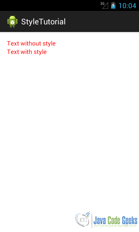
As you can notice the result is the same for both TextView.
3. Creating and applying themes
We know a theme is a special style that is applied to an Activity or to an application instead of a single View. A theme is always a style and when we want to define a theme we use the same technique used before when defining a style, so we create a XML file under res/values. Android provides a large collection of themes and styles that we can use or override customizing them.
Let us suppose we want to create a theme for all the application that sets the background to green. In this scenario, we define a style called AllGreen in this way:
<style
    name="AllGreen"
    parent="@android:style/Theme.Black" >

    <item name="android:background">#00FF00</item>

</style>
and then we apply it to the application in the Manifest.xml:
<application
    android:icon="@drawable/ic_launcher"
    android:label="@string/app_name"
    android:theme="@style/AllGreen" >

</application>
Running an app like that we will have the following result:
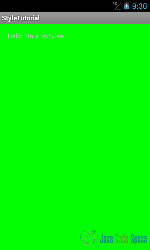
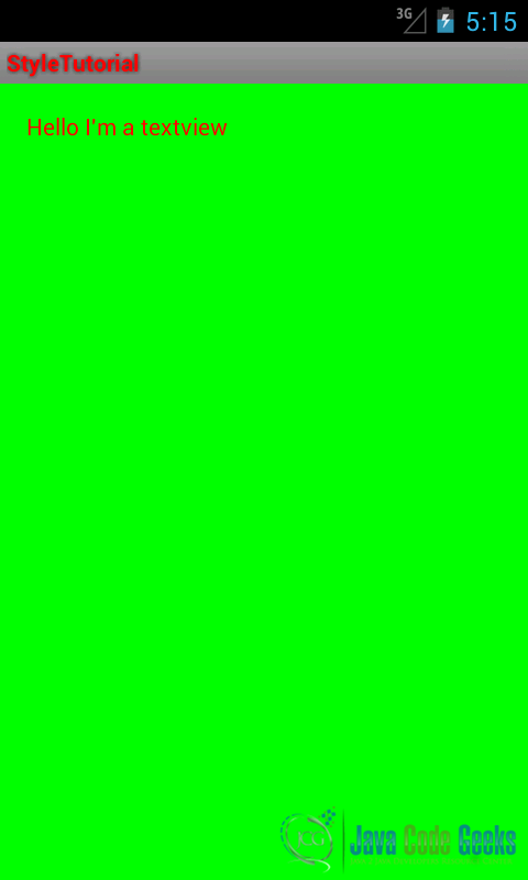
As a result the Activity background is green as we wanted. We have defined before a style for TextView and now we would like to use it in our theme. To do it, we have to modify it a little bit:
<resources xmlns:android="http://schemas.android.com/apk/res/android" >
<style
name="MyTextStyle"
parent="@android:style/Widget.Text<code>View</code>" >
<item name="android:textColor">#FF0000</item>
<item name="android:textSize">14sp</item>
</style>
<style
name="AllGreen"
parent="@android:style/Theme.Black" >
<item name="android:background">#00FF00</item>
<item name="android:textViewStyle">@style/MyTextStyle</item>
</style>
</resources>
Running the app we have:
By now we used just solid color for the background and we have seen it is easy to change the background, but what if we want to use a gradient color?
In the previous article we described how to create a gradient: we have to create a file with XML extension under
res/drawable directory; we call it grandient_red.xml:
<shape xmlns:android="http://schemas.android.com/apk/res/android" >

    <gradient
        android:endColor="#AA0000"
        android:startColor="#FF0000"
        android:type="linear" />

</shape>
Now we have to reference it in our style and for simplicity we can create another style file called style_gradient.xml:
<resources xmlns:android="http://schemas.android.com/apk/res/android" >

    <style
        name="RedGrad"
        parent="@android:style/Theme.Black" >

        <item name="android:background">@drawable/gradient_red</item>
    </style>

</resources>
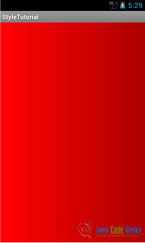
As you can notice, we referenced the drawable we created under the drawable directory, using @drawable/file_name. Running an app with this style we have:
Until now, whenever we defibed colors or font sizes, we used some hard coded values. Even if this is possible, it is not recommended for several reasons:
- If we want to change the color or a font size for example we have to look for these values in the style file.
- We would like to change the font size and colors according to the platform version for example or according to the screen dimensions.
So it is a good practice to move the color definition and/or the font size and so on to an external resources and reference them in the style.
So let us rewrite the text style we used before where this time we write the style in an XML file called style_text.xml:
<resources>

    <style name="MyTextStyle1" >

        <item name="android:textColor">@color/red</item>

        <item name="android:textSize">@dimen/myTextSize</item>
    </style>

</resources>
In this style we referenced an external resource that sets the text color and the text size. In this case, we have to create two files: one that we can call colors.xml containing the color definition and another one containing the dimension called dimens.xml:
<resources>
    <color name="red">#FF0000</color>
</resources>
<resources>
    <dimen name="myTextSize">14sp</dimen>
</resources>
We now know that we can reference external resources using the @ symbol, but sometimes we want to reference a single style element not the whole style.
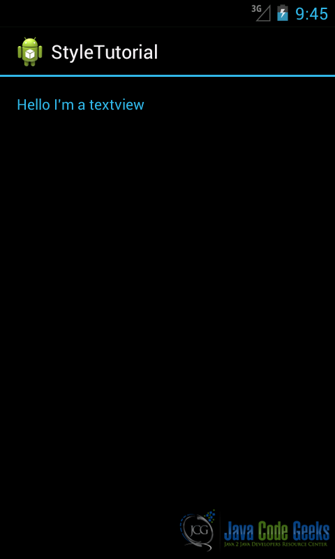
For example, we want to reference the current text color, but we do not know which one will be used by the OS. How can we do it? Well Android provides the ? symbol, which we can use to access a single element. For example we can suppose we want to set the text color value to one defined in Android OS:
<style name="TextRef" >

    <item name="android:textColor">?android:attr/textColorLink</item>

</style>
Using this notation, we set the current text color to the default text color used for links. Running the app we have:
3.1. Themes and platforms
Android provides an interesting feature that is useful when we want to create an app for different devices that can run on different Android versions.
Until now we used just res/values and we created several files that represent styles, dimensions, colors and so on. Android can use different resources according to the platform version, so we could adapt, for example, our themes and styles to the platform version, or we can even create a different style with different colors depending on the platform.
We know that newer Android version introduced some new features, APIs and resources including styles and themes. We could use newer themes when our app runs on devices that have a new Android version. At the same time, we want to keep the compatibility towards older Android versions. Using platform dependent resources we can achieve this goal.
In order to create a resource set that is dependent on the platform version we have to create a directory under res called values-vxx where xx is the API level; for example if we want to create a resource set that is suitable for Android 3.0 (API level 11) or higher, we can create a directory called values-v11. Under this directory we create style and themes. If we notice when we use Eclipse as IDE it creates two themes by default, one under res/values:
<style name="AppBaseTheme" parent="android:Theme.Light">
and another one under res/values-v11:
<style name="AppBaseTheme" parent="android:Theme.Holo.Light">
As you can see, these two themee have the same name but inherit from different parents.
We can not only specify our theme according to the platform version but also according to the screen size. For example, if we want to apply our theme when the smallest screen size is at least 600dp, we can create a directory called values-sw600dp and create under it our style file. This style and theme will be applied only when the device smallest screen size is at least 600dp. This technique is useful when we want to provide different style/theme according to the screen size. We could, for example, have only one style/theme defined in res/values and provide different text size according to the screen size. In this case we can only create a file called dimens.xml.
4. Conclusion
We now know how to use styles and themes and it is useful to recap some basic rules we should follow:
- Do not use hard coded values for colors, size and so on.
- Define a style or a theme and use
style=”...”in the widget definition to reference the style. - In the style definition do not use values directly in the XML file but reference theme using external resources. For example reference a color using
@color/color_name. - Provides different style or theme according to the platform version.
- Provides different resources according to the screen size.
5. Download the Source Code
This was a lesson on how to use Android Themes and Styles. You may download the source code here: themeStyle.zip
