This article is part of our Academy Course titled Android UI Design – Basics.
In this course, you will get a look at the fundamentals of Android UI design. You will understand user input, views and layouts, as well as adapters and fragments. Check it out here!
Table Of Contents
1. Overview
In this article, we will cover some multimedia and graphic aspects in Android. The Android SDK provides a set of APIs to handle multimedia files, such as audio, video and images. Moreover, the SDK provides other API sets that help developers to implement interesting graphics effects, like animations and so on.
The modern smart phones and tablets have an increasing storage capacity so that we can store music files, video files, images etc. Not only the storage capacity is important, but also the high definition camera makes it possible to take impressive photos. In this context, the Multimedia API plays an important role.
2. Multimedia API
Android supports a wide list of audio, video and image formats. You can give a look here to have an idea; just to name a few formats supported:
Audio
- MP3
- MIDI
- Vorbis (es: mkv)
Video
- H.263
- MPEG-4 SP
Images
- JPEG
- GIF
- PNG
Android, moreover, can handle local files, meaning files that are stored inside the smart phone or tablet or remote file using data streaming. We can leverage these capabilities in order to build very interesting apps.
All the classes provided by the Android SDK that we can use to add multimedia capabilities to our apps are under the android.media package. In this package, the heart class is called MediaPlayer. This class has several methods that we can use to play audio and video file stored in our device or streamed from a remote server.
This class implements a state machine with well-defined states and we have to know them before playing a file. Simplifying the state diagram, as shown in the official documentation, we can define these macro-states:
- Idle state: When we create a new instance of the MediaPlayer class.
- Initialization state: This state is triggered when we use
setDataSourceto set the information source thatMediaPlayerhas to use. - Prepared state: In this state, the preparation work is completed. We can enter in this state calling
preparemethod orprepareAsync. In the first case after the method returns the state moves toPrepared. In the async way, we have to implement a listener to be notified when the system is ready and the state moves toPrepared. We have to keep in mind that when calling thepreparemethod, the entire app could hang before the method returns because the method can take a long time before it completes its work, especially when data is streamed from a remote server. We should avoid calling this method in the main thread because it might cause a ANR (Application Not Responding) problem. Once theMediaPlayeris in prepared state we can play our file, pause it or stop it. - Completed state: Te end of the stream is reached.
We can play a file in several ways:
// Raw audio file as resource
MediaPlayer mp = MediaPlayer.create(this, R.raw.audio_file);
// Local file
MediaPlayer mp1 = MediaPlayer.create(this, Uri.parse("file:///...."));
// Remote file
MediaPlayer mp2 = MediaPlayer.create(this, Uri.parse("http://website.com"));
or we can use setDataSource in this way:
MediaPlayer mp3 = new MediaPlayer();
mp3.setDataSource("http://www.website.com");
Once we have created our MediaPlayer we can “prepare” it:
mp3.prepare();
and finally we can play it:
mp3.start();
Please keep in mind the observations above regarding preparing the state. According to them, we can use an async operation so that we will not stop the main thread. In this case, we have:
// Remote file
MediaPlayer mp2 = MediaPlayer.create(this, Uri.parse("http://website.com"));
mp2.setAudioStreamType(AudioManager.STREAM_MUSIC);
mp2.setOnCompletionListener(new MediaPlayer.OnCompletionListener() {
	@Override
	public void onCompletion(MediaPlayer mp) {
		mp.start();
	}
});
mp2.prepareAsync();
We used a listener to be notified when the MediaPlayer is in the prepared state so we can start playing. At the end, when we don’t need the instance of MediaPlayer anymore, we should release it:
mp2.release();
2.1. Using Android Camera
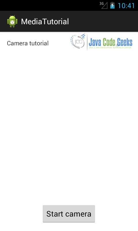
If we want to add to our apps the capability to take photos using the integrated smart phone camera, then the best way is to use an Intent. For example, let us suppose we want to start the camera as soon as we press a button and show the result in our app.
In the onCreate method of our Activity, we have to setup a listener of the Button and when clicked to fire the intent:
Button b = (Button) findViewById(R.id.btn1);
b.setOnClickListener(new View.OnClickListener() {
	@Override
	public void onClick(View v) {
		 // Here we fire the intent to start the camera
		Intent i = new Intent(MediaStore.ACTION_IMAGE_CAPTURE);
		startActivityForResult(i, 100);
	  }
});
In the onActivityResult method, we retrieve the picture taken and show the result:
@Override
protected void onActivityResult(int requestCode, int resultCode, Intent data) {
	// This is called when we finish taking the photo
	   Bitmap bmp = (Bitmap) data.getExtras().get("data");
	   iv.setImageBitmap(bmp);
}
Running the app we have:
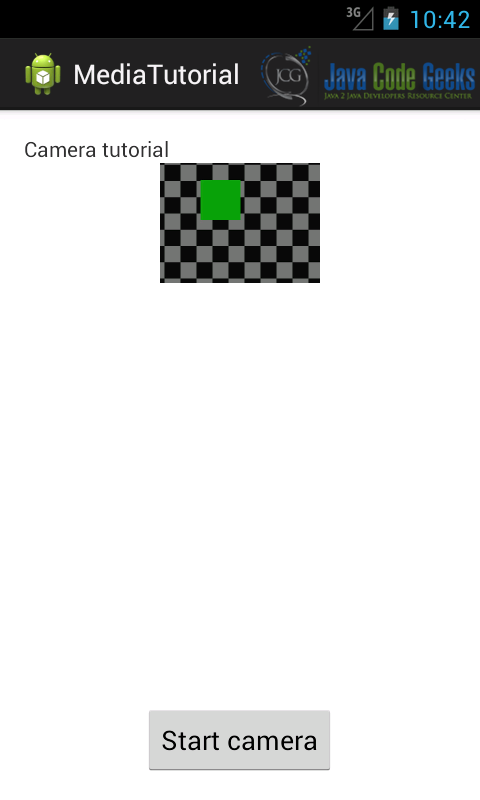
In the example above, we used an emulated camera.
3. Graphics
By now, we talked about standard components that we can be used in our UI. This is good but it is not enough when we want to develop a game or an app that requires graphic contents. Android SDK provides a set of API for drawing custom 2D and 3D graphics. When we write an app that requires graphics, we should consider how intensive the graphic usage is. In other words, there could be an app that uses quite static graphics without complex effects and there could be other app that uses intensive graphical effects like games.
According to this usage, there are different techniques we can adopt:
- Canvas and Drawable: In this case, we can extend the existing UI widgets so that we can customize their behavior or we can create custom 2D graphics using the standard method provided by the
Canvasclass. - Hardware acceleration: We can use hardware acceleration when drawing with the
CanvasAPI. This is possible from Android 3.0. - OpenGL: Android supports OpenGL natively using NDK. This technique is very useful when we have an app that uses intensively graphic contents (i.e games).
The easiest way to use 2D graphics is extending the View class and overriding the onDraw method. We can use this technique when we do not need a graphics intensive app.
In this case, we can use the Canvas class to create 2D graphics. This class provides a set of method starting with draw* that can be used to draw different shapes like:
- lines
- circle
- rectangle
- oval
- picture
- arc
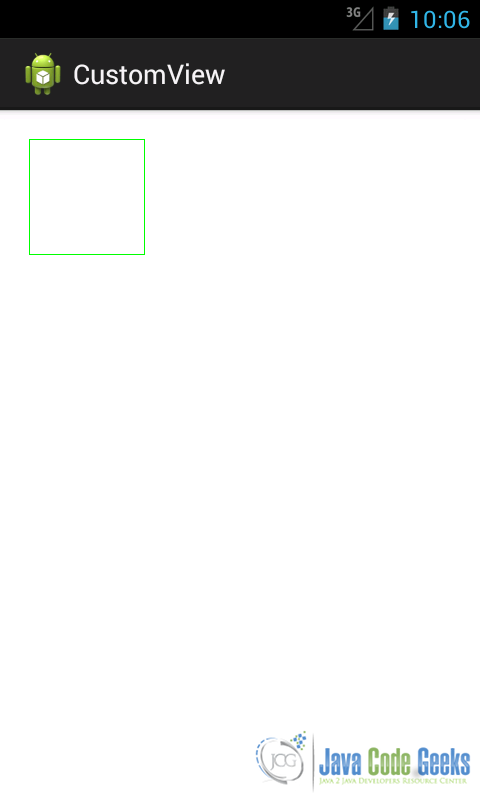
For example let us suppose we want do draw a rectangle. We create a custom view and then we override onDraw method. Here we draw the rectangle:
public class TestView extends View {
	public TestView(Context context) {
		super(context);
	}
	public TestView(Context context, AttributeSet attrs, int defStyle) {
		super(context, attrs, defStyle);

	}
	public TestView(Context context, AttributeSet attrs) {
		super(context, attrs);
	}

	@Override
	protected void onDraw(Canvas canvas) {
		super.onDraw(canvas);
		Paint p = new Paint();
		p.setColor(Color.GREEN);
		p.setStrokeWidth(1);
		p.setStyle(Paint.Style.STROKE);
		canvas.drawRect(5, 5, 120, 120, p);
		invalidate();
	}
}
As it is clear from the code above, in the onDraw method, we used the drawRect Canvas method. Notice that we used another class called Paint. This class specifies how the shape will be drawn; it specifies its color, if it has to be filled, the border width and so on.
In this case the layout looks like:
<RelativeLayout xmlns:android="http://schemas.android.com/apk/res/android"
    xmlns:tools="http://schemas.android.com/tools"
    android:layout_width="match_parent"
    android:layout_height="match_parent"
    android:paddingBottom="@dimen/activity_vertical_margin"
    android:paddingLeft="@dimen/activity_horizontal_margin"
    android:paddingRight="@dimen/activity_horizontal_margin"
    android:paddingTop="@dimen/activity_vertical_margin"
    tools:context=".MainActivity" >

    <com.swa.customview.TestView
        android:layout_width="wrap_content"
        android:layout_height="wrap_content" />

</RelativeLayout>
Running the app, we have:
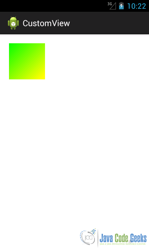
Suppose we want to fill the rectangle with a gradient color, so the onDraw method becomes:
protected void onDraw(Canvas canvas) {
	super.onDraw(canvas);
	Paint p = new Paint();
	p.setColor(Color.GREEN);
	p.setStrokeWidth(1);
	p.setStyle(Paint.Style.FILL_AND_STROKE);
	LinearGradient lg = new LinearGradient(0F, 0F, 115F,115F, Color.GREEN,  Color.YELLOW, TileMode.CLAMP);
	p.setShader(lg);
	canvas.drawRect(5, 5, 120, 120, p);
	invalidate();
}
Running the app we have:
As we told before, beginning from Android 3.0 (API 11), we can use hardware acceleration. In this case, if we want to use it, we have to modify the Manifest.xml and add the following line:
<application android:hardwareAccelerated="true" >
or we can use it at Activity level.
4. Drawable
In Android, a Drawable is a graphical object that can be shown on the screen. From API point of view all the Drawable objects derive from Drawable class. They have an important role in Android programming and we can use XML to create them. They differ from standard widgets because they are not interactive, meaning that they do not react to user touch.
Images, colors, shapes, objects that change their aspect according to their state, object that can be animated are all drawable objects. In Android under res directory, there is a sub-dir reserved for Drawable, it is called res/drawable.
Under the drawable dir we can add binary files like images or XML files.
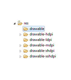
As we saw in the previous articles, we can create several directories according to the screen density we want to support. These directories have a name like drawable-<>.
This is very useful when we use images; in this case, we have to create several image versions: for example, we can create an image for the high dpi screen or another one for medium dpi screen. Once we have our file under drawable directory, we can reference it, in our class, using R.drawable.file_name. While it is very easy add a binary file to one of these directory, it is a matter of copy and paste, if we want to use a XML file we have to create it.
There are several types of drawable:
- Bitmap
- Nine-patch
- Layer list
- State list
- Level list
- Transition drawable
- Inset drawable
- Clip drawable
- Scale drawable
- Shape drawable
An interesting aspect is that we can create such elements using XML or directly from code. There is a correspondence between the elements shown above and the API class. We can add the Drawable suffix and we create the corresponding class name: for example if the corresponding class of Bitmap drawable is BitmapDrawable and so on.
You can have a look here if you want to have more information. We will not cover all these objects in this article but only the most popular.
4.1. Shape drawable
This is a generic shape. Using XML we have to create a file with shape element as root. This element as an attribute called android:shape where we define the type of shape like rectangle, oval, line and ring. We can customize the shape using child elements like:
| Element name | Description |
gradient | Specify the gradient color for the shape. |
solid | Specify the background shape color. |
stroke | Specify the border of the shape. |
corners | Specify the corner radius of the shape. |
padding | Specify the padding for the shape. |
size | Specify the width and the height of the shape. |
Table 1
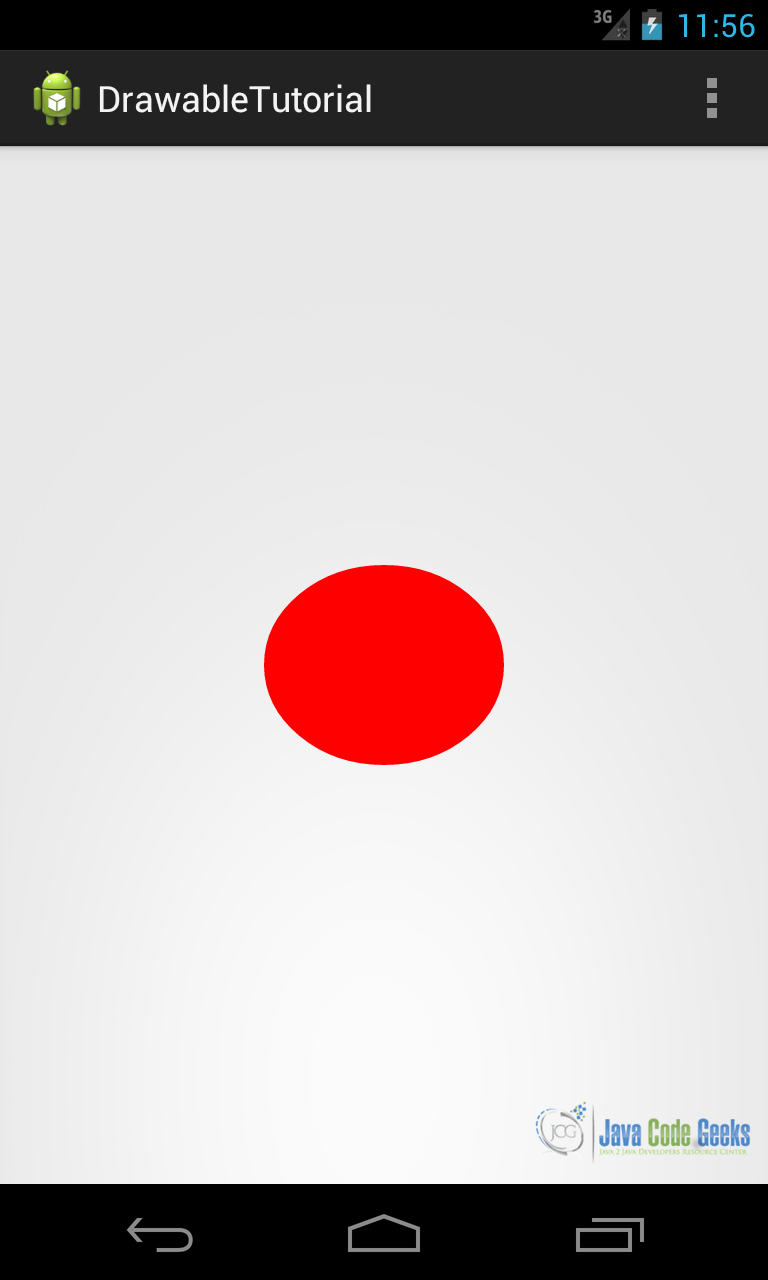
For example, let us suppose we want to create an oval with solid background color. We create a XML file called for example oval.xml:
<shape xmlns:android="http://schemas.android.com/apk/res/android"
    android:shape="oval" >

    <solid android:color="#FF0000" />

    <size
        android:height="100dp"
        android:width="120dp" />

</shape>
In this way, we create an oval shape having red as background color and with size 120dpx100dp. Then we can reference it in our layout file:
   <ImageView
    android:layout_width="wrap_content"
    android:layout_height="wrap_content"
    android:layout_centerInParent="true"
    android:src="@drawable/oval" />
Running the app, we obtain:
For example, we can suppose we want to change the Button widget look. We want to create a rectangle with rounded corners and as background a gradient color. We define a shape in XML file called round_corner.xml and we add it to drawable dir:
<shape xmlns:android="http://schemas.android.com/apk/res/android"
    android:shape="rectangle" >

    <stroke
        android:width="2dp"
        android:color="#00FF00" />

    <gradient
        android:angle="-90"
        android:endColor="#FFFFFF"
        android:startColor="#00FF00"
        android:type="linear" />

    <corners android:radius="3dp" />

    <padding
        android:bottom="4dp"
        android:left="4dp"
        android:right="4dp"
        android:top="4dp" />

</shape>
and in the layout file we have:
<Button
    android:layout_width="wrap_content"
    android:layout_height="wrap_content"
    android:layout_centerInParent="true"
    android:background="@drawable/round_corner"
    android:text="Click me" />
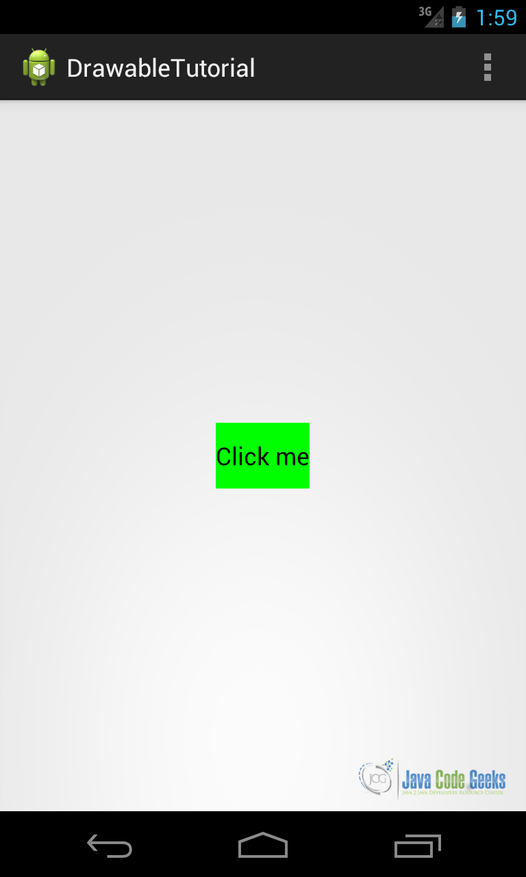
Running the app, we have:
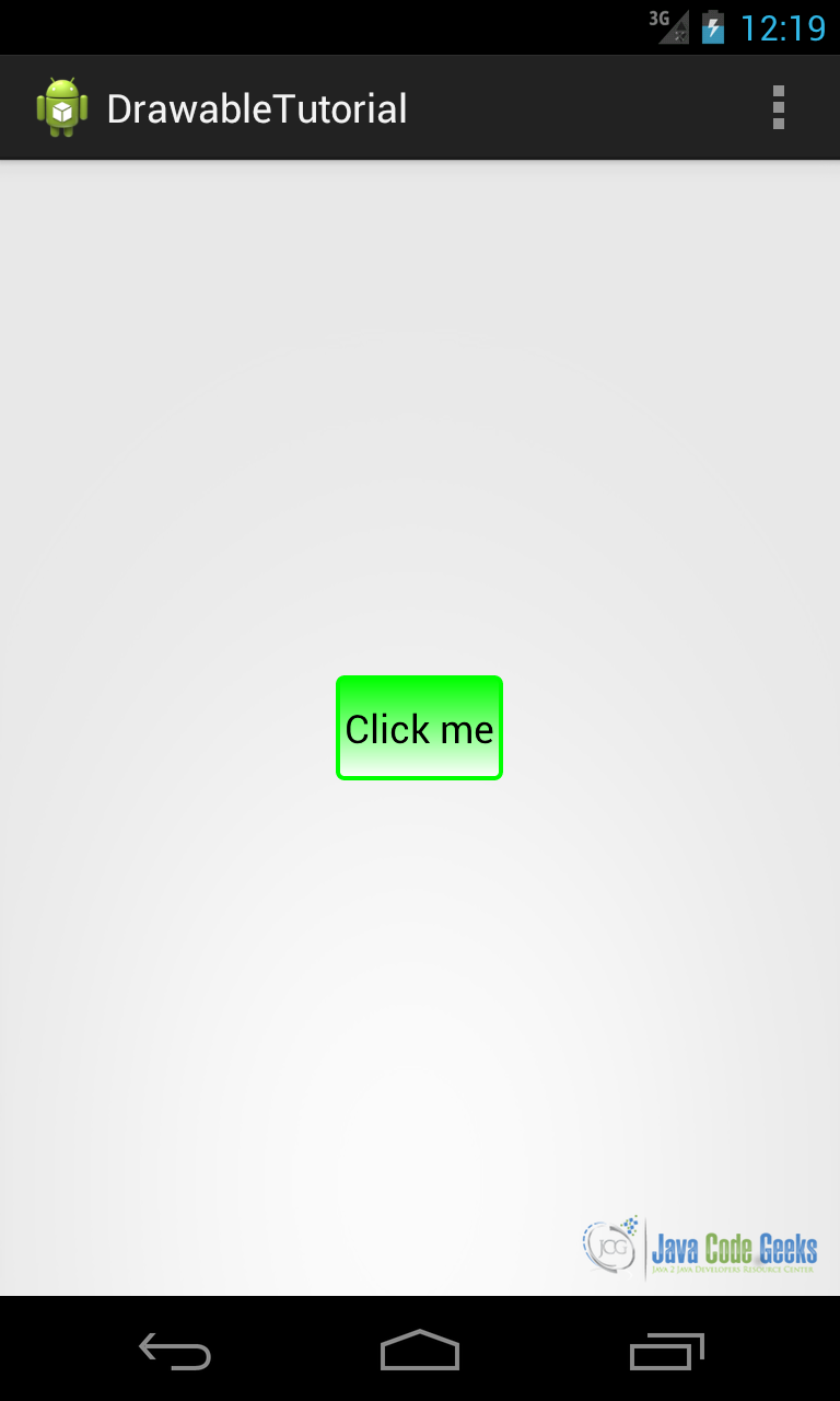
As we can see, just using XML we can modify the widget background or create shapes.
4.2. State list
This drawable object can display several drawables depending on the object state. It is very useful when we want to customize some object that has an internal states. For example, the Button widget is one of these objects, it has several states: pressed, focused and so on.
In XML this drawable is represented by selector tag. This tag has item child elements:
<selector xmlns:android="http://schemas.android.com/apk/res/android">

    <item android:drawable=""drawable1" android:state_pressed="true"/>
    <item android:drawable=""drawable2" android:state_focused="true"/>

</selector>
Let’s suppose we want to customize a Button widget in our layout when it is pressed. Additionally, we want to change its background to a red gradient color. So the first thing we do is to define two shapes:
<shape xmlns:android="http://schemas.android.com/apk/res/android" >

    <solid android:color="#00FF00" />

</shape>
green.xml
<shape xmlns:android="http://schemas.android.com/apk/res/android" >

    <gradient
        android:angle="-90"
        android:endColor="#FFFFFF"
        android:startColor="#AA0000"
        android:type="linear" />

</shape>
Once we have our shapes we can assign them to different object states:
<selector xmlns:android="http://schemas.android.com/apk/res/android">

    <item android:drawable="@drawable/red_gradient" android:state_pressed="true"/>
    <item android:drawable="@drawable/green"/>

</selector>
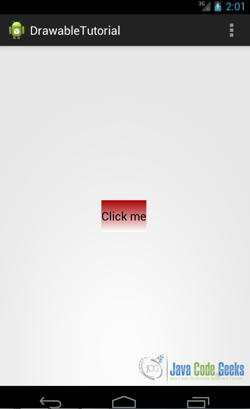
In this way, we assign the red_gradient drawable when the button is pressed and the green drawable in the default state. Running the app we have:
4.3. Nine-patch
Nine-patch image is a special background image that can be resized, so that it can hold the View content. You can look here if you want to have more information. It can be used when we want to create an image but we do not know the exact size of the View content.
Briefly, while creating this image we define the borders that can be stretched and the static area. Android provides a tool to help us creating this kind of images located under the tools directory. Suppose we want to create a Button widget background, we can create an image like the one shown below:
Now we can run draw9patch.bat under the tools directory. Now we can drag&drop this image on the window just opened:
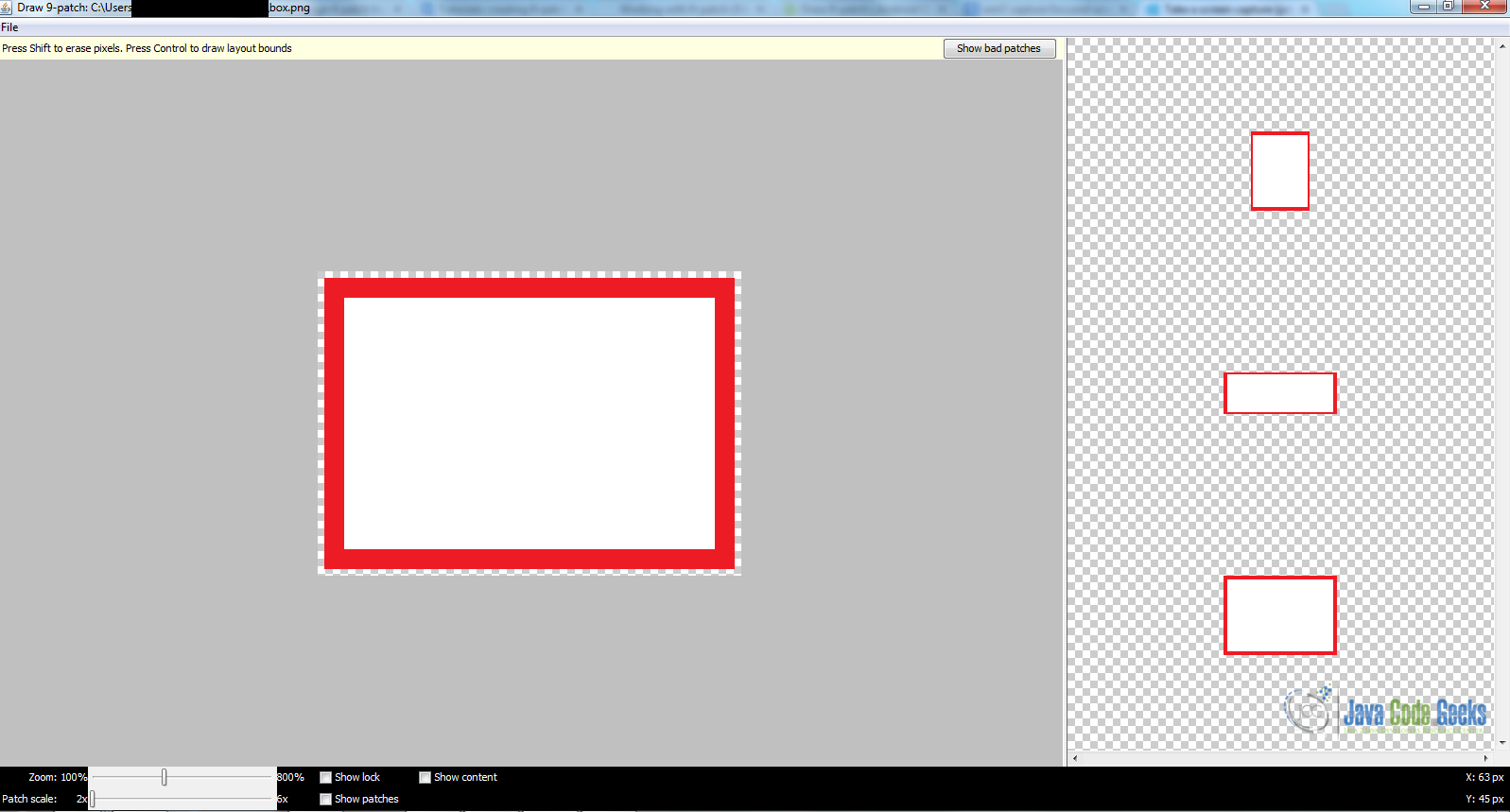
The window is divided in two areas: the left one is the “working window” while on the right side we have the final result. Now we have to choose the area of the image that can scale, we can do it drawing lines on the left and top side, as you can see in the picture:
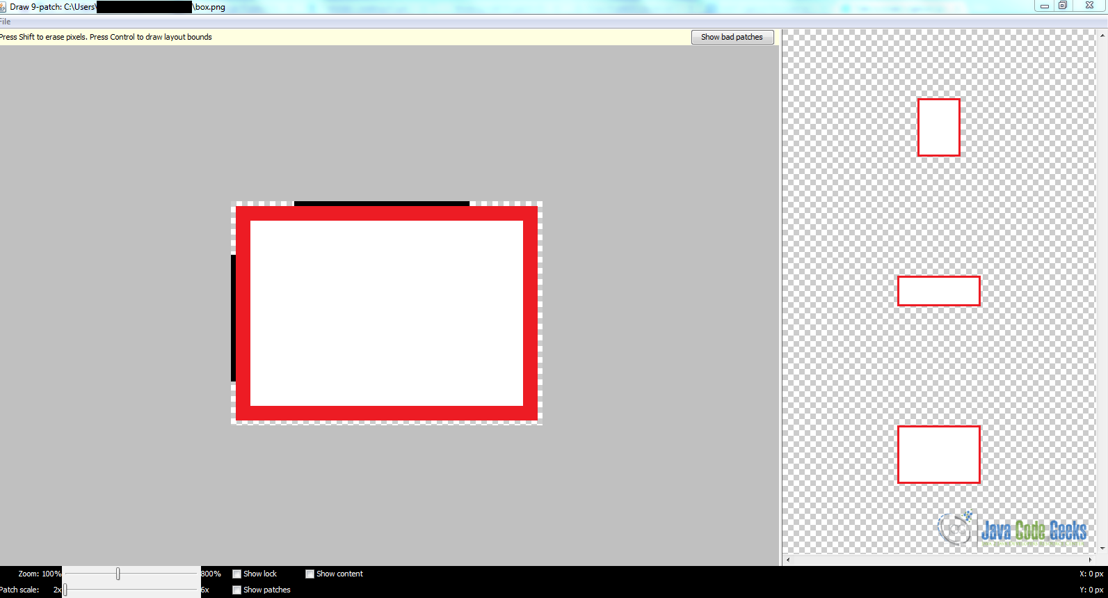
Now we set the content area, selecting the right and bottom side of the image.
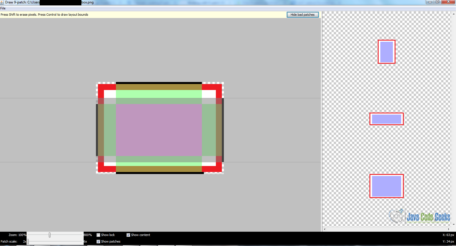
We can see on the right side the final result. Now we can save our work. When we have finished, we can copy this image under res/drawable of our Android project.
To see the final effect we can create a layout like the one shown below:
<Button
    android:id="@+id/btn1"
    android:layout_width="wrap_content"
    android:layout_height="wrap_content"
    android:background="@drawable/stdbox"
    android:text="This is a standard background with red border" />
<Button
    android:layout_width="wrap_content"
    android:layout_height="wrap_content"
    android:layout_below="@id/btn1"
    android:layout_marginTop="10dp"
    android:background="@drawable/box"
    android:text="This is a 9 patch background with red border" />
In the first button we used a standard image the simple red box as shown above, while in the second button we use a 9-patch image.
Running the example we have:
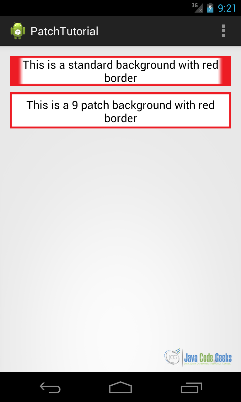
You can notice the 9-patch images scales better than the standard image.
5. Download the Source Code
This was a lesson on how to use Multimedia with Android. You may download the source code here: