Clean Sheet is an ergonomic Eclipse theme for Windows 10. It has been attuned to lessen visual fatigue and eyestrain, based on a clean and low glare look and feel. It incorporates well-balanced color selections that offer harmonic syntax highlighting and focus on readability. Along with custom scrollbars, it additionally strives to satisfy unobtrusively contemporary aesthetic demands.
This post explains the ideas behind the feature, expounds its current development state, and gives an outlook on future enhancements.
Why Another Eclipse Theme?
In my recent past, I experienced more than once serious, optic migraine-like, headaches while working on my computer. Besides consulting an ophthalmologist, this motivated me to reconsider my workplace configuration from the ergonomics point of view. I scrutinized illumination, sitting posture, screen contrasts and brightness, and, not least, the software I’m working with to reduce unnecessary strain.
As a Java developer, the program I probably use most is Eclipse. In conjunction with my perceiving that the available Eclipse themes do not match well with Microsoft’s latest and greatest anyway, it stood to reason to create a new theme with due regard to ergonomic principles. This is how I started this experiment.
The next section gives an overview of the key considerations and implementation strategies that lead to the initial version. Since I’m usually prone to making mistakes, I thought it’s probably best to publish the project early. This way others are able to benefit and help to correct problems and misconceptions at the same time.
Clean Sheet with Respect to Ergonomics
When I hatched the idea of creating an ergonomic Eclipse theme, I wondered where to start. Being a developer, I asked myself what is the most important activity a Java IDE’s look and feel should accentuate? I remembered Uncle Bob claiming that a programmer spends quite a lot of his time reading code:
The ratio of time spent reading (code) versus writing is well over 10 to 1…
Robert C. Martin, Clean Code
In this light, it seemed natural that the workbench’s appearance should be optimized for the best possible reading experience. Thus, recalling the somewhat odd look of the built-in themes on Windows 10, I focused my preliminary considerations on the impact of colors to readability next.
Shades of Gray
It turned out that, because of the strong attention steering effects of colors, they should be used sparingly. Too many different shades can cause an uneasy overall picture and lead to ineffective eye fixation [WAND93]. Consequently, Shneiderman [SHPH04] recommends to develop a monochrome graphic design of screens first, to carve out the logical or other relevant relationship representations between units.
This looked like a reasonable approach, but there was still another aspect to consider. Given the popularity of the ‘Dark’ Eclipse theme, it seemed to be important to clarify the preferable text contrast mode with respect to ergonomics.
Black on White, or White on Black?
Assuming a well-illuminated workplace which has been properly adjusted in accordance to ergonomic recommendations, the general advice has been for a long time to use black on white. Doing some research on the topic, eventually convinced me to go in a similar direction too. Let me explain in a nutshell some of the reasoning this decision is founded on, starting with a quote based on a well-hung publication of the 80s:
“However, most studies have shown that dark characters on a light background are superior to light characters on a dark background (when the refresh rate is fairly high). For example, Bauer and Cavonius (1980) found that participants were 26% more accurate in reading text when they read it with dark characters on a light background.” [GRAVIG]
Meanwhile, it seems to be ascertained that the best readability, while sparing the eyes as much as possible, is achieved with “achromatic” contrasts. These are combinations of light gray backgrounds (which, although appearing almost white, avoid strong outshining) with black or very dark font colors [HOLL07]. Holl mentions test series, which have shown that pure black, dark gray or, for example, dark green colors are suited best for text, symbols, lines and similar foreground subjects.
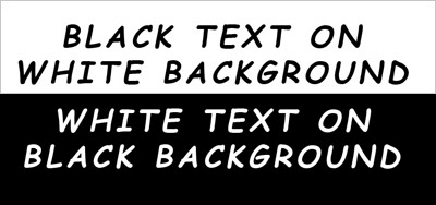
Decide for yourself, what lays less strain on your eyes. The upper or the lower part of the picture above? Admittedly it’s not a completely fair comparison, sine the lower part is placed on a bright background. To look at this contrast alone is hard work for your eyes to adjust. But it shows that ergonomics has to be looked at in its entirety. Using bright screens in a dark environment isn’t a good choice either.
The Problem with Plain-Jane
Because of the previous considerations, Clean Sheet started off with a light gray as workbench window and part background combined with a black font. Using gray instead of pure white reduces ‘text-outshining’ tendencies and background glare effects. Accentuations of structuring elements like parts, part stacks, toolbar, trim bars, and so on were also based on decent shades of gray.
However, while black on more or less light gray is perfectly suited for reading plain text, as default settings of readers like Amazon’s Kindle or Evernote’s Clearly suggest, working with code is a bit different. Code is much more structured and a developer want to recognize this structure at a glance.
To ease the recognition process, text editors support highlighting of special text elements like keywords, field declarations, string constants, and more. Of course, it would be possible to use even more shades of gray to produce the highlighting effects, but my corresponding experiments didn’t turn out satisfying.
If you are looking for a way to create your own syntax highlighting color theme for Eclipse you might check out Eclipse Color Themes. They provide an online service for theme creation and an Eclipse plug-in to install and switch themes provided by this service. This is much more comfortable for getting started than writing your own theme extension or the like.
On the one hand, having all this nuances of gray didn’t really lead to well perceivable structuring. On the other hand, the workbench’s overall impression got a bit boring and sleep inducing. Hence, I felt it was about time to bring a dash of color into play.
Introducing Spots of Color
While keeping the basic text elements black, I began a quest on the color wheel for a syntax highlighting palette which could serve as a structuring foundation and a mood booster at the same time. Referring to terms of color psychology, I opted for a stimulating color on keywords, a factual one on fields, literals etc., and a soothing one on java doc sections, for example.
Altogether, it was important to find a harmonic scheme that would blend in nicely with the workbench’s presets of iconographic elements and the like, but avoid distracting effects as much as possible. The following picture, a screenshot of my real world setup, shows what I finally came up with (click on the image to enlarge).
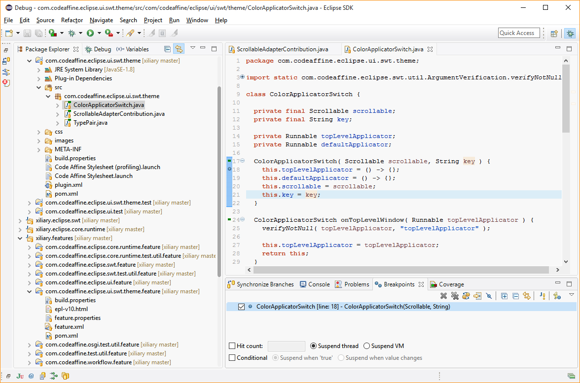
Well, isn’t she a beauty? :)
Incorporation of Flat Scrollbars
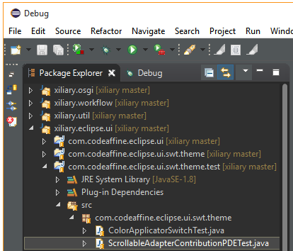
The attentive observer surely has recognized the different scrollbar styles used by the package explorer and the text editor. Clean Sheet uses the custom SWT Scrollbar component I’ve introduce a couple of months ago in my post Sacrilege – a Custom SWT Scrollbar. The reason to create this component was that the native SWT scrollbar often looks a bit disruptive on more subtle view layouts.
Using FlatScrollbar instances daily, I took such a fancy to them that I began to explore the possibilities of adapting controls of existing SWT applications. Although there is a ScrollableAdapter for trees and tables, there are technical hurdles that prevent their usage as a simple style replacement.

Yet, the styling capabilities of SWT open a door that allows to hook in the flat scrollbar overlay adapter. However, this approach started off highly experimental and I didn’t expect it to be successful due to the amount of ‘creative programming solutions’ it required 1. But, after eating my own dog food for some months now, and with most of the issues settled, it seems to work surprisingly well – at least for the UI parts within the Java IDE’s scope of whom I’m aware of.
For fans of the windows 7 and windows dark theme, the Code Affine Theme feature provides extensions for both that incorporate the Xiliary FlatScrollBar component on trees and tables.
Windows Theme with FlatScrollbar

Dark Theme with FlatScrollbar
Outlook
Clean Sheet has only been tested with the Eclipse Java IDE yet. Because of this I wouldn’t be surprised if more extensive workbench setups bring unexpected difficulties to light. Parts based on the Eclipse Forms Toolkit look a bit like alien elements which, however, isn’t much of a change in my opinion (shame on me)… If the styling doesn’t work out for you, there is no harm done. Simply switch back to your preferred theme, restart the workbench, and go on with your work.
In the near future, I expect to solve the remaining bugs filed in the Xiliary issue tracker and undertake some fine tunings derivated from daily work experiences and increasing knowledge.
In the longer term, and if the concept proves itself useful, I plan to stretch the scrollable adapter mechanism to more SWT components with StyledText, the control which all text editors are based on, leading the way. So stay tuned, it will be exciting :)
At a Glance
About Clean Sheet…
Requirements
JRE 8, Windows 10, Eclipse 4.5 (Mars), and newer.
Download and Installation
Drag and drop the ‘Install’ icon into a running Eclipse workbench to install ‘Code Affine Theme’ feature.
![]()
or
Select Help > Install New Software…
P2 repository software site @ http://fappel.github.io/xiliary/
Feature: Code Affine Theme
After feature installation and workbench restart select the ‘Clean Sheet’ theme: Preferences: General > Appearance > Theme: Clean Sheet
Licence
Published under the terms of the Eclipse Public License, version 1.0.
Home Page
Resources
- [GRAVIG]: Bauer, D., & Cavonius, C., R. (1980). Improving the legibility of visual display units through contrast reversal. In E. Grandjean, E. Vigliani (Eds.), Ergonomic Aspects of Visual Display Terminals (pp. 137-142). London: Taylor & Francis
- [HOLL07]: Friedrich Holl, Fachhochschule Brandenburg, Software Gestaltung: Farbe auf dem Bildschirm
- [SHPL04]: Shneiderman, Plaisant: Designing the User Interface. Strategies for Effective Human-Computer Interaction. Addison-Wesley, 2004
- [WAND93]:Jens Wandmacher, Software Ergonomie, Gruyter, 1993
- To be honest, there were quite a few ‘children don’t do this at home’ hacks necessary to achieve the outcome. But no guts, no glory…
| Reference: | Clean Sheet – an Ergonomic Eclipse Theme for Windows 10 from our JCG partner Frank Appel at the Code Affine blog. |

I want it for android studio too