BaDaS = Big and Data and Science
These days, BaDaS is all the rage. And to be successful at it, you need an arsenal of weapons to gain insights into vast amounts of data quickly. And more and more, I believe python is the go-to swiss-army knife used in the field. And if you’ve read my previous blog, I believe iPython Notebook (a.k.a. Jupyter) is a great way to collaborate with other people when doing data analysis.
So…
Recently, when I was analyzing the throughput/scalability of Kinesis and I wanted to graph the results, instead of turning to Excel to churn out the graph, I fired up the old iPython Notebook. (admittedly, I was also inspired by @AustinRochford’s excellent blog on Bayesian inference)
I was blown away. I was able to go from a log file to a visible graph in just minutes. Here is how I did it…
After a couple minutes of googling, I realized that the secret sauce was in matplotlib. More specifically, it was Pyplot FTW!
To get to work, I first grep’d the log files for each of my runs, and created a log file for each. I happened to be playing around with RecordBufferSizes in the Kinesis Producer Library (KPL), and ran an experiment at 10ms, 25ms, 50ms and 100ms buffer times.
I then fired up the trusty Notebook and started hacking away.
First, I imported pyplot:
from matplotlib import pyplot as plt
Then, I imported csv and dateutil to munge the data…
import csv

import dateutil
Finally, all I had to do was write some python to parse each data file and create a representative dataset. Pyplot took care of the rest.
In the below code, I loop through each CSV file and gather up the dataset for that file. The dataset is a dictionary called data. The dictionary contains two lists, one for timestamps, which is what will become the y axis, and one for the throughput (a.k.a. recordsPerSecond), which is what will become the x axis.
The first element of each row in the CSV contains the epoch time. But because I wanted a time series graph , I didn’t want to use the absolute timestamp. Instead, inline I just calculate the delta from the first timestamp I see. (neato!)
In the end, I stuff each of the data dictionaries, into an overarching dictionary that maps filename to the data dictionary representing the data for that file.
The final few lines tell pyplot to graph each of the datasets. There is some voodoo in there to set the color (hint: ‘r’ = red, ‘y’ = yellow, etc.)
In the end, you hit execute on the cell, and SHAZAM – it’s graphalicious.
%matplotlib inline
files = ['10ms.csv', '25ms.csv', '50ms.csv', '100ms.csv']

datasets = {}

for filename in files:
    data = {
        "timestamp": [],
        "recordsPerSecond": []
    }
    with open(filename, 'rb') as csvfile:
        reader = csv.reader(csvfile, delimiter=',')
        starttime = None
        for row in reader:
            timestamp = dateutil.parser.parse(row[0])
            if (starttime is None):
                starttime = timestamp
            delta = (timestamp - starttime).total_seconds()
            data["timestamp"].append(delta)
            data["recordsPerSecond"].append(row[1])
        datasets[filename] = data

plt.plot(
    datasets["10ms.csv"]["timestamp"],
    datasets["10ms.csv"]["recordsPerSecond"],
    'r', label='10ms')
plt.plot(datasets["25ms.csv"]["timestamp"],
    datasets["25ms.csv"]["recordsPerSecond"],
    'b', label="25ms")
plt.plot(datasets["50ms.csv"]["timestamp"],
    datasets["50ms.csv"]["recordsPerSecond"],
    'g', label="50ms")
plt.plot(datasets["100ms.csv"]["timestamp"],
    datasets["100ms.csv"]["recordsPerSecond"],
    'y', label="100ms")
plt.ylabel('Records / Second')
plt.xlabel('Seconds')
plt.legend()
plt.show
<function matplotlib.pyplot.show>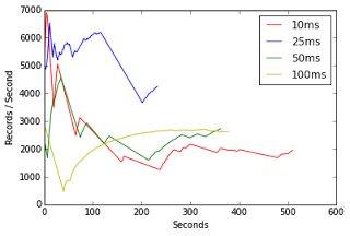
And FWIW, this entire blog post was written from within Jupyter!
If I get around to it, I’ll hopefully post what the actual results were when we played with buffer sizes with Kinesis. (HINT: Be careful – the buffer sizes control how much aggregation occurs, which not only affects throughput, but also affects cost!)
| Reference: | BaDaS Arsenal : from grep to graph in under 5 minutes w/ Pyplot from our JCG partner Brian ONeill at the Brian ONeill’s Blog blog. |