This article is part of our Academy Course titled Android UI Design – Basics.
In this course, you will get a look at the fundamentals of Android UI design. You will understand user input, views and layouts, as well as adapters and fragments. Check it out here!
Table Of Contents
1. Overview
In our previous article, we introduced some basic concepts about Android UI patterns and we saw how we can create consistent UI following those patterns. In this article, we want to explore more about Views and how we can use them to build great user interfaces. This article will cover concepts about Views and Adapters. Developing a user interface in Android can be quite simple since we can describe them using XML files and the system will do the heavy work converting those in real user interface components, placing them according to the screen size and resolution.
The Android UI framework provides some basic UI components, that are called controls or widgets, helping developers while coding and building an app.
2. Views
The View class is the basic class that all the components extend. A View draws something on a piece of screen and it is responsible to handle events while user interacts with it. Even the generic ViewGroup class extends View. A ViewGroup is a special View that holds other views and places these views following some rules. We will see that Android provides some specialized views that helps us to handle text, images, user inputs, buttons and so on.
All these views have some key aspects in common:
- All views have a set of properties: These properties affect the way the view is rendered. There is a set of properties common to all views, while there are some other properties depending on the type of view.
- Focus: The system manages the focus on each view and depending on the user input, we can modify and force the focus on a specific view.
- Listeners: All views have listeners which are used to handle events when the user interacts with the view. We can register our app to listen to specific events that occur on a view.
- Visibility: We can control if a view is visible or not and we can change the view visibility at runtime too.
A view property is a key value pair that we can use to customize the view behavior. The property values can be:
- a number
- a string
- a reference to a value written somewhere else
The first two options are trivial, the third is the most interesting one because we can create a file (always in XML) that holds a list of values and we can reference it in our property value. This is the best approach to follow especially when we use themes and styles or we want to support multi-language apps.
One of the most important property is view id: this is a unique identifier for the view and we can look up a specific view using this id. This is a “static” property meaning we cannot change it once we have defined it.
When we want to set a view property, we have two ways to do it:
- using XML while we define our view
- programmatically
For example, let’s suppose we want to define a TextView (it writes a text). In XML we have:
<TextView
    android:id="@+id/textView1"
    android:layout_width="wrap_content"
    android:layout_height="wrap_content"
    android:text="@string/hello_world" />
As you can notice, we defined an id called textView1, some other properties that have a string values and another property called android:text that reference a value written somewhere else.
We could do the same thing using just code lines:
TextView tv = new TextView(this);
tv.setText("blabla");
These two approaches are equivalent; however, the first one in XML is the preferred one. There is a correspondence between XML view property and the Java method: usually for each XML property there is a set method that we can use in our code. You can look here to have more information about this correspondence. In XML, a view property is called attribute.
Two properties that play an important role are layout_width and layout_height. These two properties define how large and how tall should be the view. We can use two predefined values:
MATCH_PARENTWRAP_CONTENT
With MATCH_PARENT value, we mean that we want our view as big as its parent that holds it, while with WRAP_CONTENT we specify that our view must be big enough to hold its content.
There is another option: using a numeric value. In this case, we specify the exact measure of our view. In this case, the best practice suggests using dp unit measure so that our view can be adapted to different screen density.
Talking about view listeners, this is a well-known approach when we want to be notified about some events. A listener in Java is an interface that defines some methods, which our listener class must implement so that it can receive notifications when a specific event occurs.
The Android SDK has several listener types, so different interfaces can be implemented. Two of the most popular are: View.OnClickListener, View.OnTouchListener and so on.
Android provides several standard components and of course if we cannot find a component that fulfills our needs, we can always implement a custom view. Using a custom view, we can define what our view will draw on the screen and its behaviour. We can even define custom properties that affect the view’s behavior. In this case, we have to extend the basic View class and override some methods.F
2.1. TextView component
This is one of the simplest components. We use it when we want to show a text on the screen. We have seen it before:
<TextView
    android:id="@+id/textView1"
    android:layout_width="wrap_content"
    android:layout_height="wrap_content"
    android:text="@string/hello_world" />
where android:text holds the text we want to show. It has some attributes we can use to specify how we want to show the text:
android:fontFamily– It is the font-family.android:shadowColor– It is the shadow color.android:shadowDx– It is the shadow x axis offset.android:shadowDy– It is the shadow y axis offset.android:textStyle– It is the style (bold, italic, bolditalic).android:textSize– It is the text size.
Below are some examples of TextView:
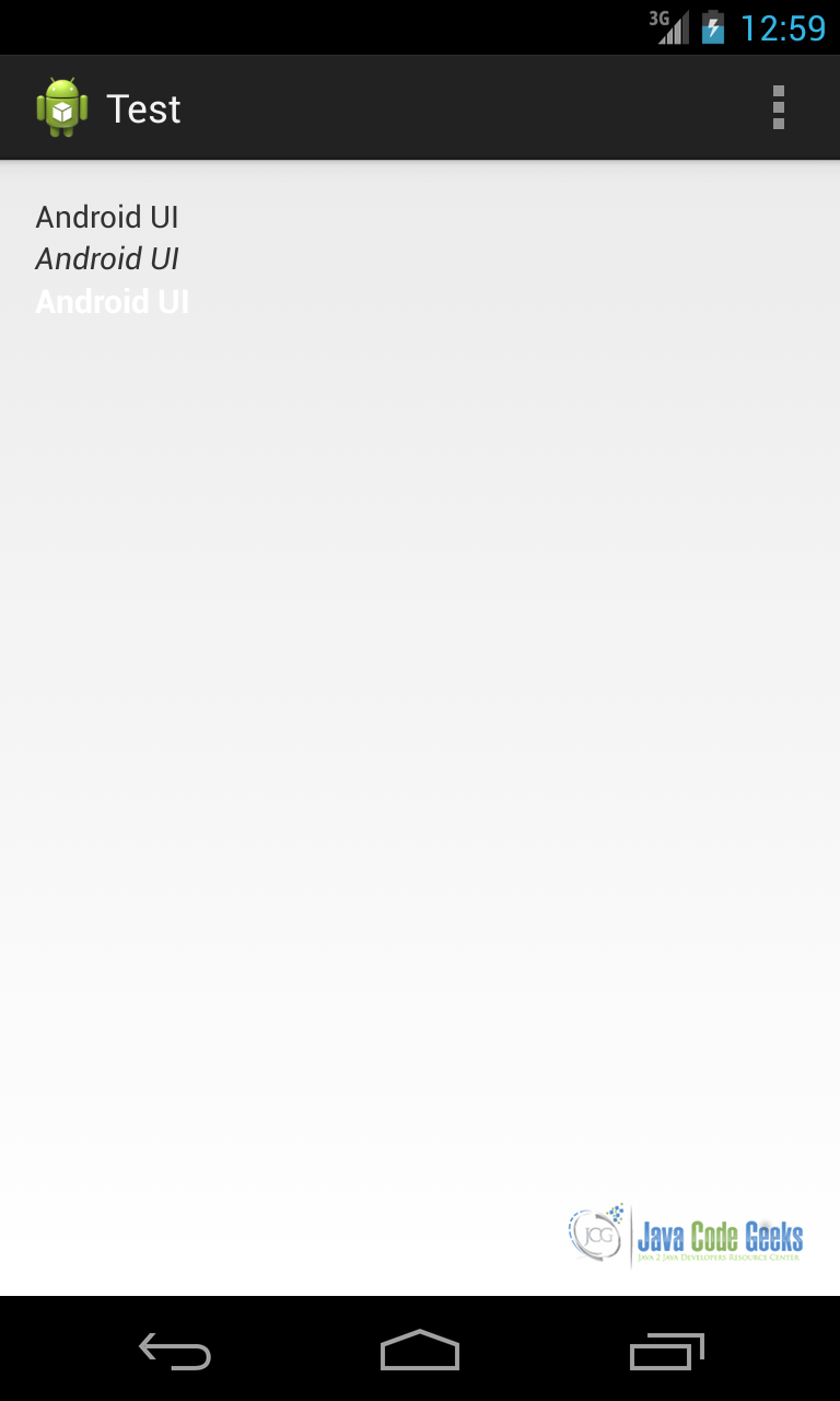
and the corresponding XML is:
<TextView
    android:id="@+id/textView1"
    android:layout_width="wrap_content"
    android:layout_height="wrap_content"
    android:text="Android UI" />
<TextView
    android:id="@+id/textView2"
    android:layout_width="wrap_content"
    android:layout_height="wrap_content"
    android:text="Android UI"
    android:textStyle="italic" />
<TextView
    android:id="@+id/textView2"
    android:layout_width="wrap_content"
    android:layout_height="wrap_content"
    android:text="Android UI"
    android:textColor="#FFFFFF"
    android:textSize="15dp"
    android:textStyle="bold" />
2.2. ImageView component
This component is used to show an image on the screen. The image we want to show can be placed inside our apk or we can load it remotely. In the first case, our image has to be placed under the res/drawable directory. Base on what we discussed in our previous article, we already know we have to keep in mind that our app can run on multipe devices with different screen density.
To better support different screen densities, we can create different images with different resolutions. The res/drawable directory is the default directory where the system looks if it cannot find an image with the right density for the screen. Generally speaking, we have to create at least four different image with different resolutions, in fact we can notice in our IDE that there are at least five directories:
drawable-ldpi(not supported any more)drawable-mdpi(medium dpi)drawable-hdpi(high dpi)drawable-xhdpi(extra-high dpi)drawable-xxhdpi(x-extra-high dpi)drawable
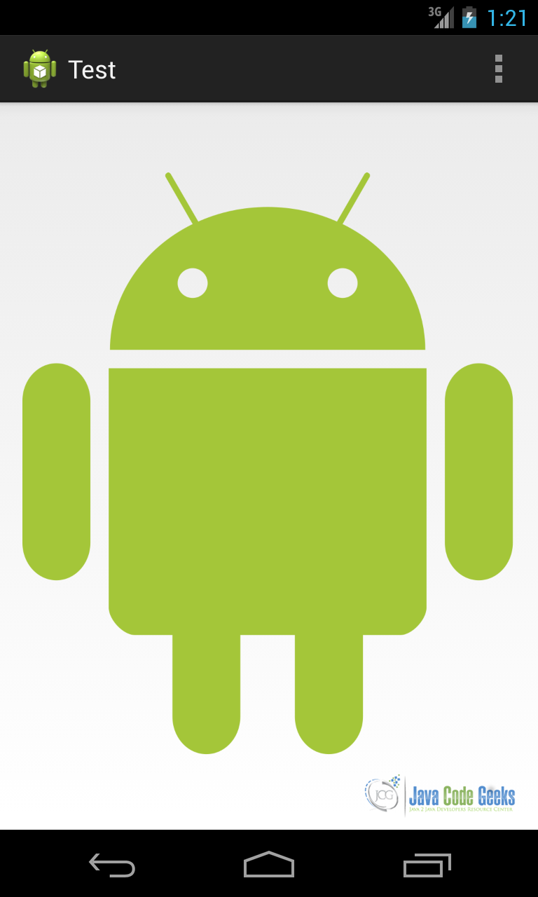
An important thing to remember is the following: the images must have the same name. Once we have it, we can use the ImageView in this way:
<ImageView
    android:id="@+id/img"
    android:layout_width="wrap_content"
    android:layout_height="wrap_content"
    android:src="@drawable/robot" />
where we referenced the image, called robot.png, using @drawable/robot (without the extension). The result is shown below:
If the image has to be loaded remotely, there are some considerations to keep in mind while doing it. First, you should consider that loading an image from a remote server is a time consuming operation and you should do it in a separate thread so that you can avoid ANR (Application Not Responding) problem. If you want to keep things simple you could use an AsyncTask or you can use the Volley lib. The second thing to remember is that you cannot set the image in an XML file, but you can define only the ImageView without referencing an image. In this case, you can set the image using:
img.setImageBitmap(your_bitmap)
where your_bitmap is the image you have loaded remotely.
2.3. Input controls
Input controls are components that the user can interact with. Using a component like that, you can, for example, give to the user the chance to insert some values. The Android UI framework provides a wide range of input controls: text field, input field, toggle buttons, radio buttons, buttons, checkbox, pickers and so on. Each of them has a specialized class and we can build complex interfaces using these components.
There is a list of common components, below, with the class that handles it:
| Component | Description | Class |
Button | This one of the most used components. It can be pressed by a user and when pressed we can launch an action. | Button |
TextFields | This is an editable text and we give to the user the chance to insert some data. EditText is the classic input field while AutoCompleteTextView is a component we can use when we have a pre-defined list of result and we want the system to complete some words inserted by user | EditText AutoCompleteTextView |
CheckBox | This is an on/off component. We can use it when we want user to select one or more choices. | CheckBox |
Radio buttons | Very similar to the checkbox except for the fact that the user can select only one item. | RadioGroup RadioButton |
Toggle button | On/off component with a state indicator. | ToggleButton |
Pickers | Component that helps the user to select one value using up/down buttons or gesture. Usually we use DatePicker and TimePicker | DatePicker TimePicker |
Table 1
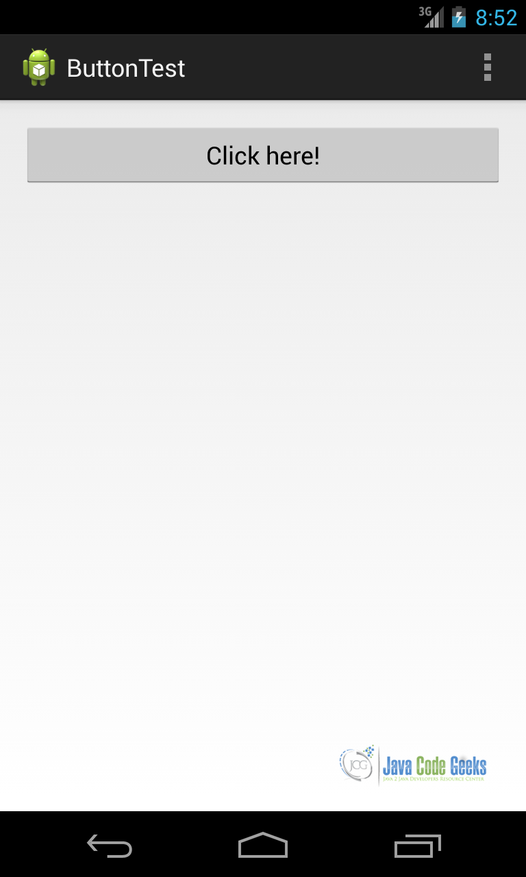
We want to focus our attention on a Button component that this is widely used in Android UI. First, we have to define our UI using XML file:
<RelativeLayout xmlns:android="http://schemas.android.com/apk/res/android"
    xmlns:tools="http://schemas.android.com/tools"
    android:layout_width="match_parent"
    android:layout_height="match_parent"
    android:paddingBottom="@dimen/activity_vertical_margin"
    android:paddingLeft="@dimen/activity_horizontal_margin"
    android:paddingRight="@dimen/activity_horizontal_margin"
    android:paddingTop="@dimen/activity_vertical_margin"
    tools:context=".MainActivity" >

    <Button
        android:id="@+id/Btn"
        android:layout_width="match_parent"
        android:layout_height="wrap_content"
        android:text="Click here!" />

</RelativeLayout>
Notice that in the button id we used @+id meaning we are adding a new id and the android:text attribute is the string we want to show on the button. You could use a reference instead of writing text directly. If we create a simple app using this layout and run it we will have:
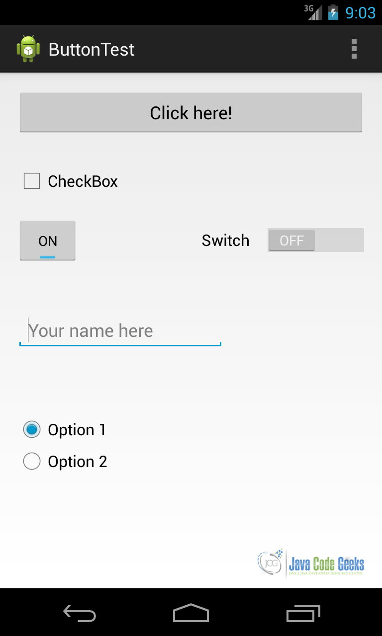
We will see later how we can catch UI events so that we can handle user clicks. We can consider a bit more complex interface:
<RelativeLayout xmlns:android="http://schemas.android.com/apk/res/android"
    xmlns:tools="http://schemas.android.com/tools"
    android:layout_width="match_parent"
    android:layout_height="match_parent"
    android:paddingBottom="@dimen/activity_vertical_margin"
    android:paddingLeft="@dimen/activity_horizontal_margin"
    android:paddingRight="@dimen/activity_horizontal_margin"
    android:paddingTop="@dimen/activity_vertical_margin"
    tools:context=".MainActivity" >

    <Button
        android:id="@+id/Btn"
        android:layout_width="match_parent"
        android:layout_height="wrap_content"
        android:text="Click here!" />

    <CheckBox
        android:id="@+id/checkBox1"
        android:layout_width="wrap_content"
        android:layout_height="wrap_content"
        android:layout_alignLeft="@+id/Btn"
        android:layout_below="@+id/Btn"
        android:layout_marginTop="29dp"
        android:text="CheckBox" />

    <ToggleButton
        android:id="@+id/toggleButton1"
        android:layout_width="wrap_content"
        android:layout_height="wrap_content"
        android:layout_alignLeft="@+id/checkBox1"
        android:layout_below="@+id/checkBox1"
        android:layout_marginTop="20dp"
        android:text="ToggleButton" />

    <EditText
        android:id="@+id/editText1"
        android:layout_width="wrap_content"
        android:layout_height="wrap_content"
        android:layout_alignLeft="@+id/toggleButton1"
        android:layout_centerVertical="true"
        android:ems="10"
        android:hint="Your name here" >

        <requestFocus />
    </EditText>

    <Switch
        android:id="@+id/switch1"
        android:layout_width="wrap_content"
        android:layout_height="wrap_content"
        android:layout_alignBaseline="@+id/toggleButton1"
        android:layout_alignBottom="@+id/toggleButton1"
        android:layout_alignParentRight="true"
        android:text="Switch" />

    <RadioGroup
        android:id="@+id/radioGroup"
        android:layout_width="wrap_content"
        android:layout_height="wrap_content"
        android:layout_alignLeft="@+id/editText1"
        android:layout_below="@+id/editText1"
        android:layout_marginTop="24dp" >

        <RadioButton
            android:id="@+id/radioButton1"
            android:layout_width="wrap_content"
            android:layout_height="wrap_content"
            android:layout_alignLeft="@+id/editText1"
            android:layout_below="@+id/editText1"
            android:layout_marginTop="40dp"
            android:text="Option 1" />

        <RadioButton
            android:id="@+id/radioButton2"
            android:layout_width="wrap_content"
            android:layout_height="wrap_content"
            android:layout_alignLeft="@+id/radioButton1"
            android:layout_below="@+id/radioButton1"
            android:text="Option 2" />
    </RadioGroup>

</RelativeLayout>
In this interface, we used almost all the UI components and if we run the app we have:
3. UI Events and Listeners
By now, we have created Android user interfaces but we have not considered how to handle events that the user generates when he interacts with our app.
Listeners are an important aspect when developing UIs in Android. Generally speaking, when an user interacts with our app interface, the system “creates” some events. Each view that builds our interface is capable of generating events and providing the means to handle them.
From an API point of view, if we look at a View class, we can notice there are some public methods; these methods are called by the system when some events occur. They are called callback methods, and they are the way we can capture the events that occur while an user interacts with our app. Usually these callback methods starts with on + event_name.
Every View provides a set of callback methods. Some are common between several views while others are view-specific. Anyway, in order to use this approach, if we want to catch an event, we should extend the View and this is clearly not practical. For this reason, every View has a set of interfaces that we have to implement in order to be notified about the events that occur. These interfaces provide a set of callback methods. We call these interfaces as event listeners. Therefore, for example, if we want to be notified when a user clicks on a button we have an interface to implement called View.onClickListener.
Let us consider the example above when we used a Button in our UI. If we want to add a listener, the first thing we have to do is to get a reference to the Button:
Button b = (Button) findViewById(R.id.btn);
In our Activity there is a method called findViewById that can be used to get the reference to a View defined in our user interface. Once we have the reference, we can handle the user click:
b.setOnClickListener(new View.OnClickListener() {
	@Override
	public void onClick(View v) {
		// here we handle the event
	}
});
As you can see we used a compact form and you can notice the callback method called onClick. This method is called by the system when a user clicks on our button, so here we have to handle the event. We could obtain the same result in a different way: we can make our Activity implement the View.OnClickListener interface and implement onClick again. Running the app we have as a result:
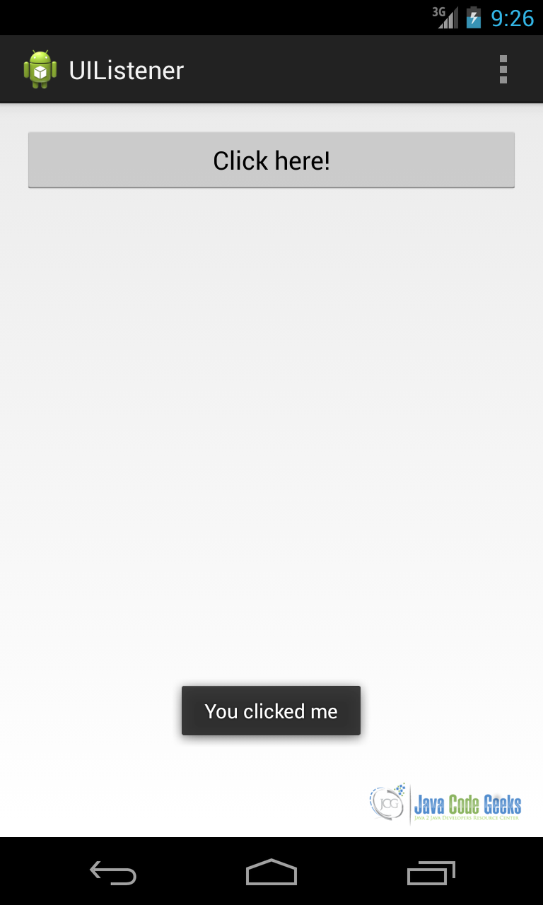
We can use the same technique if we want to listen to different events.
4. UI Development
Previously, we shortly introduced the Activity concept. It is time to better explain its function. An Android UI cannot exist if there is not a container that holds it. This container is called Activity and it is one of the most important concepts in Android. Every app we will create has at least one Activity and usually, more complex apps have several activities that interact each other exchanging data and information using Intents. An Activity takes care of creating a window where we place our UI.
We can, now, build a complete app that uses the UI components shown above and mix them. Let’s suppose we want to create an app that asks the user’s name and it has a button to confirm it.
First thing is to create a layout. We assume you already know how to create an Android project. If not, please refer to our “Android Hello World” article. In Android (i.e. using Eclipse as IDE) we have to place the XML files under res/layout. If you look carefully, you can notice that there are different sub-directories with different names and extensions. By now, it is enough that we add our files under res/layout (the default directory). Other dirs will be used depending on the type of the device, so that we have the chance to optimize our UI according to the screen size and orientation.
<RelativeLayout xmlns:android="http://schemas.android.com/apk/res/android"
    xmlns:tools="http://schemas.android.com/tools"
    android:id="@+id/edt"
    android:layout_width="match_parent"
    android:layout_height="match_parent"
    android:paddingBottom="@dimen/activity_vertical_margin"
    android:paddingLeft="@dimen/activity_horizontal_margin"
    android:paddingRight="@dimen/activity_horizontal_margin"
    android:paddingTop="@dimen/activity_vertical_margin"
    tools:context=".MainActivity" >

    <TextView
        android:id="@+id/textView1"
        android:layout_width="wrap_content"
        android:layout_height="wrap_content"
        android:text="Please insert your username" />

    <EditText
        android:id="@+id/editText1"
        android:layout_width="wrap_content"
        android:layout_height="wrap_content"
        android:layout_alignLeft="@+id/textView1"
        android:layout_below="@+id/textView1"
        android:ems="10" />

    <Button
        android:id="@+id/btn1"
        android:layout_width="match_parent"
        android:layout_height="wrap_content"
        android:layout_alignParentBottom="true"
        android:layout_marginBottom="16dp"
        android:text="Confirm" />

</RelativeLayout>
activity_main.xml
Next we have to create an activity. If we use an IDE, we will notice that it has already created a default class (in Eclipse it is called MainActivity.java). Looking its source code, there is a onCreate method. Here, the first thing we do is to “attach” our UI to the activity:
setContentView(R.layout.activity_main);
Next we can handle the click event: when user clicks, we can retrieve the EditText value and show a message:
// Lookup Button reference
Button b = (Button) findViewById(R.id.btn1);

// Lookup EditText reference
final EditText edt = (EditText) findViewById(R.id.editText1);

b.setOnClickListener(new View.OnClickListener() {

	@Override
	public void onClick(View v) {
		String txt = edt.getText().toString();
		Toast.makeText(MainActivity.this, "Hello " + txt, Toast.LENGTH_LONG).show();
	}
});
Running the app we obtain:
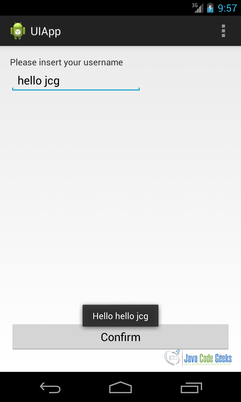
This is a very simple example but it is useful to have an idea of how we can create a user interface.
5. View and Adapters
By now, we talked about UI components that show just only one value. Some components can display multiple values or a collection of data. This type of control is called List control. If we want to use these controls in Android, we cannot use a single component, as we did before, but we have to use two components: one that manages how data is displayed and another one that manages the underlying data. The last one is called an Adapter. A list control extends AdapterView and the most “famous” list controls are:
- ListView
- Spinner
- GridView
- Gallery
A ListView component displays its item in a list. This is used very often in Android UI.
Spinner is another component that displays only one item, but let the user choice among several items.
GridView shows its child in a table form, the table is scrollable and we can set the number of column to show.
Gallery shows item in an horizontally scrolling way. This component is deprecated since API level 16. We will focus our attention on the first two component sbecause they are very useful when building user interfaces.
Looking at the API, the AdapterView extends ViewGroup so that they both extend indirectly View class. Extending ViewGroup means that a list control holds a list of views as children and at the same time it is a View too. The adapter role is to manage the data and to provide the appropriate child view according to the data that has to be displayed. Android provides some general-purpose adapters. Data can be loaded from a database, from resources or we can create it dynamically.
Let us suppose we want to create a user interface where we display a list of items. Let’s suppose that items are simply strings. In this case, the first thing we have to do is creating an ArrayAdapter. This one of the most used adapters because they are very simple to use. We can use a pre-built layout for our children so that we do not have to work too much. Android provides several pre-built layouts ready to be used.
Our app UI in XML looks like:
<RelativeLayout xmlns:android="http://schemas.android.com/apk/res/android"
    xmlns:tools="http://schemas.android.com/tools"
    android:layout_width="match_parent"
    android:layout_height="match_parent"
    android:paddingBottom="@dimen/activity_vertical_margin"
    android:paddingLeft="@dimen/activity_horizontal_margin"
    android:paddingRight="@dimen/activity_horizontal_margin"
    android:paddingTop="@dimen/activity_vertical_margin"
    tools:context=".MainActivity" >

    <ListView
        android:id="@+id/list"
        android:layout_width="match_parent"
        android:layout_height="match_parent" />

</RelativeLayout>
Now we have to create the Adapter so that we can display items:
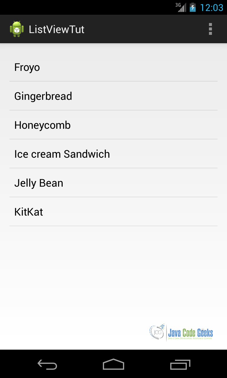
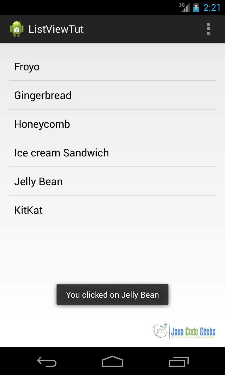
ArrayAdapter<String> aAdpt = new ArrayAdapter<String>(this, android.R.layout.simple_list_item_1,
 new String[]{"Froyo", "Gingerbread", "Honeycomb",  "Ice cream Sandwich", "Jelly  Bean", "KitKat"});
In this way, we created an ArrayAdapter using as child layout the android.R.layout.simple_list_item_1, a layout provided by Android and we created a list of string as data. Now, we have to add the adapter to the listview:
ListView lv = (ListView) findViewById(R.id.list);
lv.setAdapter(aAdpt);
Running the app, we have:
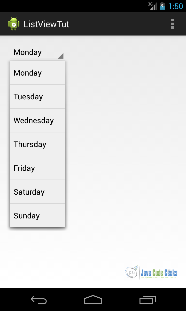
In the example above, we provided the items as a list of Strings written directly in the source code. We can provide such list in a resource file. We can suppose we have a Spinner component where its child are retrieved from a resource file. First, we create our ArrayAdapter:
ArrayAdapter<CharSequence> aAdpt = ArrayAdapter.createFromResource(this, R.array.days, android.R.layout.simple_spinner_item);
where R.array.days is our array resource file (containing day names) and android.R.layout.simple_spinner_item is the children layout. Then we attach the adapter to the spinner:
aAdpt.setDropDownViewResource(android.R.layout.simple_spinner_dropdown_item);
spinner.setAdapter(aAdpt);
Running the app, we have:
There are some cases where the information to display is stored in a database. In this case, Android provides some specialized adapter that helps us to read data from the DB and populate the corresponding list control. This adapter is called CursorAdapter or if we prefer we can use SimpleCursorAdapter. For example, we can use this type of adapter when we want to populate a ListView with the contacts stored in our smart phone. In this case, we can use CursorAdapter.
5.1. Handling ListView events
Another important aspect is the interaction between user and list components. We focus our attention on the ListView. The same considerations can be applied to other types of list components. Usually, when we have a ListView in the app interface, we want to know the item clicked by user. We can use, as we did for other UI components, event listeners. If you recall the previous example about ListView, the code to handle the event is the following:
lv.setOnItemClickListener(new AdapterView.OnItemClickListener() {
     @Override
     public void onItemClick(AdapterView<?> aView, View view, int position,long id) {
	// We handle item click event
	TextView tv = (TextView) view;
	String text = (String) tv.getText();

	Toast.makeText(MainActivity.this, "You clicked on " + text, Toast.LENGTH_LONG).show();

    }
 });
Analyzing the code above, we simply set an item click listener and in this case we have to override a method called onItemCick. In this method, we receive, as a parameter, the AdapterView, the View that is clicked, the position inside the ListView and its id. We already know that the View is a TextView because we used an ArrayAdapter of strings so we can safely cast the view to the text view. Once we know the TextView clicked we can retrieve the text.
5.2. Custom Adapter and View Holder pattern
There are some cases when the standard adapters are not sufficient and we want to have more control over the child view or we want to add other components to the child view. There are other reasons you should consider when you decide to implement a custom adapter: it could be perhaps that you have some data management requirements that you cannot satisfy using custom adapters or you want to implement a caching policy.
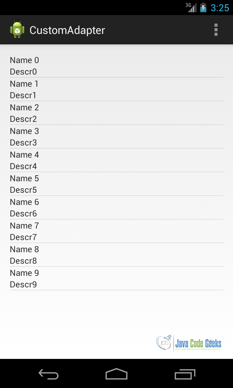
In all these cases, we can implement a custom adapter: you can decide to extend a BaseAdapter abstract class or you can extend some specialized class as ArrayAdapter for example. The choice depends on the type of information you have to handle. To keep things simple and to focus our attention on the custom adapter, we will suppose we want to create a ListView where child views has two text line.
First, we create our adapter and start implementing some methods:
public class CustomAdapter extends BaseAdapter {

	@Override
	public int getCount() {
		// TODO Auto-generated method stub
		return 0;
	}

	@Override
	public Object getItem(int arg0) {
		// TODO Auto-generated method stub
		return null;
	}

	@Override
	public long getItemId(int arg0) {
		// TODO Auto-generated method stub
		return 0;
	}

	@Override
	public View getView(int arg0, View arg1, ViewGroup arg2) {
		// TODO Auto-generated method stub
		return null;
	}
}
We have to implement four methods. Before doing it, we define a class that is our data model. For simplicity, we can assume we have a class called Item with two public attributes: name and descr. Now we need a child layout so that we can display data:
<LinearLayout xmlns:android="http://schemas.android.com/apk/res/android"
    android:layout_width="match_parent"
    android:layout_height="match_parent"
    android:orientation="vertical" >

    <TextView
        android:id="@+id/name"
        android:layout_width="match_parent"
        android:layout_height="match_parent" />

    <TextView
        android:id="@+id/descr"
        android:layout_width="match_parent"
        android:layout_height="match_parent" />

</LinearLayout>
item_layout.xml
In our adapter we need a constructor so that we can pass the data we want to display:
public CustomAdapter(Context ctx, List<Item> itemList) {
	this.ctx = ctx;
	this.itemList = itemList;
}
Now it is quite trivial to override method, except getView:
@Override
public int getCount() {
	return itemList == null ? 0 : itemList.size();
}

@Override
public Object getItem(int pos) {
	return itemList == null ? null : itemList.get(pos);
}

@Override
public long getItemId(int pos) {
	return itemList == null ? 0 : itemList.get(pos).hashCode();
}
Notice that in getItemId we return a unique value that represents the item. A bit more complex is the getView method. This is the heart of the custom adapter and we have to implement it carefully. This method is called everytime the ListView has to display child data. In this method, we can create the view manually or inflate an XML file:
@Override
public View getView(int position, View convertView, ViewGroup parent) {
    View v = convertView;

     if (v == null) {
 	LayoutInflater lInf = (LayoutInflater)
        ctx.getSystemService(Context.LAYOUT_INFLATER_SERVICE);
	v = lInf.inflate(R.layout.item_layout, null);
    }

  TextView nameView = (TextView) v.findViewById(R.id.name);
  TextView descrView = (TextView) v.findViewById(R.id.descr);

  nameView.setText(itemList.get(position).name);
  descrView.setText(itemList.get(position).descr);
  return v;
}
Analyzing the code, we can notice that we first check that the view passed as parameter is not null. This is necessary because Android system can reuse a View to not waste resources. Therefore, if the view is not null we can avoid inflating XML layout file. If it is null then we have to inflate the layout file. The next step is looking up the TextView inside our layout so that we can set their values. Running the app, we will obtain:
Looking at the getView method, we can notice we call findViewById several times. This is an expensive operation and we should avoid calling it when it is not necessary because it can slow down the overall Listview performances and when user scrolls, the ListView it can happen it is not smooth.
Moreover, we use findViewById even if the view is recycled. In this situation we can apply a pattern that reduces the use of this method. This pattern is called View Holder, it requires we create an object to hold the references to the views inside our child layout. Applaying this pattern getView method become:
@Override
public View getView(int position, View convertView, ViewGroup parent) {
	View v = convertView;
	TextHolder th = null;

	if (v == null) {
		LayoutInflater lInf = (LayoutInflater)
                ctx.getSystemService(Context.LAYOUT_INFLATER_SERVICE);
		v = lInf.inflate(R.layout.item_layout, null);

		TextView nameView = (TextView) v.findViewById(R.id.name);
		TextView descrView = (TextView) v.findViewById(R.id.descr);

		th = new TextHolder();
		th.nameView = nameView;
		th.descrView = descrView;
		v.setTag(th);
	}
	else
		th = (TextHolder) v.getTag();

	th.nameView.setText(itemList.get(position).name);
	th.descrView.setText(itemList.get(position).descr);

	return v;
}


static class TextHolder {
	TextView nameView;
	TextView descrView;
}
6. Download the Source Code
This was a lesson of using Android Views. You may download the source code here: AndroidView.zip
