This tutorial is starting to get interesting…. In this section we’ll go deep into animations, special effects, search styling and extracting contacts. In the previous sections we built the first form of the app, logged in and now we need to show the actual login form. Even more importantly we need to show it with style like this:
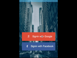
(notice that you should see an animated gif above naturally we reduced quality to make it smaller but it still takes a moment to load).
What we see here is how the login form animates out by sliding out the buttons to the right then morphing the background into the title area of the following form. We’ll get into how this is done soon enough… But first lets get the contact details!
New Contacts API
First we need to add contact access permissions to the Google API by adding the line ‘gc.setScope(“profile email https://www.googleapis.com/auth/plus.login https://www.googleapis.com/auth/plus.me”);’ into the initial login as such:
loginWithGoogle.addActionListener((e) -> {
    tokenPrefix = "google";
    Login gc = GoogleConnect.getInstance();
    gc.setScope("profile email https://www.googleapis.com/auth/plus.login https://www.googleapis.com/auth/plus.me");
    gc.setClientId("1013232201263-lf4aib14r7g6mln58v1e36ibhktd79db.apps.googleusercontent.com");
    gc.setRedirectURI("https://www.codenameone.com/oauth2callback");
    gc.setClientSecret("uvu03IXOhx9sO8iPcmDfuX3R");
    doLogin(gc, new GoogleData());
});
We are effectively asking for more permissions. Notice that profile and email are shorthand syntax for the full URI accepted by Google and the values in the scope are separated by a space.
To make contacts access generic we changed a few things in the interfaces defined in the previous steps:
static class ContactData {
    public String uniqueId;
    public String name;
    public String imageUrl;
}
First we added the simple contact data abstract class to represent a specific contact. Normally, we would just use something simpler but since Google & Facebook have radically different image sources we had to create two different implementations of this class.
static interface UserData {
    public String getName();
    public String getId();
    public String getImage();
    public void fetchData(String token, Runnable callback);
    public ContactData[] getContacts();
}
We only added one method to user data, the getContacts method. For simplicity we fetch all the contacts and do so synchronously. In a future iteration we might improve this by creating an implementation that “streams” the contacts but for now we wanted something simple that will also lend itself well to search.
Getting The Contacts On Google
We connect to the Google webservice and get all visible contacts. Here we don’t have to limit ourselves to people who installed the app and this gives us more information:
private String token;

@Override
public ContactData[] getContacts() {
    ArrayList<ContactData> dat = new ArrayList<>();
    ConnectionRequest req = new ConnectionRequest() {
        @Override
        protected void readResponse(InputStream input) throws IOException {
            JSONParser parser = new JSONParser();
            Map<String, Object> parsed = parser.parseJSON(new InputStreamReader(input, "UTF-8"));
            java.util.List<Object> data = (java.util.List<Object>)parsed.get("items");
            for(Object current : data) {
                Map<String, Object> cMap = (Map<String, Object>)current;
                String name = (String)cMap.get("displayName");
                if(name == null) {
                    continue;
                }
                String type =(String)cMap.get("objectType");
                if(!type.equals("person")) {
                    continue;
                }
                String id = cMap.get("id").toString();
                ContactData cd = new ContactData();
                cd.name = name;
                cd.uniqueId = id;

                if(cMap.containsKey("image")) {
                    cd.imageUrl = (String)((Map<String, Object>)cMap.get("image")).get("url");;
                }

                dat.add(cd);
            }
        }
    };
    req.setPost(false);
    req.setUrl("https://www.googleapis.com/plus/v1/people/me/people/visible");
    if(token == null) {
        token = Preferences.get("googletoken", (String)null);
    }
    req.addArgumentNoEncoding("key", token);
    NetworkManager.getInstance().addToQueueAndWait(req);

    ContactData[] cd = new ContactData[dat.size()];
    dat.toArray(cd);
    return cd;
}
The code is a bit large but is in fact really simple, we get the Google token which we provide to the Google API to request the contacts list. We then do a synchronous call using addToQueueAndWait which is really convenient in this case and add all the entries into an array list.
Notice that we skip object types that aren’t “person”, in the Google+ API the pages you follow are also returned so its necessary to remove some redundant noise.
The JSON returned keeps all the contacts who are connected under the data property so we parse the JSON and get the array of friends from the items property. Then its just a matter of going over the contacts and constructing a new contact object.
Getting The Contacts From Facebook
Facebook is pretty similiar, we need to query the Graph API for the users and iterate them. The current code only gets the first page of users hence its a bit flawed but it should be easily adaptable for paging thru the full result list. Notice that Facebook will only return the users that signed in to the app so while the result might list your hundreds of friends you might still get a blank list if none of them signed into the app.
@Override
public ContactData[] getContacts() {
    ArrayList<ContactData> dat = new ArrayList<>();
    ConnectionRequest req = new ConnectionRequest() {
        @Override
        protected void readResponse(InputStream input) throws IOException {
            JSONParser parser = new JSONParser();
            Map<String, Object> parsed = parser.parseJSON(new InputStreamReader(input, "UTF-8"));
            //name = (String) parsed.get("name");
            java.util.List<Object> data = (java.util.List<Object>)parsed.get("data");
            for(Object current : data) {
                Map<String, Object> cMap = (Map<String, Object>)current;
                String name = (String)cMap.get("name");
                if(name == null) {
                    continue;
                }
                String id = cMap.get("id").toString();
                ContactData cd = new ContactData();
                cd.name = name;
                cd.uniqueId = id;
                cd.imageUrl = "http://graph.facebook.com/v2.4/" + id + "/picture";
                dat.add(cd);
            }
        }
    };
    req.setPost(false);
    req.setUrl("https://graph.facebook.com/v2.4/me/friends");
    if(token == null) {
        token = Preferences.get("facebooktoken", (String)null);
    }
    req.addArgumentNoEncoding("access_token", token);
    NetworkManager.getInstance().addToQueueAndWait(req);

    ContactData[] cd = new ContactData[dat.size()];
    dat.toArray(cd);
    return cd;
}
This is almost identical to the Google version, the only differences are in the structure of the JSON returned and the URL’s.
Adding The Things We Need To The Theme
For the next section to work we need to add several multi-images to the theme using Quick Add Multi Image in the image menu in the designer then picking “Very High” as the source image resolution. This will automatically adapt the image to all DPI’s.
First we need rounded-mask.png:
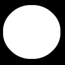
This image will be used to convert square pictures into round images as my picture in the title area that you can see above. Effectively masking uses the black pixels to remove the corresponding pixels in the image while leaving the white pixels, gray pixels will remain translucent.
Then we need rounded-border.png:
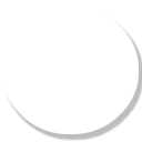
We will place this image underneath the mask image thus resulting in a border/shadow effect. This is important for appearance since the source image is downloaded from Facebook/Google etc. and might have a color clash with the toolbar. That way we guarantee that the border will fit in with the toolbar.
Lastly we add the image that will be placed in the toolbar area social-chat-tutorial-image-top.jpg:

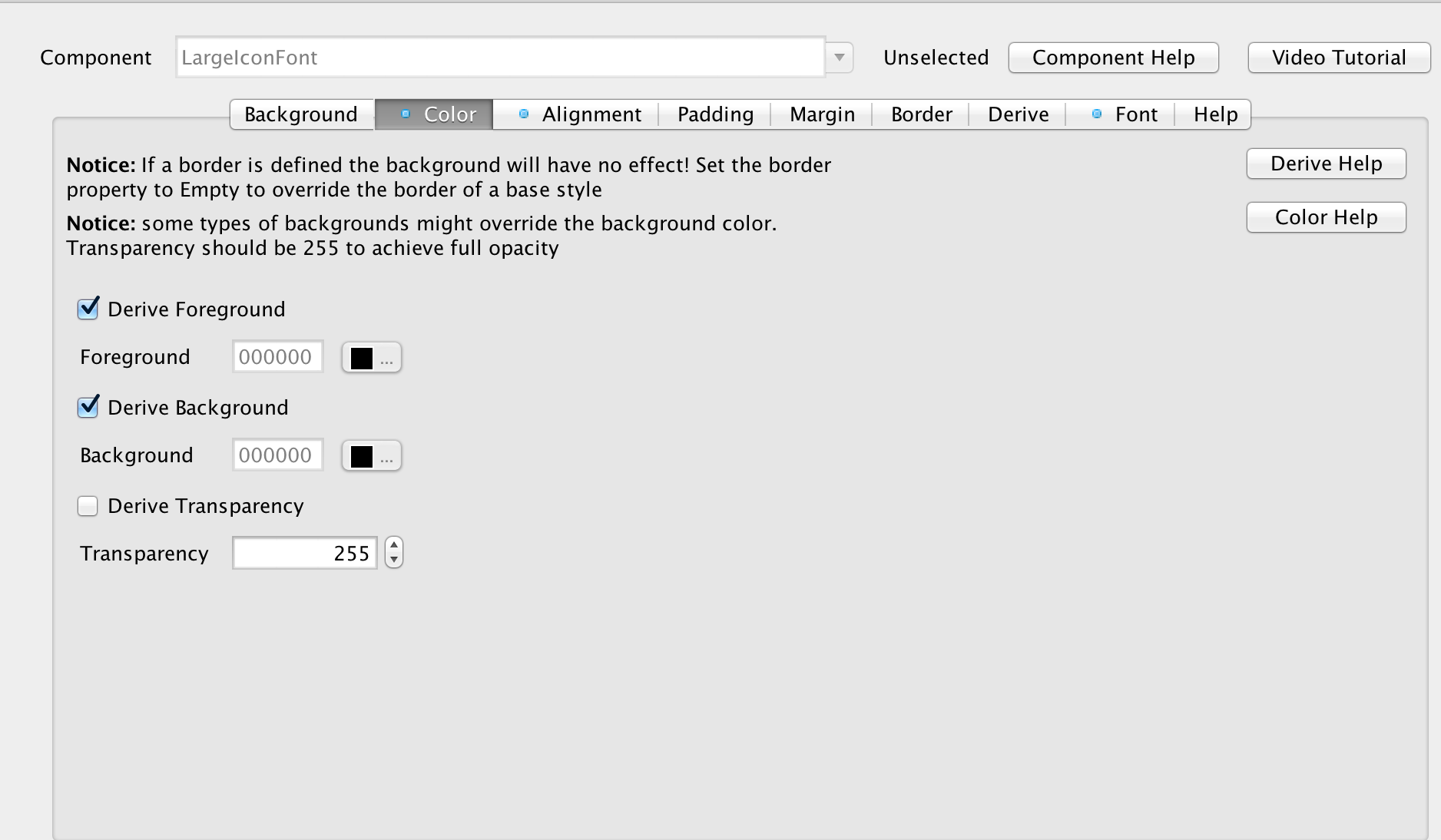
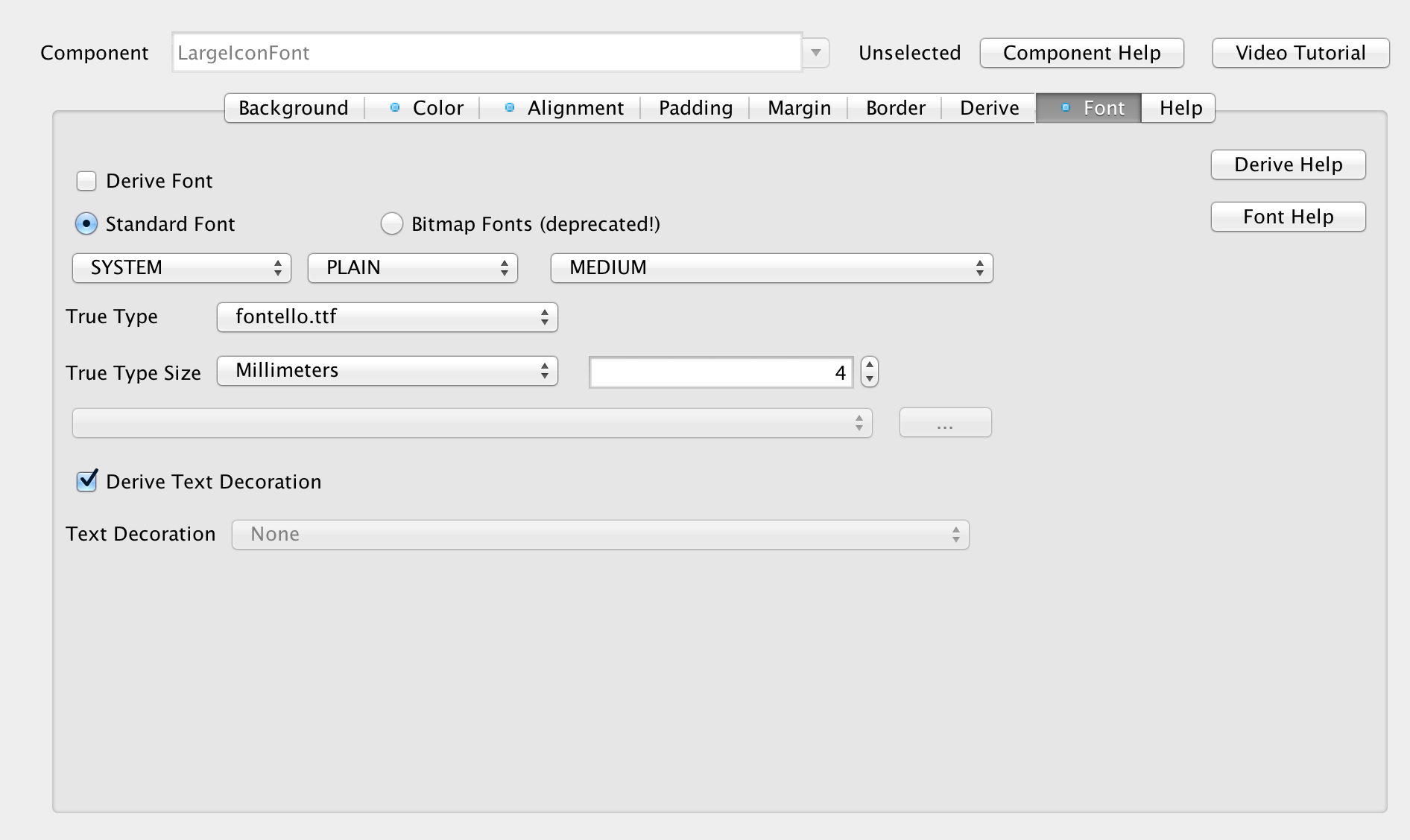
Now that all the images are in place we need to add some UIID’s into the theme to support the additional components we will use, first we start with the LargeIconFont UIID which is very similar to the IconFont UIID we introduced the last time around, but it doesn’t override the foreground color and is sized at 4mm. This icon font is used in the body of the application so we want it to use the default colors so it will integrate properly, otherwise the white foreground of the standard icon font might vanish.
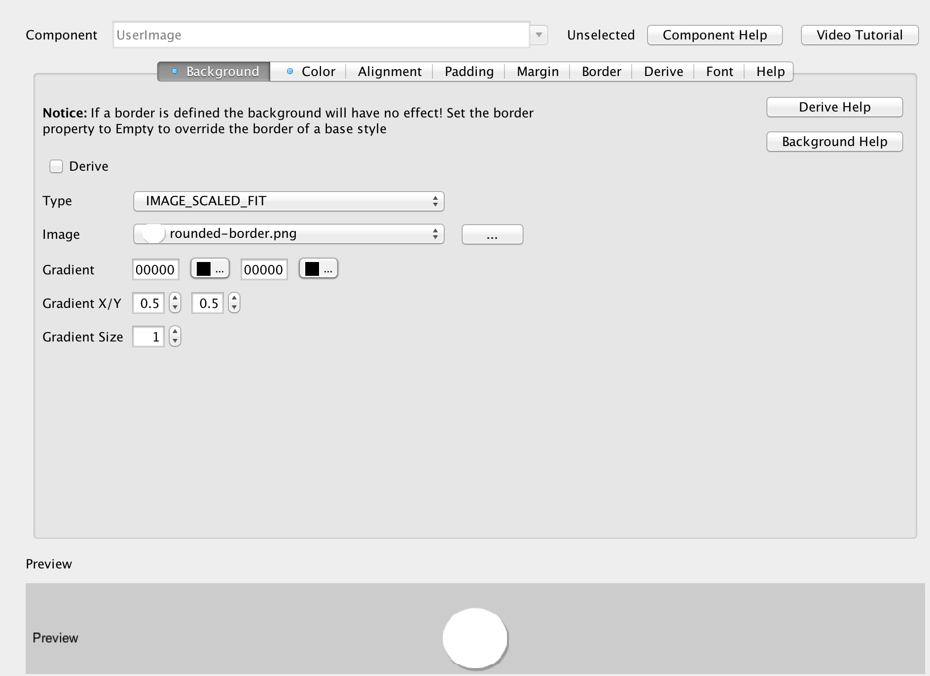
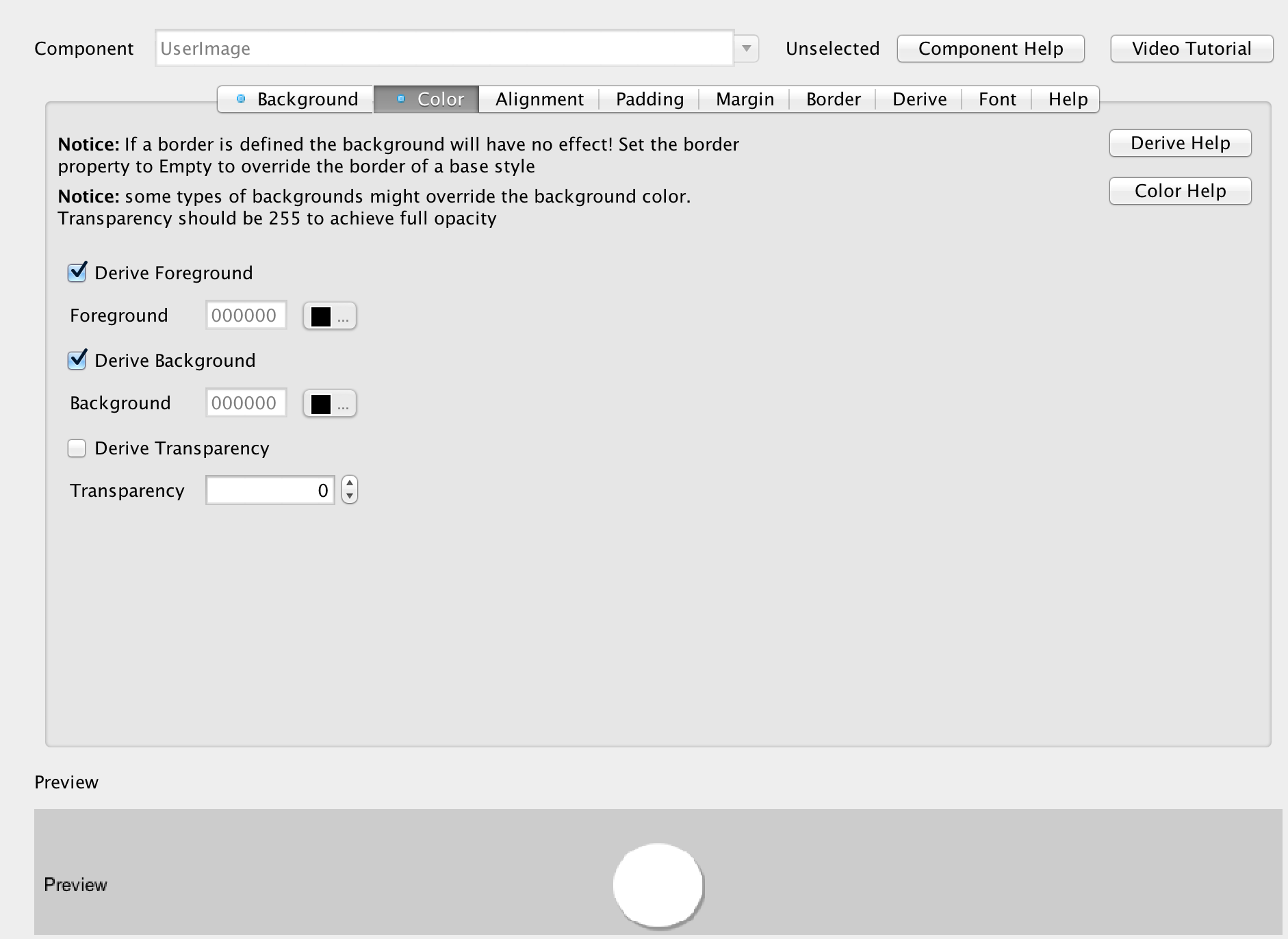
We’ll also add the rounded-border image as a UIID that we can apply to the actual image later by adding a UserImage UIID and setting the background image to rounded-border.png and the background behavior to scaled to fit. We also need to set the transparency to 0 to make sure that the style is transparent.
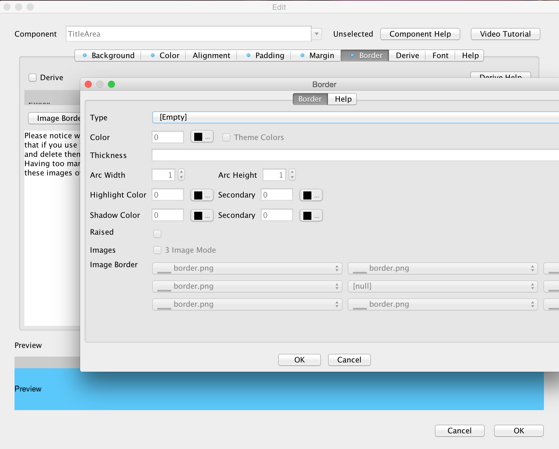
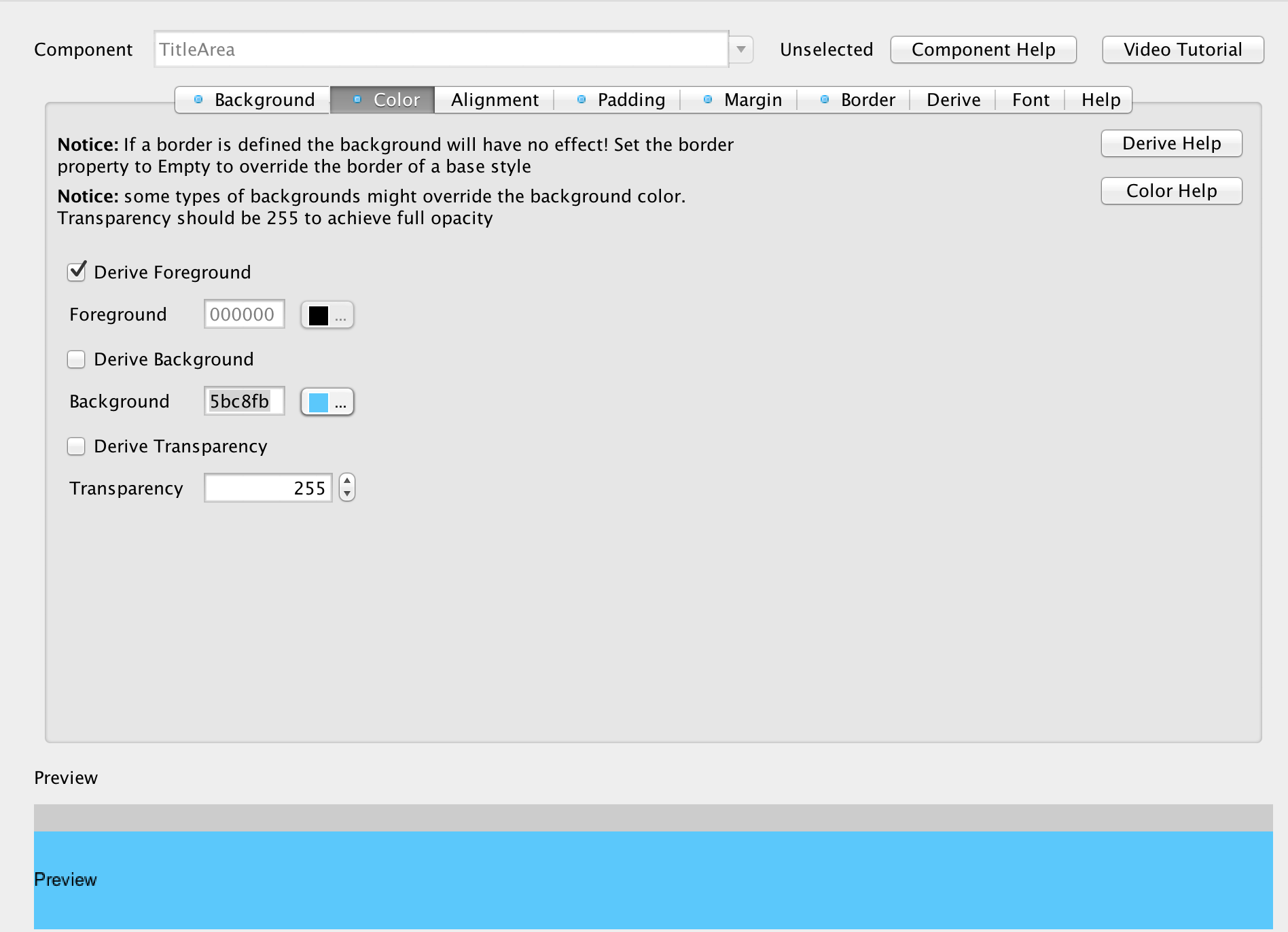
We also want to make the TitleArea more controllable thru opacity. Currently its defined as an image border which is problematic so we will change the border to be “Empty”, define the background color to 5bc8fb and set the transparency to 255 which will give the same effect but allow us more control in the code.
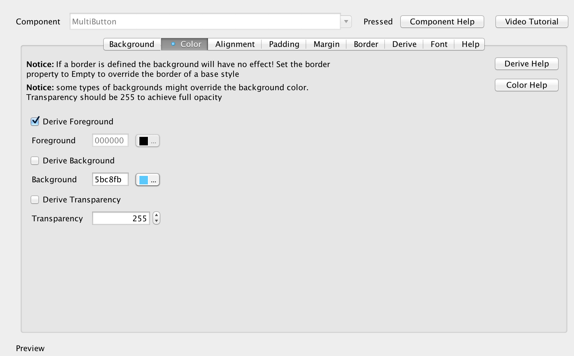
And finally MultiButton’s don’t have a clickable state in the default theme so we need to update their selected state to have 255 transparency (opaque) and have the background color `5bc8fb which will provide us with a click effect.
Showing The Contacts
To show the contacts we will need several new UI elements and several new class variables so first lets define the new class members that are needed for this:
private String fullName;
private String uniqueId;
private String imageURL;
private static EncodedImage userPlaceholder;
private EncodedImage roundPlaceholder;
private Image mask;
private ContactData[] contacts;
These members are defined in the main class and include images that we will use to show the individual entries and create a “rounding” mask to make the rounded picture effect on the title bar area. We also added a variable containing the contacts array that we can use later in the code.
To initialize these variables we’ll use the init(Object context) method, of the main class right after the theme initialization. This code happens only once per app execution and is a great place to load/initialize things. Notice that it should still be a relatively fast method so don’t do heavy processing there otherwise app launch might be slowed down and the OS might kill your unresponsive app.
Style iconFontStyle = UIManager.getInstance().getComponentStyle("LargeIconFont");
iconFontStyle.setBgTransparency(255);
FontImage fnt = FontImage.create(" \ue80f ", iconFontStyle);
userPlaceholder = fnt.toEncodedImage();
mask = theme.getImage("rounded-mask.png");
roundPlaceholder = EncodedImage.createFromImage(userPlaceholder.scaled(mask.getWidth(), mask.getHeight()).applyMask(mask.createMask()), false);
fullName = Preferences.get("fullName", null);
uniqueId = Preferences.get("uniqueId", null);
imageURL = Preferences.get("imageURL", null);
We are doing several interesting things here, we are defining the icon style to use the LargeIconFont UIID which allows us to create a scalable placeholder image. This is then used for two purposes in the code, placeholder for pictures of our contacts (before the image is downloaded by URLImage) and for “my picture” (currently logged in user) in the title area. In the “my picture” case it will be rounded using the rounded-mask image mentioned above.
This line is pretty complex so lets break it down a bit:
roundPlaceholder = EncodedImage.createFromImage(userPlaceholder.scaled(mask.getWidth(), mask.getHeight()).applyMask(mask.createMask()), false);
What we do here is several different things, userPlaceholder.scaled(mask.getWidth(), mask.getHeight()) takes the userPlaceholder and makes sure it matches the size of the mask perfectly. If it doesn’t we’ll get an exception. We then take the mask image mask.createMask() and convert it to an internal representation. You might recall from above that the mask image is this:
So the createMask method extracts these pixels and converts them to an internal representation that we can later apply to an arbitrary image. This is a slightly expensive operation so we don’t recommend doing it often. We then take the scaled image and apply the newly created mask onto the scaled image which generates a round image with the call to applyMask.
However, we need an instance of EncodedImage and not just a regular image so we use EncodedImage.createFromImage with the false argument (indicating the image isn’t opaque) to convert the resulting placeholder to an encoded image. Notice that if the image is already an encoded image this method does nothing…
We need an encoded image since later in the code we will use URLImage which expects EncodedImage, the EncodedImage is generally a more efficient way of storing images in terms of RAM and it allows us to get the image data more effectively. It means the image PNG/JPEG data is still available… All standard/multi images returned form the resource file are `EncodedImage’s which helps with memory utilization.
Now that everything is in place we can start with the main method that shows the UI:
void showContactsForm(UserData data) {
    Form contactsForm = new Form("Contacts");
    contactsForm.setLayout(new BoxLayout(BoxLayout.Y_AXIS));

    // the toolbar is created into a layer on the content pane. This allows us to render behind it and leave it semi transparent
    Toolbar tb = new Toolbar(true);

    // we want the title area to be transparent so it won't get in the way
    contactsForm.getTitleArea().setUIID("Container");

    // folds the toolbar automatically as we scroll down, shows it if we scroll back up
    tb.setScrollOffUponContentPane(true);
    contactsForm.setToolBar(tb);

    // we want the image behind the toolbar to stretch and fit the entire screen and leave no margin
    Label titleLabel = new Label(" ");
    Style titleLabelStyle = titleLabel.getUnselectedStyle();
    titleLabelStyle.setBgImage(theme.getImage("social-chat-tutorial-image-top.jpg"));
    titleLabelStyle.setBackgroundType(Style.BACKGROUND_IMAGE_SCALED_FILL);
    titleLabelStyle.setPadding(tb.getPreferredH(), tb.getPreferredH(), tb.getPreferredH(), tb.getPreferredH());
    titleLabelStyle.setPaddingUnit(Style.UNIT_TYPE_PIXELS, Style.UNIT_TYPE_PIXELS, Style.UNIT_TYPE_PIXELS, Style.UNIT_TYPE_PIXELS);
    titleLabelStyle.setMargin(0, 0, 0, 0);

    contactsForm.addComponent(titleLabel);

    // the behavior of the title is rather complex so we extract it to a separate method
    tb.setTitleComponent(createTitleComponent(contactsForm));

    InfiniteProgress ip = new InfiniteProgress();
    contactsForm.addComponent(ip);

    loadContacts(data, ip, contactsForm.getContentPane());

    // creates the morph and other animations from the main form to the second form of the app
    createMorphEffect(titleLabel);

    contactsForm.show();
}
This is a relatively big method but it delegates most of the hard work to other methods so most of the stuff done here isn’t very complex or even interesting. Here:
contacts.getTitleArea().setUIID("Container");We just make the title area transparent (since the Container UIID is always transparent), this allows us to style the toolbar in a rather elaborate way in the createTitleComponent method.
This code:
Label titleLabel = new Label(" ");
Style titleLabelStyle = titleLabel.getUnselectedStyle();
titleLabelStyle.setBgImage(theme.getImage("social-chat-tutorial-image-top.jpg"));
titleLabelStyle.setBackgroundType(Style.BACKGROUND_IMAGE_SCALED_FILL);
titleLabelStyle.setPadding(tb.getPreferredH(), tb.getPreferredH(), tb.getPreferredH(), tb.getPreferredH());
titleLabelStyle.setPaddingUnit(Style.UNIT_TYPE_PIXELS, Style.UNIT_TYPE_PIXELS, Style.UNIT_TYPE_PIXELS, Style.UNIT_TYPE_PIXELS);
titleLabelStyle.setMargin(0, 0, 0, 0);
Initializes the image behind the title:
Notice we style it in code since we want it to be positioned in a very specific way and gain the size of the toolbar. Because of that we use the padding from the toolbar to set the size properly. Notice that we explicitly state the padding unit otherwise some platforms which default to millimeter padding might end up out of whack.
We can do this sort of effect in several different ways but this specific approach with the “scaled to fill” option allows the image to adapt nicely to device orientations without losing proportionality.
There are several methods used within this block, we will go thru them from the easiest to the hardest:
private MultiButton createContactComponent(ContactData d) {
    MultiButton mb = new MultiButton();
    mb.putClientProperty("uid", d.uniqueId);
    mb.setTextLine1(d.name);
    if(d.imageUrl != null) {
        mb.setIcon(URLImage.createToStorage(userPlaceholder, "userPic" + d.uniqueId, d.imageUrl, URLImage.RESIZE_SCALE_TO_FILL));
    } else {
        mb.setIcon(userPlaceholder);
    }
    mb.addActionListener((e) -> {
        showChatForm(d, mb);
    });
    return mb;
}
An entry within the contacts list is just a multi-button without much funfair, we place the uid as a client property using the putClientProperty call. This effectively allows us to place objects into a Map that exists within a Component that way later on in the code when the button click is handled we can invoke mb.getClientProperty("uid"); and get the unique identifier represented by the button. That’s great for decoupling the application logic from the UI.
private void createMorphEffect(Label titleLabel) {
    // animate the components out of the previous form if we are coming in from the login form
    Form parent = Display.getInstance().getCurrent();
    if(parent.getUIID().equals("MainForm")) {
        for(Component cmp : parent.getContentPane()) {
            cmp.setX(parent.getWidth());
        }

        // moves all the components outside of the content pane to the right while fading them out over 400ms
        parent.getContentPane().animateUnlayoutAndWait(400, 0);
        parent.getContentPane().removeAll();

        // we can't mutate a form into a component in another form so we need to convert the background to an image and then morph that
        // this is especially easy since we already removed all the components
        Label dummy = new Label();
        dummy.setShowEvenIfBlank(true);
        dummy.setUIID("Container");
        dummy.setUnselectedStyle(new Style(parent.getUnselectedStyle()));
        parent.setUIID("Form");

        // special case to remove status bar on iOS 7
        parent.getTitleArea().removeAll();
        parent.setLayout(new BorderLayout());
        parent.addComponent(BorderLayout.CENTER, dummy);
        parent.revalidate();

        // animate the main panel to the new location at the top title area of the screen
        dummy.setName("fullScreen");
        titleLabel.setName("titleImage");
        parent.setTransitionOutAnimator(MorphTransition.create(1100).morph("fullScreen", "titleImage"));
    }
}
The morph effect shows several effects when leaving the main form. Notice that it only applies when the main UI is the source of the transition, which makes sense for most cases. E.g. we will have a different effect when going back into the contacts form from a chat…
We are showing two distinct effects here, in the first we animate the buttons outside of the screen, we do this by placing them in their end location (outside of the screen to the right) then invoking the animateUnlayoutAndWait which is the opposite of animateLayoutAndWait. Its designed to show exit animations like this and effectively returns the components to their proper layout positions then animates them out while optionally fading them.
Once the components are gone we remove them and then move the image into one big label and turn the UIID of the form to a standard form. This is necessary for the morph transition which can only morph elements and not the form itself. Normally this “trick” would work seamlessly but on iOS we have a StatusBar UIID at the top of the form to push the application downwards and allow us to see the content of the status bar (battery etc.). A small hack allows us to temporarily remove that component if it exists and prevents a “bounce” in the transition.
Next we name the source/destination components for the morph transition and set it to the parent form. That’s it, the morph transition does the rest of the work of animating the components into one another.
The title area of the form is a standard Toolbar, though instead of using a standard title we used a custom component comprised of layers to create the special effect. The Toolbar still folds automatically as we scroll and provides all the standard effects. It also has a cool search feature that we will discuss in the next section.
private Component createTitleComponent(Form parent) {
    // we want the toolbar to be completely transparent, since we created it on the layered pane (using the true
    // argument in the constructor) it will flow in the UI
    parent.getToolbar().setUIID("Container");

    // we create 3 layers within the title, the region contains all the layers, the encspsulate includes the "me image"
    // which we want to protrude under the title area layer
    Container titleRegion = new Container(new LayeredLayout());
    Container titleEncapsulate = new Container(new BorderLayout());
    Container titleArea = new Container(new BorderLayout());

    // since the Toolbar is now transparent we assign the title area UIID to one of the layers within and the look
    // is preserved, we make it translucent though so we can see what's underneath
    titleArea.setUIID("TitleArea");
    titleArea.getUnselectedStyle().setBgTransparency(128);

    // We customize the title completely using a component, the "title" is just a label with the Title UIID
    Label title = new Label(parent.getTitle());
    title.setUIID("Title");
    titleArea.addComponent(BorderLayout.CENTER, title);

    // the search button allows us to search a large list of contacts rather easily
    Button search = createSearchButton(parent, title, titleArea, titleRegion);

    // we package everything in a container so we can replace the title area with a search button as needed
    Container cnt = new Container(new BoxLayout(BoxLayout.X_AXIS));
    titleArea.addComponent(BorderLayout.EAST, cnt);
    cnt.addComponent(search);

    // this is the Me picture that protrudes downwards. We use a placeholder which is then replace by the URLImage
    // with the actual image. Notice that createMaskAdapter allows us to not just scale the image but also apply
    // a mask to it...
    Label me = new Label(URLImage.createToStorage(roundPlaceholder, "userImage", imageURL, URLImage.createMaskAdapter(mask)));
    me.setUIID("UserImage");

    // the search icon and the "me" image are on two separate layers so we use a "dummy" component that we
    // place in the search container to space it to the side and leave room for the "me" image
    Label spacer = new Label(" ");
    Container.setSameWidth(spacer, me);
    cnt.addComponent(spacer);

    Container iconLayer = new Container(new BorderLayout());
    titleEncapsulate.addComponent(BorderLayout.NORTH, titleArea);

    titleRegion.addComponent(titleEncapsulate);
    titleRegion.addComponent(iconLayer);
    iconLayer.addComponent(BorderLayout.EAST, me);

    return titleRegion;
}
The search button encapsulates a lot of functionality, effectively it replaces the title with a TextField that allows us to type in a contact name. The cool part is the way in which we filter down the contacts to find the right entry this is done using a data change listener and hiding the irrelevant entries dynamically.
You can see this animation in action in this short video:
All of this functionality is embedded directly into the code that creates the search button:
private Button createSearchButton(Form parent, Label title, Container titleArea, Container titleRegion) {
    // we want the search feature to be based on the title style so it will "fit" but we need it to use the font defined
    // by the icon font UIID so we merge both
    Style s = new Style(title.getUnselectedStyle());
    Style iconFontStyle = UIManager.getInstance().getComponentStyle("IconFont");
    s.setFont(iconFontStyle.getFont().derive(s.getFont().getHeight(), Font.STYLE_PLAIN));
    FontImage searchIcon = FontImage.create(" \ue806 ", s);
    FontImage cancelIcon = FontImage.create(" \ue81e ", s);

    // this is the actual search button, but we don't want it to have a border...
    Button search = new Button(searchIcon);
    search.setUIID("Label");

    // the search box will be placed in the title area so we can type right into it. We make it look like a title but
    // explicitly align it to the left for cases such as iOS where the title is centered by default
    TextField searchBox = new TextField();
    searchBox.setUIID("Title");
    searchBox.getUnselectedStyle().setAlignment(Component.LEFT);
    searchBox.getSelectedStyle().setAlignment(Component.LEFT);

    // the data change listener allows us to animate the data on every key press into the field
    searchBox.addDataChangeListener((type, index) -> {
        String text = searchBox.getText().toLowerCase();
        if(text.length() > 0) {
            Dimension hidden = new Dimension(0, 0);
            // iterates over the components, if a component matches its set to visible and its size is kept as default
            // otherwise the component is hidden and set to occupy no space.
            for(Component cmp : parent.getContentPane()) {
                if(cmp instanceof MultiButton) {
                    String l1 = ((MultiButton)cmp).getTextLine1();
                    if(l1.toLowerCase().indexOf(text) > -1) {
                        cmp.setPreferredSize(null);
                        cmp.setVisible(true);
                    } else {
                        cmp.setPreferredSize(hidden);
                        cmp.setVisible(false);
                    }
                }
            }
        } else {
            // no search string, show all the components by resetting the preferred size to default (thru null) and making them visible
            for(Component cmp : parent.getContentPane()) {
                cmp.setPreferredSize(null);
                cmp.setVisible(true);
            }
        }

        // update the UI with an animation effect
        parent.getContentPane().animateLayout(200);
    });

    // the action event is invoked when the button is pressed, this can have 2 separate states: during search/before search
    search.addActionListener((e) -> {
        if(search.getIcon() == searchIcon) {
            // Starts the search operation by replacing the title with a text field and launching the native editing
            search.setIcon(cancelIcon);
            titleArea.replaceAndWait(title, searchBox, CommonTransitions.createCover(CommonTransitions.SLIDE_VERTICAL, true, 400));
            titleRegion.revalidate();
            Display.getInstance().editString(searchBox, searchBox.getMaxSize(), searchBox.getConstraint(), "");
        } else {
            // if we are currently searching then cancel the search, return all items to visible and restore everything
            search.setIcon(searchIcon);
            for(Component cmp : parent.getContentPane()) {
                cmp.setPreferredSize(null);
                cmp.setVisible(true);
            }
            parent.getContentPane().animateLayoutAndWait(200);
            search.setEnabled(true);
            search.setVisible(true);
            titleArea.replaceAndWait(searchBox, title, CommonTransitions.createCover(CommonTransitions.SLIDE_VERTICAL, true, 400));
        }
    });
    return search;
}
That’s a bit of a large method but its functionality is relatively simple. Next time we’ll discuss the chat UI.
Other Posts In This Series
This is an ongoing series of posts including the following parts:
- Part 1 – Initial UI
- Part 2 – Login With Google
- Part 3 – Login With Facebook
- Part 4 – The Contacts Form
- Part 5 – The Chat Form (coming soon)
| Reference: | Building A Chat App With Codename One Part 4 from our JCG partner Shai Almog at the Codename One blog. |
