
Modern web applications require responsive interfaces that can seamlessly adapt across different devices, screen sizes, and layouts. Traditionally, developers have relied on CSS media queries to build responsive designs by applying styles based on the browser viewport size. However, media queries have limitations when individual components need to adapt independently based on their own dimensions or layout context. CSS Container Queries address this challenge by allowing components to apply styles based on the size of their containing element rather than the overall viewport, making them more reusable, flexible, and suitable for modern component-based frameworks such as React, Angular, and Vue. In addition, modern CSS provides scroll-driven experiences that enable elements to respond dynamically to user scrolling, allowing developers to create smooth animations, sticky headers, progress indicators, and interactive UI transitions without depending heavily on JavaScript libraries.
1. Understanding Container Queries and Media Queries
1.1 What are CSS Media Queries?
CSS Media Queries are a fundamental technique used in responsive web design to apply different styles based on the characteristics of the user’s device or browser viewport. They allow developers to create layouts that adapt to different screen sizes, resolutions, orientations, and device conditions without changing the underlying HTML structure. Media queries typically use viewport dimensions such as width and height to determine when specific CSS rules should be applied. They are commonly used for designing responsive page layouts, navigation menus, typography adjustments, and mobile-friendly interfaces.
@media (max-width: 768px) {
    .card {
        flex-direction: column;
    }
}
In this example, the card layout switches from a horizontal arrangement to a vertical layout whenever the browser viewport width becomes smaller than 768px. The style decision is based on the screen size rather than the component’s own available space.
While media queries are effective for controlling overall page responsiveness, they become less flexible when building reusable components that need to adapt independently across different sections of an application.
1.2 What are CSS Container Queries?
CSS Container Queries provide a modern approach to responsive design by allowing a component to adapt based on the size of its parent container rather than the browser viewport. Instead of asking “How large is the browser window?”, container queries focus on “How much space is available for this component?”. This makes components more independent, reusable, and easier to maintain, especially in component-based applications where the same UI element may appear in different layouts such as dashboards, sidebars, cards, or modal windows.
To use container queries, the parent element must first be defined as a query container using the container-type property.
.dashboard {
    container-type: inline-size;
}
Once the parent element becomes a query container, child components can use @container rules to apply styles based on the available container size. The component can automatically change its layout, spacing, or appearance without depending on the overall screen size. For example, a product card can display an image and content side-by-side in a large container and automatically switch to a stacked layout when placed inside a smaller panel.
1.3 Media Queries vs Container Queries
| Feature | Media Queries | Container Queries |
|---|---|---|
| Based On | Browser viewport properties such as screen width, height, orientation, or device characteristics. | Size and characteristics of the parent container in which a component is rendered. |
| Scope | Applies globally to the page layout and responds to changes in the browser window. | Applies locally to individual components based on their available space. |
| Reusable Components | Limited because components depend on the overall viewport size and page structure. | Highly reusable because components adapt independently wherever they are placed. |
| Best For | Page-level responsiveness such as layouts, navigation menus, and major screen breakpoints. | Component-level responsiveness such as cards, widgets, dashboards, and embedded UI elements. |
| Responsive Decision | The browser decides the layout based on the device or window dimensions. | The component decides its layout based on the space available from its parent container. |
| Example Use Cases | Responsive navigation bars, page grids, mobile and desktop layouts. | Reusable product cards, dashboard panels, sidebars, and modular UI components. |
1.4 Understanding Scroll State
Scroll state refers to the ability of modern CSS to respond to an element’s position or progress during scrolling. Traditionally, developers implemented scroll-based interactions using JavaScript event listeners, but newer CSS capabilities enable smoother and more performant scroll-driven experiences directly through styles. CSS scroll-driven animations use features such as scroll-timeline and view-timeline to connect animations with the user’s scrolling progress. This allows elements to animate automatically as they enter, leave, or move through the viewport without requiring additional JavaScript logic.
Common use cases include:
- Sticky navigation effects: Change the appearance of headers or navigation bars as users scroll through a page.
- Scroll progress indicators: Display reading progress or completion status based on the user’s scroll position.
- Image reveal animations: Gradually reveal images or content as they become visible in the viewport.
- Parallax scrolling effects: Create depth-based motion where different elements move at different speeds while scrolling.
- Animated cards while scrolling: Add smooth entry animations for cards, sections, and components as they appear on screen.
By combining scroll-driven animations with container queries, developers can create responsive and interactive components that adapt to both available space and user interaction.
2. Code Example
In this example, we will build a reusable product card component that combines CSS Container Queries and scroll-driven animations. The card automatically changes its layout based on the available container size and smoothly appears when the user scrolls through the page.
<!DOCTYPE html>
<html lang="en">
   <head>
      <meta charset="UTF-8" />
      <meta name="viewport" content="width=device-width, initial-scale=1.0" />
      <title>Container Queries and Scroll Effects Example</title>

      <style>
         * {
            box-sizing: border-box;
         }

         body {
            font-family: Arial, sans-serif;
            background: #f4f4f4;
            padding: 40px;
         }

         /*
 Parent container becomes
 a CSS query container.

 Child components can now
 respond to its size.
*/
         .product-container {
            width: 100%;
            max-width: 900px;
            margin: auto;
            container-type: inline-size;
         }

         /*
 Product card default layout.

 Displays image and content
 horizontally.
*/
         .product-card {
            display: flex;
            align-items: center;
            gap: 20px;
            padding: 25px;
            background: white;
            border-radius: 15px;
            box-shadow: 0 8px 20px rgba(0, 0, 0, 0.1);

            /*
    Scroll driven animation

    Card appears when it
    enters the viewport.
    */
            animation: reveal linear both;
            animation-timeline: view();
            animation-range: entry 0% cover 40%;
         }

         .product-card img {
            width: 300px;
            border-radius: 12px;
         }

         .content {
            flex: 1;
         }

         h2 {
            margin-top: 0;
         }

         button {
            padding: 12px 20px;
            border: none;
            background: black;
            color: white;
            border-radius: 8px;
            cursor: pointer;
         }

         /*
 Container Query

 When the available container
 width becomes smaller than
 500px, change layout.
*/
         @container (max-width:500px) {
            .product-card {
               flex-direction: column;
            }

            .product-card img {
               width: 100%;
            }
         }

         /*
 Scroll reveal animation

 Initial state:
 Hidden and moved down.

 Final state:
 Visible in original position.
*/
         @keyframes reveal {
            from {
               opacity: 0;
               transform: translateY(80px);
            }

            to {
               opacity: 1;
               transform: translateY(0);
            }
         }
      </style>
   </head>

   <body>
      <h1>Responsive Product Card</h1>

      <div class="product-container">
         <article class="product-card">
            <img src="https://placehold.co/300" alt="Laptop" />

            <div class="content">
               <h2>Modern Laptop</h2>
               <p>High performance laptop designed for developers, engineers, and creators.</p>

               <ul>
                  <li>32 GB RAM</li>
                  <li>1 TB SSD Storage</li>
                  <li>AI Optimized Processor</li>
               </ul>
               <button>Buy Now</button>
            </div>
         </article>
      </div>
   </body>
</html>
2.1 Code Example
This example demonstrates how CSS Container Queries and scroll-driven animations can be used together to build a responsive and interactive product card component. The HTML structure contains a parent product-container that wraps an individual product-card component. The parent container is configured as a CSS query container using container-type: inline-size;, which allows child elements to respond to the available width of their parent instead of depending on the browser viewport size. The universal selector * { box-sizing: border-box; } ensures that padding and borders are included within the element’s total width and height, making layout calculations more predictable. The body styles define the overall page appearance by setting the font family, background color, and spacing around the content.
The .product-card class creates the main component layout using CSS Flexbox. By default, the image and content are displayed horizontally using display: flex;, with gap providing spacing between the image and text sections. Additional styling such as padding, background color, rounded corners, and box shadow improves the visual appearance of the card. The image width is initially set to 300px, while the .content section uses flex: 1; to occupy the remaining available space inside the card. The button styles define the appearance of the call-to-action element by adding spacing, background color, rounded corners, and cursor interaction.
The container query section uses the @container rule to create component-level responsiveness. Unlike media queries that depend on the browser window size, this query checks the width of the product-container. When the available container width becomes smaller than 500px, the .product-card automatically changes its layout from horizontal to vertical using flex-direction: column;. At the same time, the product image width changes to 100% so that it fits properly within the smaller container. This makes the component reusable because the same card can adapt correctly whether it is displayed inside a dashboard, sidebar, modal, or full-page layout.
The scroll-driven animation is implemented using the properties animation-timeline: view(); and animation-range: entry 0% cover 40%;. The view() timeline connects the animation progress with the element’s visibility in the viewport. As the user scrolls and the card enters the visible area, the browser automatically controls the animation progress without requiring JavaScript scroll event listeners. The @keyframes reveal animation defines the visual transition. Initially, the card starts with opacity: 0; and is moved downward using translateY(80px). As the animation progresses, the card becomes fully visible with opacity: 1 and returns to its original position using translateY(0), creating a smooth reveal effect.
Overall, this example combines three modern CSS capabilities: Flexbox for layout management, Container Queries for component-level responsiveness, and Scroll-Driven Animations for interactive user experiences. The result is a flexible product card component that automatically adjusts its design based on available space and provides smooth visual effects while scrolling, all without additional JavaScript logic.
2.2 Code Output
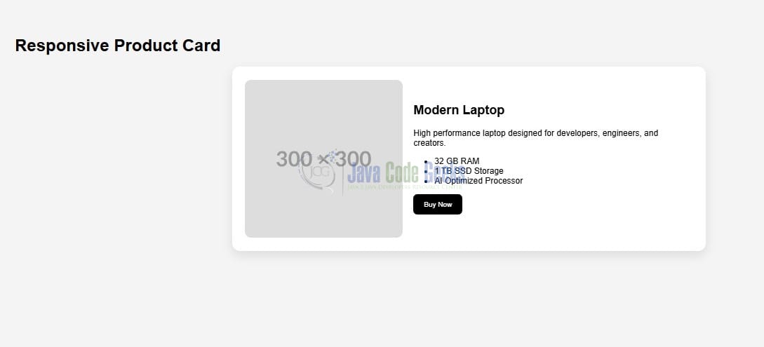
When the above HTML and CSS code is executed in a modern browser, it renders a responsive product card component with adaptive layout behavior and scroll-based animation effects. Initially, the product card appears with the product image displayed beside the product details, including the title, description, feature list, and action button. This horizontal layout is applied when sufficient space is available inside the parent container.
As the available width of the product-container decreases below 500px, the container query automatically changes the card layout from a horizontal design to a vertical stacked layout. The image expands to occupy the full container width, while the product information moves below it. This responsive behavior is controlled by the component’s container size rather than the browser viewport, allowing the same component to work consistently across different application layouts.
When the user scrolls through the page and the product card enters the viewport, the scroll-driven animation is triggered. The card smoothly transitions from a hidden state with reduced opacity and a downward offset into its final visible position. The animation progress is automatically managed by the browser using the view() timeline, eliminating the need for JavaScript-based scroll event handling.
The final output demonstrates a reusable and interactive UI component that combines responsive design and modern CSS animations. The component can be placed inside different layouts such as dashboards, side panels, or full-page sections while automatically adapting its appearance based on available space and user scrolling behavior.
- Large container: Product image and information are displayed side-by-side.
- Small container: Product card switches to a vertical stacked layout using container queries.
- Scrolling behavior: Card smoothly fades in and moves upward as it enters the viewport.
- Reusable component: The design works independently without relying on the overall page size.
3. Conclusion
CSS Container Queries represent a significant advancement in responsive web development by allowing components to adapt based on their own available space rather than relying only on the browser viewport dimensions. While media queries continue to be useful for managing overall page-level layouts and device-specific designs, container queries provide a more flexible approach for creating reusable and independent UI components that can adjust automatically in different layout contexts. When combined with modern scroll-driven animation capabilities, developers can create rich, interactive user experiences using cleaner CSS with reduced dependency on JavaScript. As component-based development continues to evolve, CSS Container Queries and scroll-driven animations will become important techniques for building flexible, performant, and maintainable web applications.