Stop guessing where your Java app is spending its time. Here is everything you need to go from zero to actionable insight with async-profiler.
You have a Java service that is slower than it should be. Latency is spiking, CPU is higher than expected, and the thread dump tells you nothing useful. So you reach for a profiler — and suddenly you are staring at a towering wall of colourful stacked rectangles that looks equal parts fascinating and completely impenetrable. Sound familiar?
Flame graphs are, once you understand how to read them, the single most information-dense way to understand where your JVM is spending its time. They were invented by Brendan Gregg at Netflix specifically because traditional profiler output — long lists of percentages, tree views, drill-down menus — was too slow for the fast-moving engineering environment that cloud software demands. A flame graph lets you find the hot path in seconds, not minutes.
In this guide, we will walk through how flame graphs are constructed, how to read them correctly (including some counterintuitive traps), and how to generate them on a live JVM using async-profiler — the tool that has become the standard choice for production JVM profiling. By the end, you will know not just what you are looking at, but what to do about it.
Why async-profiler — Not Just Any Profiler
Before diving into flame graphs themselves, it is worth understanding why async-profiler has become the go-to choice and what makes it fundamentally different from older JVM profilers.
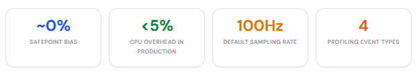
Most traditional Java profilers — including many commercial tools — are built on the JVMTI API (GetAllStackTraces). The problem with this approach is that it can only capture stack traces at safepoints: specific points in the JVM’s execution where threads are paused for garbage collection or deoptimisation. This introduces what is known as safepoint bias — your profiler systematically under-reports code that spends time in tight loops or other code paths that do not frequently reach a safepoint. In other words, it lies to you about your most performance-critical code.
The safepoint bias problem
Research into JVM profiling bias shows that a 5ms safepoint every 100ms represents roughly 5% steady-state overhead — and that overhead gets worse under load, precisely when you most need accurate profiling data. Deep call stacks from frameworks like Spring compound the issue significantly.
async-profiler sidesteps this entirely. Instead of relying on JVMTI, it uses the AsyncGetCallTrace API provided by HotSpot, combined with Linux perf_events, to interrupt threads at arbitrary points — not just safepoints. As a result, it captures an accurate picture of what code is actually running, including native code, JVM internals, and kernel functions that JVMTI-based profilers never show you at all.
Getting Started: Install and Run in Under 5 Minutes
async-profiler ships as a pre-compiled tarball for Linux and macOS — no compilation or build tooling required. Download the latest release from the GitHub releases page, extract it, and you are ready to go.
# Download and extract (Linux x64 example — check releases for your platform)
wget https://github.com/async-profiler/async-profiler/releases/download/v3.0/async-profiler-3.0-linux-x64.tar.gz
tar -xzf async-profiler-3.0-linux-x64.tar.gz
cd async-profiler-3.0-linux-x64

# Profile a running JVM for 30 seconds, output an interactive HTML flame graph
# Replace 12345 with your actual Java process PID (use: ps aux | grep java)
./asprof -d 30 -f /tmp/cpu-flame.html 12345

# Open the result in your browser
open /tmp/cpu-flame.html
That single command is often all you need for a first pass. However, for more accurate results from the JIT compiler, add these two flags when starting your Java process. They tell HotSpot to generate more detailed debug information at non-safepoints:
java -XX:+UnlockDiagnosticVMOptions -XX:+DebugNonSafepoints -jar myapp.jar
On Linux, you may also need to allow perf events for non-root users. If you see a permission error, run:
# Allow perf events (add to /etc/sysctl.conf for persistence)
echo 1 | sudo tee /proc/sys/kernel/perf_event_paranoid
echo 0 | sudo tee /proc/sys/kernel/kptr_restrict
Profiling inside Docker
If your application runs in a container — which, today, it almost certainly does — profiling requires a couple of extra steps. The container needs SYS_PTRACE capability and access to perf events:
# Copy async-profiler into your running container
docker cp async-profiler-3.0-linux-x64 :/tmp/asprof

# Run the profiler inside the container (attach to PID 1 or your Java process)
docker exec  /tmp/asprof/asprof -d 30 -f /tmp/profile.html 1

# Copy the result out
docker cp :/tmp/profile.html ./profile.html
How to Actually Read a Flame Graph
This is where most tutorials either oversimplify or confuse. Let us be precise, because the flame graph layout has a few properties that catch developers off guard the first time.
The axes are not what you might expect
The most common misreading of a flame graph is treating the X axis as time. It is not. The X axis represents an alphabetically sorted aggregation of all collected stack traces. Width is proportional to the number of samples that included that frame — not the order in which things happened. Two methods running at different times but equally often will appear equally wide, even if one ran at 9am and the other at 9pm.
The Y axis is call depth. Frames at the bottom of the graph are closest to main() or a thread’s entry point. Frames at the very top are the innermost — the code that was actually running on the CPU when the sample was taken.
The golden rule: look at the top, and look at the wide
The widest frames at the top of the graph (or plateau regions) are your hotspots — the code spending the most CPU time without calling anything else. That is where your optimisation effort should start. A wide frame at the bottom just means it is a common ancestor for many different code paths, not necessarily that it is slow.
Colour in async-profiler’s flame graphs
async-profiler uses colour to encode origin, not importance. This is critical to know so that you read the graph correctly rather than assuming the most visually striking colour is the problem:
| Colour | What it means | Examples |
|---|---|---|
| 🟩 Green | Java methods | Your application code, Spring Framework, Hibernate |
| 🟨 Yellow | JVM code (C++) | JIT compilation, GC internals, class loading |
| 🟥 Red | Native methods | JDBC drivers, JNI calls, native libraries |
| 🟧 Orange | Linux kernel | System calls, I/O, network stack, context switches |
In practice, a healthy Spring Boot application will show a sea of green at the bottom (the framework bootstrap and request handling scaffolding) with narrower columns of application-specific green rising above it. Wide red or orange regions near the top of a stack often indicate expensive I/O or native library calls worth investigating.
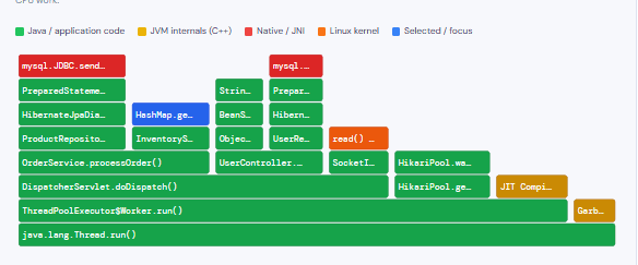
An annotated flame graph
The interactive diagram below shows a representative flame graph from a Spring Boot application handling HTTP requests. Hover over any frame for details, and click any frame to zoom into that subtree — just as you would in a real async-profiler HTML output.
Annotated CPU flame graph — Spring Boot API (simulated)
Choosing the Right Profiling Mode
One of the most common mistakes developers make when starting with async-profiler is defaulting to CPU mode for every investigation. In reality, choosing the wrong mode can lead you to spend hours optimising something that is not actually the bottleneck. Consequently, understanding when to use each mode is just as important as knowing how to run the tool.
CPU mode (-e cpu)
Samples threads that are actively consuming CPU cycles. Use this when CPU utilisation is genuinely high. Will miss time spent blocked on I/O or locks.
Best for: compute-heavy work
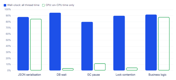
Wall-clock mode (-e wall)
Samples all threads regardless of CPU state — including those blocked on I/O, sleeping, or waiting on locks. Best starting point for latency issues in distributed systems.
Best for: latency, I/O, DB calls
Allocation mode (-e alloc)
Captures stack traces at every object allocation. Invaluable for finding allocation hot paths that stress the GC. The top frame is the allocated class.
Best for: GC pressure, memory leaks
Lock mode (-e lock)
Profiles contended monitor/lock attempts. The top frame shows the lock class; the counter is nanoseconds spent waiting. Essential for diagnosing thread contention.
Best for: thread contention
Start with wall-clock mode for distributed systems
If your application talks to databases, message queues, or external APIs, most of its latency will not show up in CPU mode at all — because threads are blocked, not running. Wall-clock mode captures everything: time waiting on the database, time blocked on a lock, time in the GC. For most modern Spring Boot applications, this is the right first choice. Switch to CPU mode once you have confirmed that CPU consumption itself is the problem.
Profiling modes at a glance
When to use each async-profiler mode
Five Flame Graph Patterns and What They Mean
Once you can read a flame graph, the next skill is pattern recognition — knowing what to look for. Over time, certain shapes and structures start to jump out as clear signals.
1. The plateau: your number-one target
A wide, flat top — a frame that spans a large horizontal segment with no children above it — is a method spending CPU time without delegating to anything else. This is almost always the hotspot you want to fix first. Wide plateaus at the top of a CPU flame graph are the unmissable signal that async-profiler was designed to surface.
2. Tall narrow towers: deep call chains
A very tall, narrow column indicates a deep call chain where each frame calls exactly one other thing. By itself this is not alarming — it might just be a Spring interceptor chain or a deeply nested framework initialisation path. However, if the tower is wide and tall, it means a substantial portion of your samples are going through that entire chain, which is worth tracing back to root.
3. Unexpected yellow or orange regions
Significant amounts of JVM-internal (yellow) or kernel (orange) frames at the top of your stacks often indicate you are hitting infrastructure limits: excessive GC pressure (yellow/JVM frames), lots of system calls for I/O (orange), or memory pressure causing page faults. If your application logic looks lean but performance is poor, look here.
4. Wide bases of framework code
In a Spring Boot application you will typically see a wide base of green framework frames — DispatcherServlet, ThreadPoolExecutor, AbstractHandlerMethodAdapter — spanning most of the width. This is normal and expected. The interesting work is the application-specific green frames rising above the framework base. Only worry about framework frames if they are also wide at the top.
5. Allocation mode: the serialisation surprise
In allocation mode, JSON serialisation libraries (Jackson, Gson) and string formatting operations almost always appear prominently. This is because they create many short-lived objects. Most of the time this is fine — the GC handles it efficiently. However, if you are seeing frequent GC pauses, allocation mode will show you exactly which code paths are responsible, and you can decide whether object pooling, more efficient serialisers, or structural code changes are warranted.
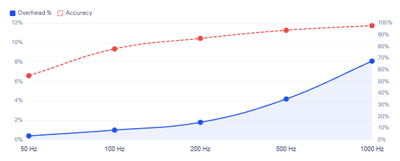
async-profiler CPU overhead by sampling frequency
A Practical Investigation Workflow
Knowing the theory is one thing — having a repeatable workflow for an actual production incident is another. Here is a battle-tested sequence that experienced JVM engineers tend to follow.
Start with wall-clock mode for 30–60 seconds under realistic load. This gives you the broadest view of where time is actually going, regardless of whether the culprit is CPU, I/O, or concurrency. Look at the resulting flame graph and ask: is the wide top-level work happening in framework code, application code, or native/kernel layers?
If application code is dominant, switch to CPU mode for a more focused picture of computational hotspots. If you are seeing unexpected yellow (JVM internals), consider running allocation mode to check for GC pressure. And if your application under load shows inconsistent latency even when CPU is not high, lock mode is your next stop — contended synchronisation is a classic source of latency spikes that CPU mode will completely miss.
# Step 1: Wall-clock overview (works for all workloads)
./asprof -e wall -t -d 60 -f /tmp/wall.html <pid>

# Step 2: CPU hotspot analysis (only if CPU is genuinely elevated)
./asprof -e cpu -d 30 -f /tmp/cpu.html <pid>

# Step 3: Allocation pressure (if GC pauses are frequent)
./asprof -e alloc -d 30 -f /tmp/alloc.html <pid>

# Step 4: Lock contention (if latency is high but CPU is not)
./asprof -e lock -d 30 -f /tmp/lock.html <pid>

# Optional: output JFR format for IntelliJ or Java Mission Control
./asprof -e cpu -o jfr -f /tmp/profile.jfr <pid>
IntelliJ IDEA Ultimate (2023.1+) bundles async-profiler natively. You can profile any run or debug configuration directly from the IDE: open Run → Edit Configurations → Profiler tab → select CPU or allocation mode → click “Run with Profiler”. The flame graph opens inline with source-level navigation — clicking any frame jumps straight to the corresponding code. This is by far the most convenient way to profile during development.
Common Pitfalls to Avoid
| Mistake | What it looks like | Fix |
|---|---|---|
| Using CPU mode for I/O-bound apps | Flame graph looks thin; everything seems fast, but latency is high | Switch to wall-clock mode first |
Profiling without -XX:+DebugNonSafepoints | JIT-compiled methods appear as [unknown] frames | Add the flag when starting the JVM |
| Profiling without realistic load | Results show idle threads and GC; nothing meaningful | Run a load test (k6, wrk, JMeter) before starting the profiler |
| Treating the X axis as time | Thinking left-side frames ran first and right-side frames ran later | Remember: X is alphabetical aggregation, not temporal order |
| Assuming GC-heavy frames means slow application code | Large yellow JVM GC frames near the top | Switch to allocation mode to find the root cause in application code |
Always profile under production-like load
A flame graph from an idle application is nearly useless. The JIT compiler will not have warmed up the hot paths, many threads will be parked, and the profiles you collect will not reflect real usage patterns at all. Always run your profiling session while a realistic load test is in progress — otherwise you risk optimising code that is never a bottleneck in practice.
What We Learned
Flame graphs are an aggregated visualisation of stack trace samples, where the X axis represents sorted sample counts (not time) and the Y axis represents call depth. The widest frames at the very top of a flame graph are your actual hotspots — the code spending the most CPU time without delegating elsewhere. async-profiler is the right tool to generate these on JVM applications because, unlike JVMTI-based profilers, it uses AsyncGetCallTrace and Linux perf_events to sample threads at arbitrary points and thereby avoids safepoint bias entirely.
Colour encodes origin: green is Java code, yellow is JVM internals, red is native, and orange is Linux kernel. Choosing the right profiling mode matters as much as reading the output: wall-clock mode captures all thread time regardless of blocking state and is the correct starting point for latency investigations in distributed systems, while CPU mode is only suitable when CPU utilisation is genuinely elevated. Running the profiler without production-realistic load, without -XX:+DebugNonSafepoints, or misreading the X axis as time are the most common ways developers get misleading results.