It is no secret that the website is the backbone of every business. If you want your business to be successful in this COVID-19 era, you’ve got to have a well-designed website. As, due to social distancing, more and more potential customers are searching for information via the company’s website.
A well-designed website can help you grow your business as a flawless design creates a great impression on your potential customers inducing them to take the desired action. Common web design mistakes, however, can quickly derail even your best efforts. And while you hear a lot about what to do when designing your website. But do you know what not to do?
Well, to give you an edge, we have outlined 12 common website design mistakes that hurt many businesses. Avoid them while designing your website, and you should have more success in converting visitors.
What Is Web Design And Why It Is Important?
Before we cover these common web design mistakes in detail, it is crucial to understand what web design is all about. Web design is a process of iteratively strategizing, conceptualizing, and delivering information and overall business functionality in an aesthetically appealing layout.
Visual components of web design encompass the text content, images, videos, colors, fonts, different elements and shapes like buttons, forms, icons, the spacing between these elements, and the overall layout itself.
Design functionality comprises website speed, navigation, animation, user experience, user interaction, overall site’s tech architecture, SEO, cross-browser, cross-platform, cross-device design consistency, and responsiveness.
Now that we’ve covered web design and why it’s so important, it’s time to understand the common web design mistakes designers and developers must avoid in 2021.
12 Common Web Design Mistakes
We all know to err is human, but to avoid mistakes in the first place is divine. With that in mind given below are 12 common web design mistakes that you must avoid.
1. Not Opting For Design-Thinking Approach Before Implementation
One of the most common web design mistakes that most designers make is that they don’t realize the importance of design-thinking and drawing the layout on-paper. Designers often tend to “assume things” about users rather than carry out extensive “user research” to understand user needs. But this is not the right way to go about web design.
Understanding the design thinking approach is the key to designing addictive experiences for users. Not sure what design-thinking is – well, it is a process that understands and identifies customer needs and motivations. It’s a mindset to empathize with the customers, detail their problems, and build solutions to solve them.
The design thinking approach enables designers to identify goals, project scope, build business features, understand user requirements, technological capabilities, solution feasibility, and effectiveness. All this helps designers gather data-points to devise the right sitemaps and wireframes before hopping on to some designing software.
Remember – If you don’t understand your customers, you won’t be able to design good websites for them. So, be empathetic, and do user research to understand what your customers care about.
2. Not Prioritising Grids & Columns
We all know that the web design world is changing at a remarkable speed, and you need to change with it too. But some of the designers are still confined to developing designs the old way, i.e., organizing content by only using flexbox, float, breakpoints, etc., and overlook the importance of CSS grids and guides in developing responsive well-architectured websites designs. On the other hand, many junior developers have this misconception that flexbox and floats are dead. It’s a misconception. CSS grids, flexbox, floats, and breakpoints are all important from a web designer’s perspective, and using it in the right way can help avoid all grid & column related web design mistakes.
Using CSS technologies, designers can deliver a seamless user-experience where content gets automatically segmented and aligned using rows and columns. Grid-template-columns, minmax, autofit properties of CSS eliminates the need to use media queries breakpoints but using grid-template-areas does need to use breakpoints.
One of the CSS grid-related web design mistakes most designers tend to make is getting confused with CSS numbers. While designing for CSS frameworks like bootstrap, we count the number of columns in a row, usually 12, but in the grid system, we count lines or stacks. In the grid system, moving from lines 1 to 7 is akin to spanning 6 columns.

3. Not Strategizing Hierarchical Aesthetics
Another web design mistake that most designers need to avoid is not strategizing the visual hierarchy of content, including CTAs. Well devised user journeys can be efficiently implemented by designing efficient visual hierarchies. This can be achieved by using appealing words, colors, images, and small animations. Spacing between these elements and their size can also be very crucial in driving user engagement. Getting this wrong means less user interaction and can hurt your business profitability.
4. Not Prioritising Intuitive Navigation & Accessibility
Skipping the essential step of brainstorming, sitemap, and wireframing is the basis of several web design mistakes. One of the prominent ones being the poorly configured menu and navigation layout. An improper navigational structure can drive away your website visitors as it’s a pain to scroll through randomly structured websites. Suppose you’re designing a website with loads of pages, then it makes sense to group them into categories and arrange these categories hierarchically to enable users to navigate the website intuitively.
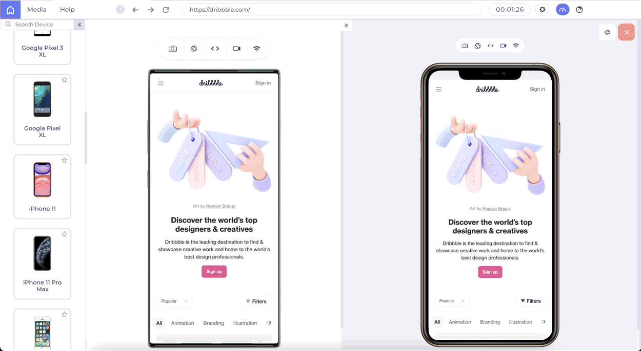
Moreover, navigation is not the same for every device. Though there are different ways to work with navigation, you need to choose the right strategy. For example, while working with mobiles, you can choose a hamburger menu strategy, as it works great for navigation on smaller screens. If you wish to compare the navigation of your website on mobile and tablets, you can use the LT Browser to do so:

Other than navigation, there are some other aspects to boost website accessibility. Research says there are 300+ Mn people with color blindness. But most designers overlook this aspect while designing websites and user journeys. There are millions of people with visual and hearing disabilities. Not taking these users in your design-thinking approach could be one of the major yet common website design mistakes.
Text size, color contrasts, page titles, image alternate text, keyboard accessibility, moving and blinking contents like carousels, ads, autoplaying videos, scrolling news feeds, and tickers are crucial components of a website from the accessibility point of view. A person battling hypermetropia might want to zoom the content on small devices. A person with visual impairment may prefer speech to consume content rather than text. A user with attention-deficit may want to pause carousels and so on. A good web design takes all this into the picture to enhance website accessibility. Doing it wrong can lead to a bad user experience and hurt your business. Given below is an example of an intuitive web design:

Source
The above example of Amazon’s website shows how they have used the search functionality in the best way one can imagine. An easy-to-use site search functionality avoids the need to have labeling menu items built-in for a diverse set of users.
5. Not Adhering To Security-First, Responsive Design Approach
Though website security is much of a technical architecture-dependent aspect but to an extent, it is also related to website design and user journeys. How designers depict the user journeys greatly influences how developers implement the designs. If website security is prioritized right from the design stage, many security loopholes can be avoided. For example, putting the business-critical data behind authentication and payment walls.
Read our blog if you are curious about finding the influence of Microservice architecture in Security testing.
Besides security, the design must be responsive and consistent across browsers and devices to offer an omnichannel experience. One of the big web design mistakes in website development is designing different user journeys and roadmaps for different platforms and devices. The priority should be to maintain as much consistency across devices as possible. It would be better if you can check the responsiveness before making it live. Tools like LTBrowser from LambdaTest allows you to design responsive websites without any hassle.
Ensure Responsive Web Design Of Your Website On 25+ Mobile Views With LT Browser
6. Cluttering Up The Web Design With Too Much Content
Too little information and you run the risk of not delivering the solution your user is looking for. Too much information and you may end up building a solution that is hard to understand, consume, or access. In their sheer desperation, designers can overwhelm the visitors with resources and end-up delivering a highly cluttered website. Though it is successful because it’s highly popular since the early days. And maybe to maintain consistency for its users, they still haven’t changed the website design. But one should not make the same mistake.
One of the common web design mistakes to avoid is not building scalable designs from the very beginning. This is the core reason behind so many businesses revamping their website design. Unstructured, un-templated website designs are a growth bottleneck because, after a few hundred pages, it becomes erroneously difficult to maintain, develop, and scale these websites. To avoid these design scalability issues, the design approach should embrace a “divide and conquer” strategy.
Divide the overall website interface into different web pages like product listing, product information, user profiles, user interaction, etc. Next, divide each webpage interface constituents into reusable blocks and components. Each of these components should focus on delivering one functionality. For example, carousels, short user profiles, product descriptions, reviews, etc. Next, use these components to build the overall website. This approach ensures faster development and scalability of the webpages. Given below is an example of a cluttered and bad website design:

7. Not Having A Clear CTA
Not having a clear CTA is another common web design mistake. Websites are like marketing and sales funnel or pipeline. Your website visitor traverses within that funnel to go from the prospects’ stage to the converted clients’ stage. Not giving a clear “call to action” at the appropriate places may lead to not converting many hot prospects. Overdoing CTA may also lead to irritating prospects. You can learn about the 18 most effective CTA design tips to boost your website’s conversion rate.
8. Poorly Designed Or Irrelevant Images
We all know that images and graphics are a critical part of web design. When done well, images can clearly convey the message to the visitor. Done wrong, they can confuse the reader. Many businesses are still not paying attention to their images and are using low-quality and irrelevant images. Don’t make this mistake, as low-quality images will muck up your website and turn off your visitors, which will hurt your conversions. Similarly, irrelevant images will only confuse your visitors, inducing them not to take the desired action. That being said, you should also not clutter your website with too many images as they can take away the eyes from CTA, leading to a loss in conversions.
9. Not Paying Attention To 404 Page Design Can Hurt SEO
Web design is not just limited to developing layouts and user journeys. Wikipedia definition expands web design to incorporate content and search engine optimization (SEO). From the SEO point-of-view, multiple common website design mistakes can be easily avoided.
The first SEO-critical web design mistake is not to have a dedicated custom 404-page template. You can have a custom 404 page for your domain to present users with something relevant, or you may use 302 or 301 redirects to link to some other page on the web. Broken links on a website harm a business reputation. Users feel as if the website is a scam, and the product/service won’t be of standard. Using 302 or 301 redirects, these broken links could be easily handled. For an external website with broken links, you’ve to test, identify, and replace such links continuously.
Secondly, SEO-specific and common website design mistakes include not using title & heading tags. Using descriptive page text won’t be as impactful as describing it in the title. Similarly, using larger fonts won’t be as impactful for SEO as using h1, h2 tags.
10. Multimedia Related Web Design Mistakes
We already highlighted how irritating autoplay videos are, especially with sound. Additionally, it makes websites pretty slow to load. It’s often better to not autoplay videos and wait for some sort of user activity to trigger playing such videos. For example, the user scrolls to a section on your page containing the video.
We also underlined how fast carousels could be a turn off too. Other than these, there are a few more multimedia related web design mistakes that should be avoided.
- First, a massive web design mistake is not to optimize your website images. Big size images make websites slow to load. If your website loads slow, it can hurt your conversions terribly. Did you know 1 in 4 visitors would abandon a website that takes more than 4 seconds to load? Even search engines don’t like such websites. So, as a designer, it is preferable to use clear and optimized images. As a developer, the attempt should be to lazy load these images. Lazy loading of images makes websites faster to load.
- Second, avoid using cheap free stock images. Everyone has used them; everyone knows when you use one! It creates a cheap impression. So, if the free-stock image is not exactly spot-on, avoid using it.
- Third, use contextual icons esp, favicons. We understand it’s an obvious thing, but a surprising number of designers don’t do this even in 2020. This helps in delivering the right message and boosts branding too.
- Fourth, do not use several font styles on the same web page. Not maintaining the font’s style consistency across the webpage is another common web design mistake.
11. Not Designing Multilingual Voice Enabled Website Designs
Today it is possible to build websites in multiple languages and even add voice interface based functionalities. But not many designers and website owners are utilizing these web capabilities. If a business has customers in different countries, then to appeal better to target customers, websites can be developed in the native language. To boost accessibility, a voice-based interface can be added to the website. A big chunk of the google searches on phones is voice-based. Users are using voice technology to book cabs, hotels, etc. It would be a mistake not to count the voice and multilingual approach in the overall website design plan.
Keeping in mind the customers from different countries, you might be interested to know how your website may appear and work differently through different countries and continents and how to perform Geolocation cross browser testing through VPN on LambdaTest.
12. Not Harnessing Analytics Or Testing To Ensure Cross Browser Compatibility
The design, like content, is a creative work that can be improved iteratively. Using sophisticated analytics tools, your website analytics administrator can give you data on how users navigate your website. Also, analytics, testing can help you discover broken links. Based on the analytics input, you can find out the flaws in the user journey. You can identify what’s working and what needs improvements, which CTAs are getting clicked, which needs to be upgraded.
After completing the development phase successfully, keeping in mind all the website design problems and web design mistakes to avoid, we can proceed to the testing phase. Testing a website is an indispensable step as the world is filled with devices that are either different physically or from the inside. Cross browser testing, usability testing, and A/B testing are just a few to name as different goals demand different testing types.
One of the most common website design mistakes that developers tend to commit is assuming that a redesigned website is perfect and not performing browser compatibility testing as rigorously as they should. They feel that since the redesigned website has similar functionalities to the previous one, rigorous rechecking functionalities are meaningless. This, albeit, is not a good approach and is an unforgivable blunder in the redesigning part. With this mentality, a lot of things can go wrong, such as cross-browser compatibility. Therefore, always test your website with equal commitment to optimize and make it bug-free for your audiences, thereby avoiding all related website design problems.
LambdaTest can help you identify and overcome such mistakes by allowing you to perform cross-browser testing of a website on 2000+ browsers and their versions, with the help of VMs hosted on their cloud servers.
Over To You
A website could be your business’s most important asset, so you need to make it flawless to create a great first impression. But to do that, you need to avoid these web design mistakes.
Don’t worry. These common website design mistakes are fairly easy to avoid as well as fix. Identifying them is the hardest step. But now that you know these mistakes, you can easily avoid or fix them moving forward.
So, are you making any of these web design mistakes? Is there any other common website design mistake that you want to add to this list? Please, chime in the comment section below!
Written by Nishant Choudhary
A Web Scraping Python Developer and Data Evangelist, Nishant also loves to evangelize startups and technologies by writing technical content.
| Published on Java Code Geeks with permission by LambdaTest, partner at our JCG program. See the original article here: 12 Common Web Design Mistakes To Avoid in 2021 Opinions expressed by Java Code Geeks contributors are their own. |