I see a lot of confusion around velocity in new-to-agile teams. Too many people treat velocity as an acceleration measurement. That is, they expect velocity to increase to some large number, as a stable state. Velocity is a rate of change coupled with direction. When managers think they can measure a team with velocity, they confuse velocity with acceleration.
As I enter a highway, I have a higher rate of acceleration. As I continue to drive, I achieve a stable state: I get into a lane and maintain a constant speed. (Well, with any luck.) I stay stable with respect to the road (my direction). My velocity stays the same—especially if I use my cruise control. With a reasonable velocity—that might change a little with traffic—I can get to my destination.
A note on direction: I live in the Boston area, where roads curve. North, South, East, and West are useful to other people. We have highways that literally point south that have a designation of “North.” They curve. I don’t find these directions useful. I am more likely to talk about the exit number on a highway or the gas station on a side road. Direction is as contextual as is velocity.
Direction for a project is much more about finishing features. How close to “done” are you? More on that below. When managers try to use velocity as acceleration, they create schedule games. See Double Your Velocity. That often leads to people taking shortcuts and incurring technical debt. What can you use instead of velocity? The feature burnup/burndown chart and the product backlog burnup chart.
This chart is an example of a feature burnup/burndown chart.
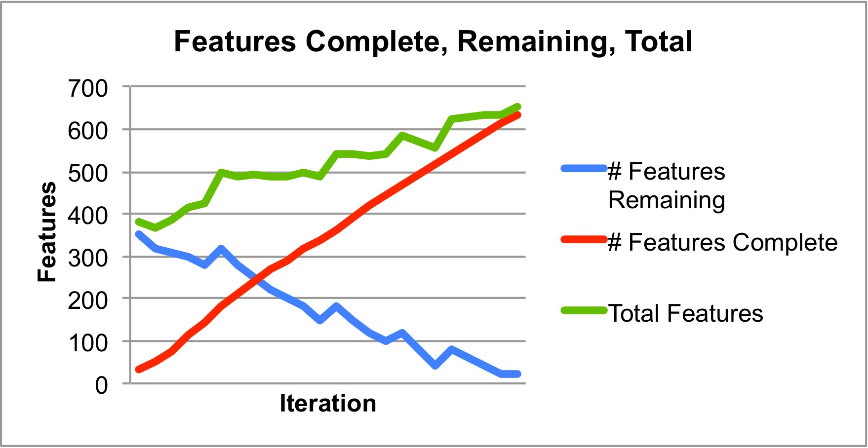
You chart the total number of features (the green line that wiggles at the top), the features complete (the burnup red line that continues to increase), and the features remaining (the burndown in blue, the line that proceeds down). I like this chart because you can see if things get a little “wonky” during the project.
If you add too many features faster than the team can finish features, you will have a large gap between the green and red lines. The blue line will go up. This chart shows you that. You can see how close to done you are for the project. I also like the product backlog burnup chart. This shows how much progress a team (or teams) make on all the feature sets. (That helps people realize they should define feature sets. Feature sets help the team see where the product is headed.)
In this chart, the team works on feature set 1 (FS 1) and feature set 2 (FS 2). Those stories are more valuable than anything in feature set 3.
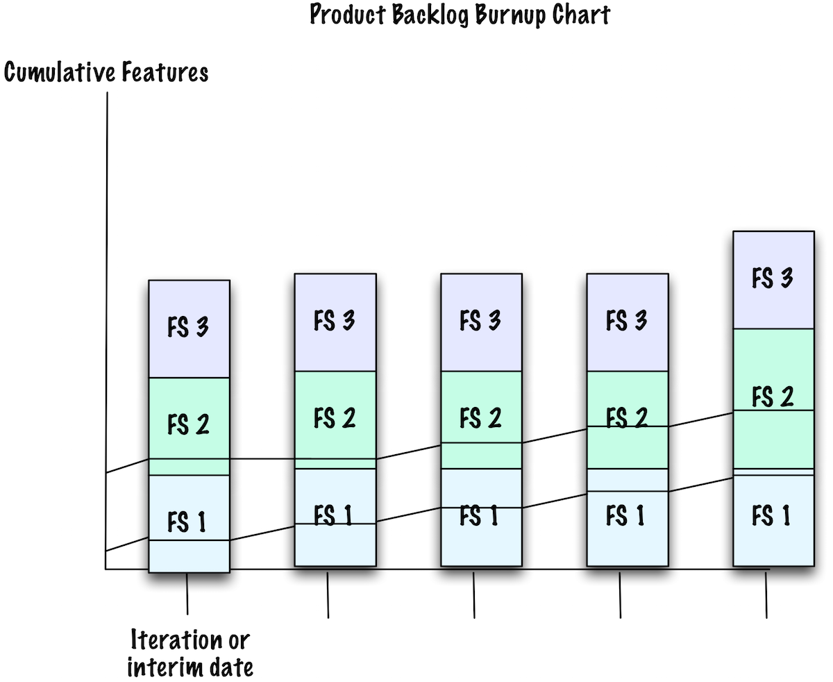
You can see that feature set 2 increased in the number of stories for the 5th milestone/iteration. That also helps people understand when they can expect the project to be done.
Measuring velocity can help a team see what’s happening. See Value of Burndown and Burnup Charts. However, velocity is for a team. Velocity helps a team see its context over some time period. They get to decide how to show it and what to do about it. If management wants to see progress, the team can measure the features complete, remaining, total chart and the product backlog burnup chart. (I would also measure cumulative flow to see how much work in progress the team has.) Don’t measure velocity to see progress. That’s not the measurement you want or need.
| Reference: | Velocity is Not Acceleration from our JCG partner Johanna Rothman at the Managing Product Development blog. |