The Java performance metrics you need to follow for understanding how your application behaves in production
Unlike the days when software used to be shipped in boxes and there was no way of knowing how it will perform in production, today almost any metric you can think of can be tracked down and reported. The problems we’re now dealing with are coming from information overload and scale, rather than not having enough information. With tens or hundreds of servers at play, this becomes even harder to keep track of. One thing that remained from those boxed software days are logs, which stayed pretty much the same for over 20 years now. Most developers still depend on those for insights into their production systems, but now they’re gradually being replaced.
For this post we’ve decided to gather some of the most insightful metrics you can follow to understand how your application behaves in production, WITHOUT relying on log files in any way. Aside from external factors like user loads (or… AWS downtime), new deployments are probably the most common influence on how Java performance indicators behave. So following up on them becomes even more critical right at those sensitive times following new deployments.
If it has numbers in it, then it must be true!
Before we move on to discussing each metric, let’s highlight one major caveat. There’s this notion that if you back yourself with data, then you must be right. The problem here is that it’s really easy to misrepresent data. Much easier than to prove it wrong when presented to you. Let’s distinguish here between measures coming from looking at simple time-series data, seeing how a certain basic metric behaves over time, versus looking at the data from a different angle and keeping your performance percentiles in check. The bottom line is that we need to be mindful to the impact of the metrics we care about, and have some sanity check to assess them.
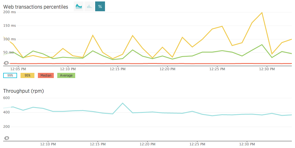
For example, say we’re looking at median / 50th percentile transaction response time. A popular indicator that many companies use as one of their main KPIs. In practice, when a single pageview has tens or more of these requests (usually well over 40), it means that the user is 99.999…% likely to experience a result worse than the median (It’s simple math: 1 – (0.5 ^ 40)). So which percentile does it make sense to focus on? Even if we’re looking at the 95th percentile, since you probably have well over 40 requests per page, most of your users will experience a response even worse than that. Multiply over several pageviews, and it gets even tougher. To read more about percentiles and just how misleading data, check out Gil Tene’s blog right here.
Now, let’s take a closer look at our metrics of choice, see exactly what do they stand for, and how you can get a hold of them:
1. Response times and throughput
The application response time measures how long does it take for the transactions in your application to complete. It can also be looked at from the HTTP requests level, or say, the database level. Allowing you to narrow down on the slowest queries that may need some help with optimization. The Throughput indicator looks at transactions from another angle, and displays how many requests your application is processing at any given time, usually per minute (rpm).
One way to measure this is using APMs like New Relic or AppDynamics (which we compared head to head on a previous blog post). On these kind of tools you can follow up on the average response time and compare it to that of yesterday’s or last week’s straight from the main reporting dashboard. This helps us see how new deployments affect our application’s health. Another view allows you to look at the web transaction percentiles, measuring how long does it take to HTTP requests to complete.
It’s also possible to monitor this in-house, but may require hard coding, like sending out data with Dropwizard metrics and publishing it to Graphite. It seems though that the most useful insights come when you correlate this data with other metrics. More on that in the following measures we’re covering here.
Takeaway #1: Make sure the collection methods you use allow you to look at the data from different angles and get down to the percentile level.
Tools to check:
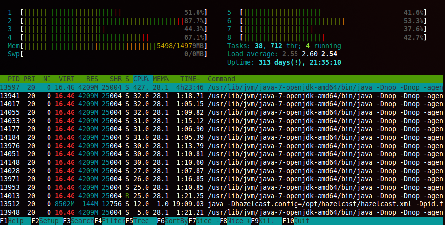
2. Load Average
The second metric we extensively follow is the Load Average on our servers. Load Average is a metric that’s traditionally divided to 3, showing its result for the last 1, 5 and 15 minutes (left to right). As long as your score is under the number of cores your machine has – You’re in the clear. Once it goes over the number of cores. it means your machine is under stress.
Beyond the simple measure of CPU utilization, Load Average takes into account how many processes each core has in its queue. A state where a core is 100% utilized, but will soon finish up with a task, versus a state where it has 6 more tasks in the queue is quite different. CPU utilization alone doesn’t cover that, but load average takes the bigger picture into account.
An awesome way to follow up on your server load average on linux is with htop by Hisham Muhammad. Great colorful and live visualization that makes your command line feel much like a NASA dashboard :)
Takeaway #2: Utilization of a resource is not enough to determine its load, you need to be mindful of the tasks in its queue to be fully informed.
Tools to check: htop
3. Error Rates (and how to solve them)
There are several different ways to look at error rates, and most developers go with the high level metrics – Looking at error rates at the whole application level, total failed HTTP transactions out of the overall HTTP requests for instance. But there’s an often overlooked in-depth layer to this with immediate implications for your application health: Error rates for specific transactions. Showing the number of times a certain method in your code fails and produces a logged error or exception out of the overall times it has been called.
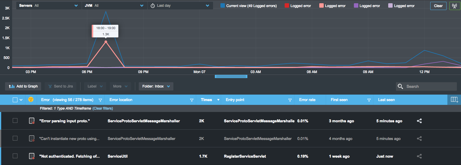
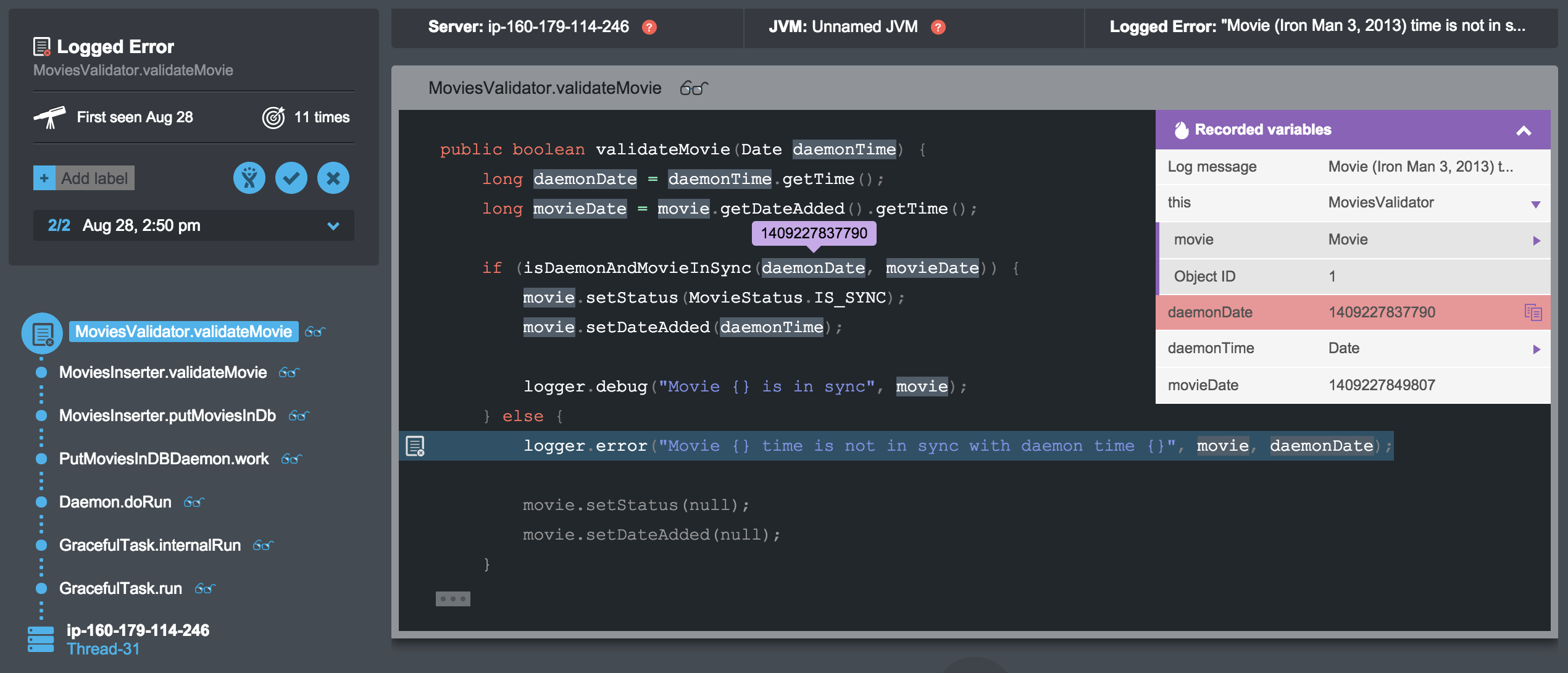
But this data doesn’t mean much on its own, right? The second step after prioritizing the most urgent events that you should address, be it logged errors or exceptions, is to get down to their real root cause and fix them. And we’ve built a solution to this problem as well. With Takipi in play, you don’t need to pull up log files and start looking for clues. All the information about the state of the server is accessible from the same screen. This includes the stack trace, the actual source code, and the variable values, across multiple instances of each faulty call.
Takeaway #3: High level data is not enough to get down to the real root cause of increased error rates. You need to favor collection methods that produce the richest data about the metrics you care about.
Tools to check: Takipi
4. GC rate and pause duration
A misbehaving garbage collector is one of the main reason that can cause your application throughput and response time to take a deep dive. So when digging in to find the cause for these symptoms, a common resolution would be that the application was in the middle of a stop the world GC pause. To learn more about the process of optimizing garbage collection and its associated metrics you can check out this post we published around solution strategies for GC issues.
The key to understanding the frequency and duration of GC pauses goes through analyzing GC log files. It’s not a metric you can get out of the box without analyzing it on your own, or using tools like jClarity. To analyze this you’ll need to make sure to turn on GC log collection with the appropriate JVM arguments.
Takeaway #4: Keep in mind to have a broad view correlate the data between different metrics to see how they affect each other.
Tools to check:
5. Business Metrics
The performance of your application doesn’t solely depend on how fast it responds, and neither on its error rate. The flipside is business metrics, and the responsibility for those is not at the hands of the product / sales people only. Measures like revenue, user counts, and interactions with specific areas of your application are critical for understanding how it performs. Having those side by side with the timestamps of new deployment is important to see how the fixes and new features you deploy impact the bottom line in terms of the business. Hopefully for the better of course, but if it goes for the worse – It’s super easy to know what needs fixing once you have all your data in one place.
Moreover, the ability to tie those business metrics, in real time, together with data about error rates and latency, is extremely powerful. This allows you to drill down to understand exactly which error or exception is causing you the most trouble, so you can prioritize them by their impact on business goals. Making sense of all the exceptions and log errors that are flying around. The way to do to this is using monitoring tools that are open to integrations and play well with the other kids in the neighborhood. This is why it’s super important to keep all data open and have the option to export it to our service of choice.
Say you’re using Graphite to centralize the business metrics that you’re reporting on, you’ll need the tool you’re using to be open to sending data to it. For example, the way our engineering team enabled this is by opening the metrics we report on to publishing through StatsD, so they can be then directed to any reporting dashboard our users choose to use.
Takeaway #5: Siloed data is a thing of the past. The methods you choose to pull metrics by should also let you correlate it with data from different sources.
Tools to check:
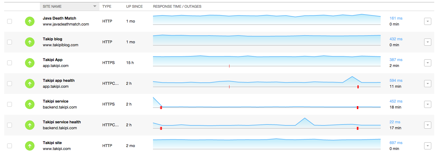
6. Uptime and service health
This one metric sets the tone for the whole shebang. Beyond using it as an alerting medium, it also lets you define your SLAs over time. Seeing what percent of the time you’re providing a fully functioning service to your users.
The way we follow up on this is through a health check we run with a single servlet using Pingdom. The check looks into all of the services that take part in the transactions in our application, including the database and S3.
Takeaway #6: Uptime might be a binary indicator but there’s a lot of value in looking at in an aggregate matter to locate the weak spots in your stack.
Tools to check: Pingdom
7. Log size
All the metrics we’ve discussed so far skip logging altogether, well, except for GC logs. But we still can’t ignore logs altogether. A side effect of logs is that they never stop growing. If you don’t keep an eye on their size and the process you have in place for keeping them in check – Bad things can happen. When logs get loose, hard drives cry. Your server start filling up with junk, and everything slows down. So it’s important to keep a close eye on them. It’s a neverending source of havoc.
The most popular solution approach is partitioning the logs on the server using services like logstash and sending them out to storage with Splunk, ELK, other log management tools, or plain storage on S3 for example. Another way could be just to rollover or truncate them at some point, but then we’re risking information loss since like most developers, we haven’t cut our dependence on logs just yet.
Takeaway #7: Logs are a huge pain, especially since you’re being charged by the GBs if you’re having some external service take care of them for you. It’s time to rethink the problem and start reducing log sizes.
Final Thoughts
We see a trend in how data collection from applications in production is slowly moving away from complete reliance on log files. The new world of software analytics is more open, with smarter data that goes beyond plain numbers and holds rich contextual information. It’s exciting to to see how will it all turn out, and we look forward to building this new future together with you.
| Reference: | 7 Java Performance Metrics to Watch After a Major Release from our JCG partner Alex Zhitnitsky at the Takipi blog. |
