The Gallery view provides a list of scrollable objects much like the standard ListView. The one main benefit of using the Gallery View is its snap-to-position feature. When the user stops scrolling, the images that end up being displayed are also snapped to the center of the screen. This means the user won’t be looking at half of two separate images at one time, and as a developer, you are also aware of exactly what the user is centered on. Also, the Gallery view works very well in a horizontal mode, instead of a vertical mode like the standard ListView.
The nice thing about the Gallery View is that it can be used with any type of View you can think of, not just images. By creating a custom layout with whatever you would like to display in the Gallery View, you’re able to come up with some pretty interesting displays.
Making a custom view and adding it to a gallery view is pretty simple. Here is a quick example that displayed a horizontal gallery view with a CheckBox to the left, a TextView in the center, and an ImageView on the right.
To start off, we simply create a new Android project (the API level doesn’t matter, this should work in any version). In main.xml (which is the default layout file of the project), we add the Gallery and remove the default TextView like so:
<?xml version="1.0" encoding="utf-8"?>
<LinearLayout xmlns:android="http://schemas.android.com/apk/res/android" android:orientation="vertical" android:layout_width="fill_parent" android:layout_height="fill_parent">
	<Gallery android:id="@+id/gallery" android:layout_width="fill_parent" android:layout_height="wrap_content"></Gallery>
</LinearLayout>
Now that we have the Gallery widget in our project, lets go ahead and create the gallery item layout. This layout represents exactly how each item in the gallery view will look. Like I said above, we want a CheckBox locked on the left, a TextView in the center, and a ImageView locked on the right. Also, some padding on the right and left sides would be nice to ensure we can see everything fine. To get that desired look, a RelativeLayout is used:
<?xml version="1.0" encoding="utf-8"?>
<RelativeLayout xmlns:android="http://schemas.android.com/apk/res/android" android:orientation="horizontal" android:layout_width="fill_parent" android:layout_height="fill_parent" android:id="@+id/gallery_item">
	<TextView android:id="@+id/textView" android:layout_width="wrap_content" android:text="TextView" android:layout_height="wrap_content" android:layout_alignParentTop="true" android:layout_centerHorizontal="true" android:layout_marginTop="14dp"></TextView>
	<ImageView android:layout_width="wrap_content" android:id="@+id/imageView" android:src="@drawable/icon" android:layout_height="wrap_content" android:layout_alignParentTop="true" android:layout_alignParentRight="true" android:layout_marginRight="22dp"></ImageView>
	<CheckBox android:id="@+id/checkBox" android:layout_width="wrap_content" android:layout_height="wrap_content" android:layout_alignParentTop="true" android:layout_alignParentLeft="true" android:layout_marginLeft="24dp"></CheckBox>
</RelativeLayout>
Now that all the layouts are ready to go, all we need to do is set up our Gallery Adapter. This is where the Gallery view is a bit different from the standard ListView. In order to get a custom layout, the BaseAdapter needs to be extended to provide a custom view. So we’ll call the new Custom adapter newGalleryAdapter. We’ll simply put the adapter at the bottom of our Activity. Here’s what our Activity looks like now:
public class GalleryExampleActivity extends Activity {

	@Override
	public void onCreate(Bundle savedInstanceState) {
		super.onCreate(savedInstanceState);
		setContentView(R.layout.main);
		// Find our gallery view and set the adapter for it
		Gallery gallery = (Gallery) findViewById(R.id.gallery);
		gallery.setAdapter(new newGalleryAdapter(this));
	}

	// The new custom Gallery Adapter for our new layout

	private class newGalleryAdapter extends BaseAdapter {
		private Context context; // needed to create the view

		public newGalleryAdapter(Context c) {
			Context = c;
		}

		// set to three for this example
		// for normal use this should be set to the length of the data
		// structure that contains the items to be displayed
		public int getCount() {
			return 3;

		}

		public Object getItem(int position) {
			return position;
		}

		public long getItemId(int position) {
			return position;
		}

		public View getView(int position, View convertView, ViewGroup parent) {
			View v;

			// just a simple optimiztaion -
			// we only inflate a new layout if we don't have one to reuse

			if (convertView == null)
				v = LayoutInflater.from(context).inflate(R.layout.gallery_item,
					parent, false);
			else
				v = convertView;

			// Now that we have our new custom View, find out widgets in the
			// view and set them
			TextView tv = (TextView) v.findViewById(R.id.textView);

			tv.setText(String.valueOf(position));
			CheckBox cb = (CheckBox) v.findViewById(R.id.checkBox);

			// this just alternates what the checkbox states are
			if (position % 2 == 0)
				cb.setChecked(true);
			else
				cb.setChecked(false);
			return v;

		}

	}

}
In onCreate, we just find our Gallery View and set its Adapter to our new Adapter. On line 14 and down, we design our new adapter. The most important method in the adapter class is the getView method (line 37). In this method, our new custom layout(gallery_item.xml) is inflated. We then find the widgets and set them to whatever we would like. Once we’re done setting up the View, simply return it.
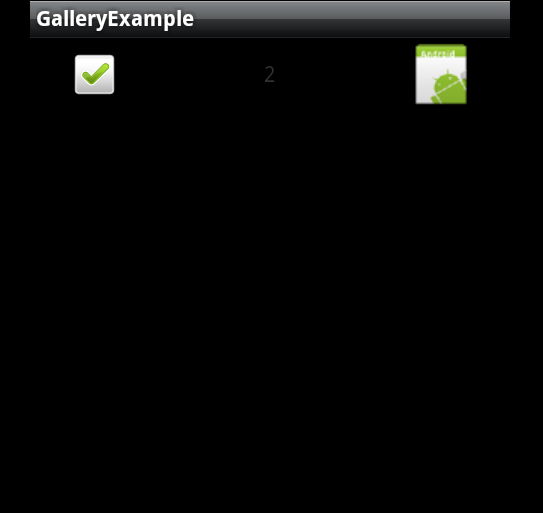
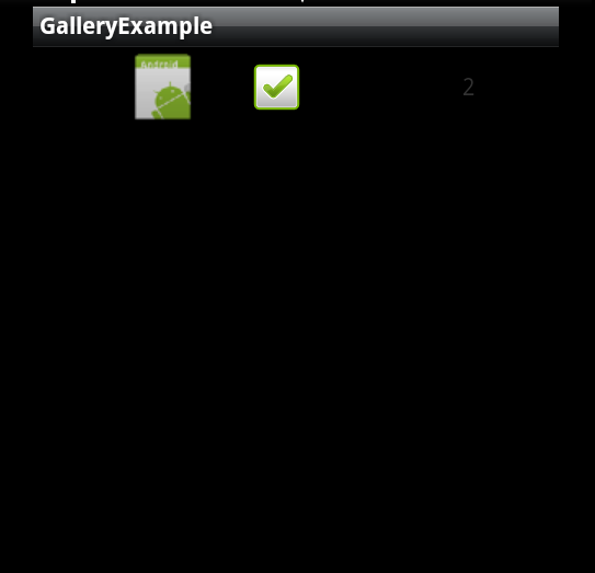
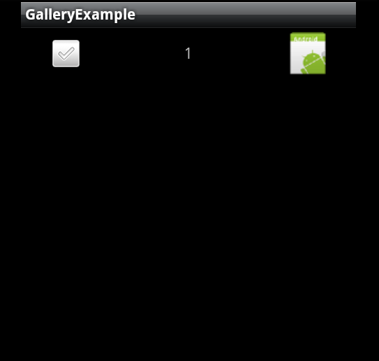
With everything said and done, We get this:
Reference: Android Tutorial: Gallery View without Pictures from our JCG partner at the Programming Mobile blog.
Related Articles :
