 Burn-down charts are awesome. They are part of agile’s set feedback loops. Take a look at a burn-down chart, and it will tell you if you’re on track or not.
Here’s a simple example:
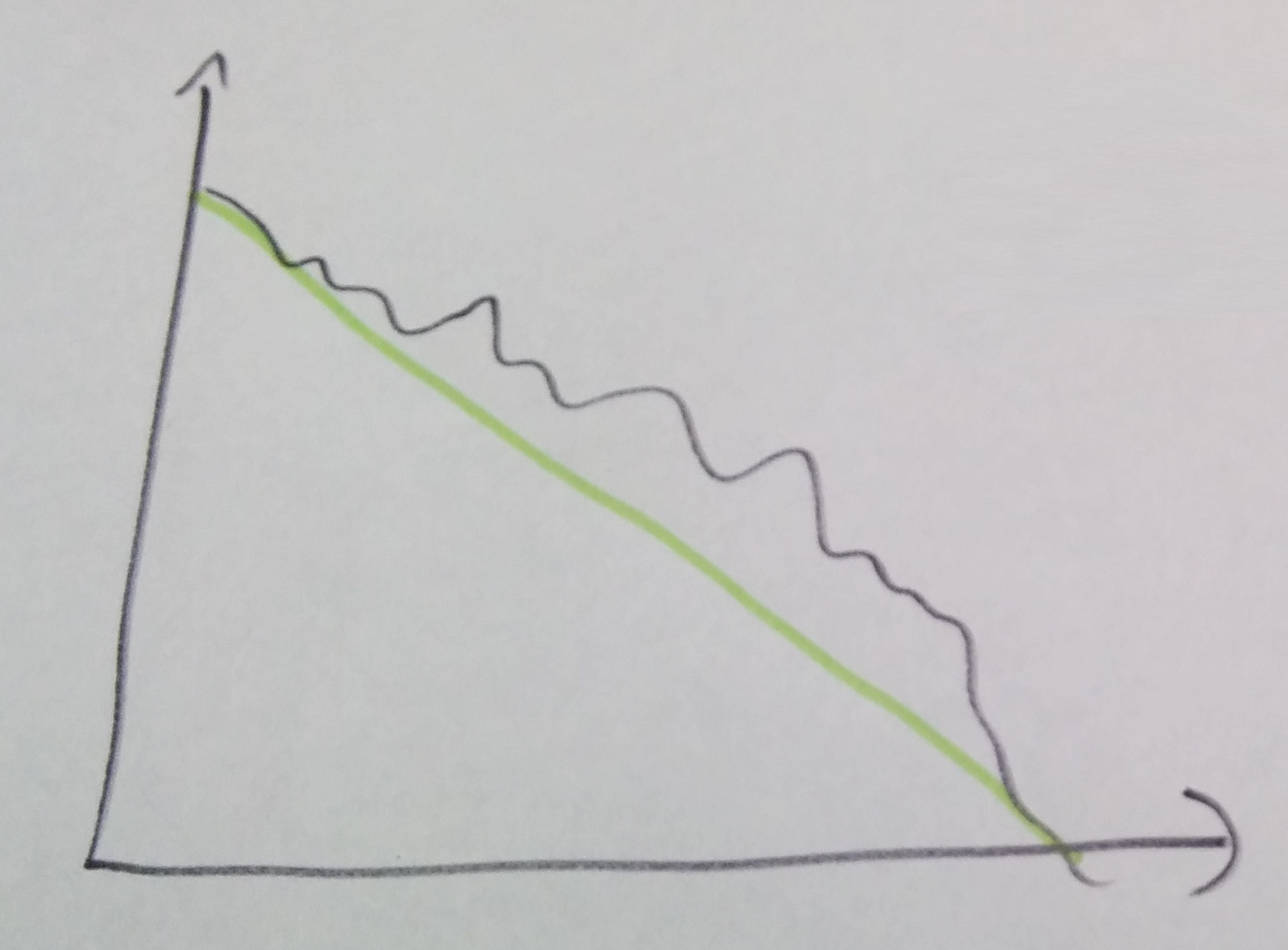 Note that I haven’t used a unit on the Y axis. It can be story points or hours, or whatever unicorn unit you estimate by and track. The burn-down itself may not be linear, but if we follow that skillfully painted green trend line to the bottom right, we’ll see if we’re on track, ahead of schedule or behind schedule. It’s good feedback, that helps us decide to continue, pull in more work, or top the iteration and re-plan.
It doesn’t happen straight from the beginning but after a while, when the team knows what they’re doing, the graph should hit the bottom right estimated point consistently. That means that the team has learned its average capacity, and therefore, its average velocity. In average, past velocity is a good forecaster.
Now, what happens when the burn-down chart consistently looks like this:
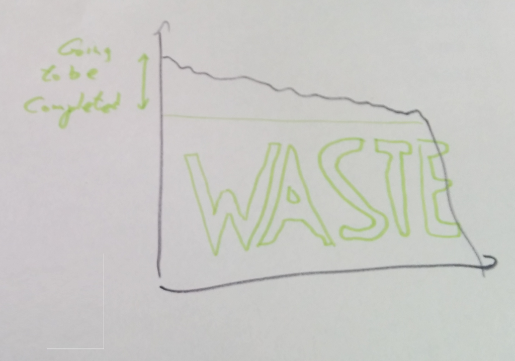 We can see that the team is over-committing, because the trend line never reaches its target point. That drop to the right, is where the team throws stories off the side of the ship to save the sprint. Pushing the stories to the next sprint may cause that trend line to hit the target point, but everybody knows that’s putting lipstick on a pig. Right?
Let’s look at the bottom part. That’s the one with WASTE title.
Part of this work was actually done, but the stories were not completed. You can say that work was investment towards the next sprint, and sometimes you would be right. In many cases, though, work on this non-completed stories was done instead of helping other team members to complete other stories. Instead of completing one (maybe even two) out of three stories by swarming, the team didn’t get any completed.
That’s not the only waste though: Every story that was planned for the iteration was prepared and discussed, most of them by several people. Since the stories were not completed, it is destined to be discussed again (and maybe again, depending on the ability of the team to complete it next time). All these re-digested discussions are waste. That time can be better used to work on stories that can be completed.
The Chart Speaketh The Truth
Ok, that’s reality. The chart doesn’t lie.
Can we do something better?
What we can do is plan to our capacity: We can stop planning when we filled the “going to be completed” stories. If the chart looks like this for every iteration, we’re wasting all time on that waste time. Just stop planning when you reached that capacity. Assuming we’re working according to priority, the top stories would complete, and there’s probably some additional work that’s going to be done too. Either that, or invest the slack in learning and improving, so the team can increase their capacity in the future.
A burn-down chart has value beyond projecting progress done on estimates. We just need to understand the story it’s trying to tell us.
And what about those estimates? Are they useful at all?
| Reference: | Burning Down The House–Agile Remix from our JCG partner Gil Zilberfeld at the Geek Out of Water blog. |