In 2007, Steve Jobs launched the first iPhone, which revolutionized the world. But because of that, many businesses dealt with the problem of changing the layout of websites from desktop to mobile by delivering completely different mobile-compatible websites under the subdomain of ‘m’ (e.g., https://m.facebook.com). And we were all trying to figure out how to work in this new world of contending with mobile and desktop screen sizes.
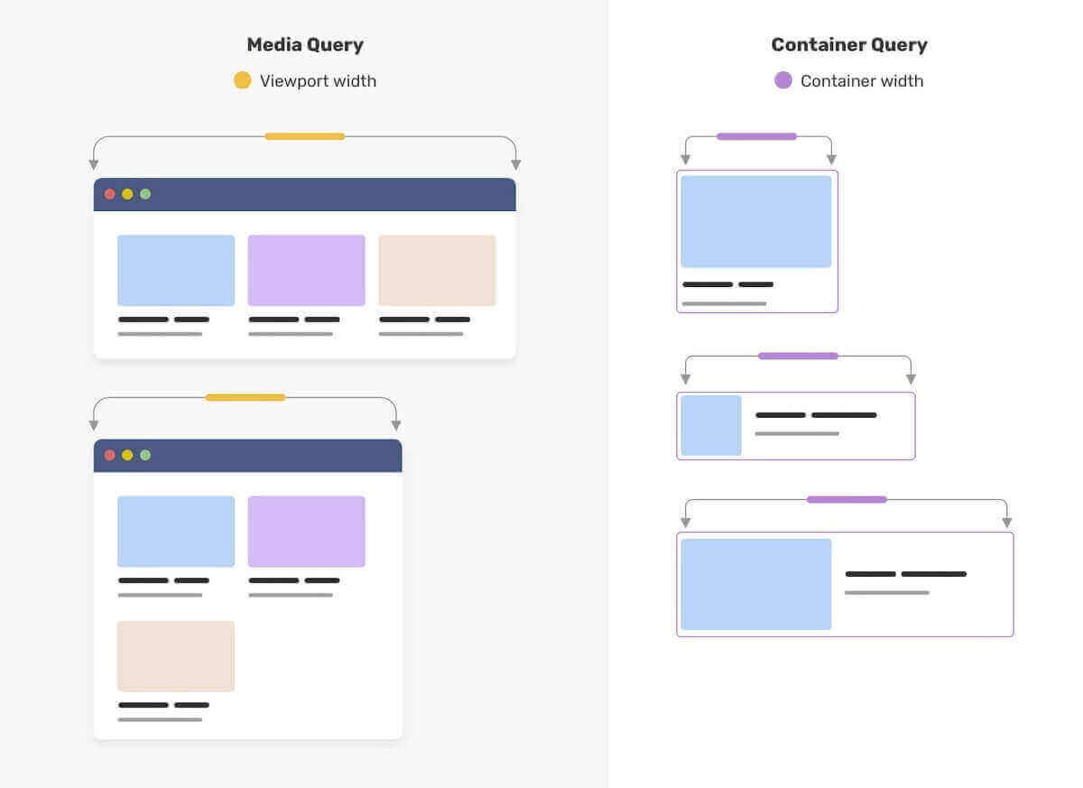
But after a few years, in 2010, Ethan Marcotte introduced the concept of Responsive Design. Responsive Web Design is the idea that design and development should respond to the user’s behavior and environment based on the screen size, device, and orientation. And central to that idea was the availability of CSS Media Query, which allowed setting various layout rules depending on the size of the viewport.
The responsive design opened up many more layout solutions with the help of Media Query. Frameworks like Bootstrap rose in popularity due to providing responsive grid systems. As per W3Techs, Bootstrap is used by 19.3% of all websites, with a market share of 79.5%.
Nowadays, component libraries (ReactJS) have gained popularity because of its ‘build once, deploy anywhere’ nature. A component is built once and can be used anywhere in the layout to make complex interfaces more efficient. And those components come together to create a webpage.
Currently, you can only change the webpage layout with respect to the viewport using Media Query. But when writing media queries for UI elements, we are trying to find a “magic” viewport value for a breakpoint like 320px – 480px for mobile devices, 481px – 768px for tablets/iPads, 769px – 1024px for small laptops and 1025px – 1200px for big screen laptops/pc, so that the target element has minimum dimensions, and the layout doesn’t break. This value usually differs from the viewport dimension and leads to bugs when the inner container’s dimension or layout changes.
This is one of the issues that CSS Container Queries attempt to fix. CSS Container Queries extend existing media query functionality with queries that depend on the target element dimensions. And in this blog, we will dive deep into the concept of CSS Container Queries.
Getting Started with CSS Container Queries
The most important thing to know about CSS Container Queries is that “containers” are the elements being queried, but rules within the CSS Container Queries affect only the descendants of the container. In other words, you may define the ‘body’ element, ‘ main’ element, or perhaps event list items. Then, CSS Container Queries will allow defining rules for how elements within those change across container sizes.
CSS Container Queries are not as straightforward as regular media queries. You’ll have to add the container property to the parent UI element to make CSS Container Queries work, but there’s a reason, and we’ll cover that next.

Browser Support
CSS Container Queries are by default enabled in Chrome (the latest version). For smooth and better performance, you can install the latest browser.
Note: If you are not using the above-recommended browser, the following CodePens might not work. So an image showcasing the intended working example will be provided alongside the CodePens demo.
Contain Property
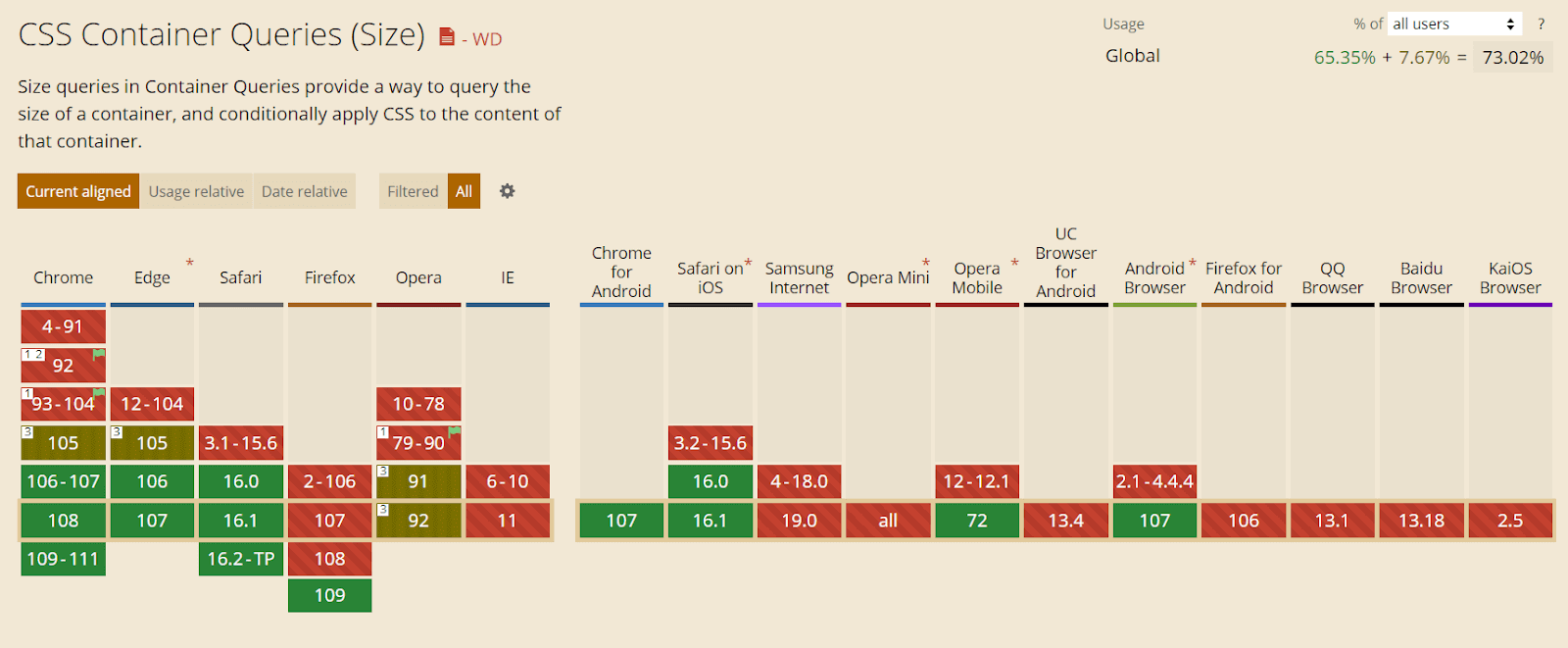
CSS contain property has been added to most modern browsers and has a decent 90% browser support when writing this article.
The contain property is mainly used for performance optimization by hinting to the browser which parts of the page can be treated as independent and won’t affect the other elements of the page. If a change occurs in a single element, the browser will re-render only that part instead of the whole page. With contain property values, we can specify which types of containment we want to use – layout, size, paint, Content, or none.
The level 3 draft specification adds the inline-size and block-size keywords to contain. In addition, the draft specification proposes some new properties:
- Container-type
Defines an element as a query container. Descendants can query aspects of its sizing, layout, and state.
- Container-name
Specifies a list of query container names for @container rules to filter which query containers are targeted.
- Container
A shorthand property to set both container-type and container-name.
Container-Type
It assigns a query container to an element. Depending on the value, descendants can query aspects of its size, layout, style, and state of the object. This helps to make setting the contain property easier with arguments that combine different properties.
The container type property can have the following values:
- Size: Creates a query container that supports dimensional queries on both the inline and block axis.
- Inline-size: Creates a query container that supports dimensional queries on the inline axis.
- Block-size: Creates a query container that supports dimensional queries on the block axis.
- Style: Allows for style queries by defining a query container.
- State: Allows for state queries by defining a query container.
Size, Inline-size, and Block-size are also given layout, size, and style containment.
But what does the CSS Contain property used for optimization have to do with CSS Container Queries? For CSS Container Queries to work, the browser must know if a change occurs in the element’s children layout. It should re-render only that component. The browser will know to apply the code in the container query to the matching component when the component is rendered or the dimension of the container changes.
Let’s have a look at contain property with a small code example.
HTML :
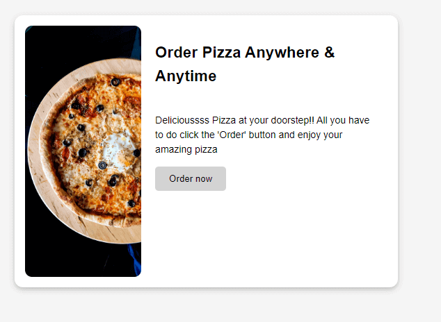
<div class="wrapper">
    <div class="container">
      <article class="card">
        <header>
          <h3 class='header'>
            Order Pizza Anywhere & Anytime
          </h3>
        </header>

        <div class="image"><img src="https://i.imgur.com/OzPVEvW.jpg" alt="a pizza"></div>

        <div class="Content">
          <p class='para'>Delicioussss Pizza at your doorstep!! All you have to do click the 'Order' button and enjoy your amazing pizza </p>
          <button class='btn'>Order now</button>
        </div>

      </article>
    </div>
CSS :
* {
          box-sizing: border-box;
        }

        img {
          max-width: 100%;
          height: 100;
          display: block;
        }

        body {
          font: 1.2rem Roboto, sans-serif;
          background: whitesmoke;
          line-height: 1.5;
        }

        .wrapper {
          padding: 20px;
          display: grid;
          grid-template-columns: 2fr 1fr;
          gap: 20px;
        }

        .card {
          background: white;
          box-shadow: rgba(0, 0, 0, 0.24) 0px 3px 8px;
          border-radius: 12px;
          display: grid;
          overflow: hidden;
          padding: 15px;
        }

        .card .image {
          border-radius: 10px;
        }

        .image > img {
          border-radius: 10px;
        }

        .card .Content {
          padding: 10px;
        }

        .para {
          font-size: 14px;
        }

        .btn {
          cursor: pointer;
          color: black;
          background: lightgray;
          padding: 10px 20px;
          border-radius: 5px;
          border: none;
        }

        .btn:hover {
          background: gray;
          color: white;
        }

        .card h2 {
          margin: 0;
          padding: 10px;
        }

        .container {
          container-type: inline-size;
        }

        @container (min-width: 500px) {
          .card {
            grid-template-columns: 1fr 2fr;
            grid-template-rows: auto 1fr;
            align-items: start;
            column-gap: 20px;
          }

          .card h2 {
            padding: 0;
            margin: 0.5em 0 0 0;
          }

          .card header {
            grid-row: 1;
            grid-column: 2;
          }

          .card .image {
            grid-row: 1 / 3;
            grid-column: 1;
          }

          .card .Content {
            grid-column: 2;
            grid-row: 2;
            padding: 0 20px 20px 0;
          }
        }
As we can see in the above code block, we are not adding the ‘container’ property to a more distant parent like ‘wrapper’ and keeping the container as close to the affected element as possible.
That is why we should correctly signal the browser about the change. Wrapping a distant parent element with a ‘container’ property can be counter-productive and negatively affect page performance. In worst-case scenarios of misusing the ‘container’ property, the layout may break, and the browser won’t render it correctly.
That’s all for now about the ‘container’ property. Now let’s look at the CSS Container Queries and how they work.
Test CSS Container Queries on 50+ different viewports. Try LambdaTest Now!
What are CSS Container Queries?
A Container (also called a Wrapper) is an element that contains another element(s). So in simple terms, CSS Container queries specify changes to an element in relation to its parent container or element rather than the entire viewport.
(Desktop – 1084px)
(Mobile – 386px)
When a component is placed within an item, it’s contained within it. That means we can query the width of its parent and modify the component based on that. CSS Container Queries enable developers to approach responsiveness from a component standpoint, where elements on a page are designed to be responsive as individual units. This means that regardless of where these elements are placed on the page, they will adjust based on the parent element’s size rather than the entire page’s size.
After the container property has been added to the card element wrapper in the above code example, we can write a container query. We’ve added a container property to an element with a container class, so now we can include any of its child elements in a container query.
\    .container {
          container-type: inline-size;
        }
Just like a regular media query, we need to define a query using min-width or max-width properties and nest all selectors inside the block. However, we’ll use the @container keyword instead of @media to define a container query.
 @container (min-width: 500px) {
          .card {
            grid-template-columns: 1fr 2fr;
            grid-template-rows: auto 1fr;
            align-items: start;
            column-gap: 20px;
          }

          .card h2 {
            padding: 0;
            margin: 0.5em 0 0 0;
          }

          .card header {
            grid-row: 1;
            grid-column: 2;
          }

          .card .image {
            grid-row: 1 / 3;
            grid-column: 1;
          }

          .card .Content {
            grid-column: 2;
            grid-row: 2;
            padding: 0 20px 20px 0;
          }
        }
See the Pen Demo 1 by Aman Mandal (@aman-mandal) on CodePen.

CSS Container Queries provide a new and refreshing approach to responsiveness. However, it is by no means a replacement for media queries. Instead, consider it a cool new addition to the developer’s responsive toolbox.
What problems do CSS Container Queries solve?
CSS Container Queries offer a unique solution for developers working on large-scale projects where different components make up different parts of the webpage. They allow components to modify their appearance to fit the context in which they’re put. This means that the components can be used repeatedly, making them reusable.
Many websites have components that need to change their layout based on the container’s available width. This may not always be related to the viewport’s size but to where the component is placed in the layout. CSS Container Queries provide a solution for developers to change component style and layout depending on the available width of the container or parent element.
Here’s a proper example so that we can see the power of container queries:
HTML:
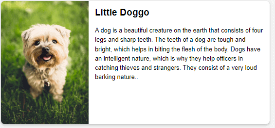
<div class="wrapper">
    <div class="left">
      <article class="card">
        <header>
          <h2>Little Doggo</h2>
        </header>

        <div class="image"><img src="https://i.imgur.com/0l8iHZD.jpg" alt="a little puppy in the grass"></div>

        <div class="Content">
          <p>A dog is a beautiful creature on the earth that consists of four legs and sharp teeth. The teeth of a dog are tough and bright, which helps in biting the flesh of the body. Dogs have an intelligent nature, which is why they help officers in catching thieves and strangers. They consist of a very loud barking nature..  </p>
        </div>

      </article>
    </div>
    <div class="right">
    <article class="card">
        <header>
          <h2>Little Doggo</h2>
        </header>

        <div class="image"><img src="https://i.imgur.com/0l8iHZD.jpg" alt="a little puppy in the grass"></div>

        <div class="Content">
          <p>A dog is a beautiful creature on the earth that consists of four legs and sharp teeth. The teeth of a dog are tough and bright, which helps in biting the flesh of the body. Dogs have an intelligent nature, which is why they help officers in catching thieves and strangers. They consist of a very loud barking nature.. </p>
        </div>

      </article>
    </div>
  </div>
CSS :
* {
  box-sizing: border-box;
}

img {
  max-width: 100%;
  display: block;
}

body {
  font: 1em Roboto, sans-serif;
  background: whitesmoke;
}

.wrapper {
  display: grid;
  grid-template-columns: 2fr 1fr;
  gap:20px;
}

.card {
  background: white;
  box-shadow: rgba(0, 0, 0, 0.24) 0px 3px 8px;
  border-radius: 12px;
  display: grid;
  overflow: hidden;
}

.card .image {
/*   border: 10px solid #000; */
  border-radius: 10px;
}

.card .Content {
  padding: 10px;
}

.card h2 {
  margin: 0;
  padding: 10px;
}

/* make the two grid items a containment context */
.left,
.right{
  container-type: inline-size;
}

@container (min-width: 500px) {
  .card {
    grid-template-columns: 1fr 2fr;
    grid-template-rows: auto 1fr;
    align-items: start;
    column-gap: 20px;
  }

  .card h2 {
    padding: 0;
    margin: .5em 0 0 0;
  }

  .card header {
    grid-row: 1;
    grid-column: 2;
  }

  .card .image {
    grid-row: 1 / 3;
    grid-column: 1;
  }

  .card .Content {
    grid-column: 2;
    grid-row: 2;
    padding: 0 20px 20px 0;
  }
}
See the Pen Container-Query demo by Aman Mandal (@aman-mandal) on CodePen.
Note: View this example in Chrome Canary with container queries enabled.
For those who aren’t using Chrome canary, here are the output images at different container sizes.
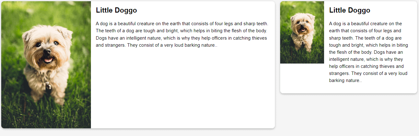

We created a simple card that resizes and adapts to fit any layout and container in our example. Our one container has a width of ⅔ and the other one of ⅓. This means our card component will have a width of 1066px and 534px at a viewport width of 1600px.
We want our container to look slightly different at different breakpoints depending on its available space while remaining responsive. We could do this with a media query, but to do that, we’d have to make changes regarding the viewports meta-information rather than the container itself. This means we must constantly watch for changes to the screen size and adjust our components according to that particular size.
Although this might not seem like an issue, it could quickly lead to the use of too many media queries to target if we had multiple containers because we would need to make sure all elements on the page, not just the card component, are responsive.
This is where CSS Container Queries come into play. Let’s go over our above code example again and see how we can turn this into a container:
We want our container to look slightly different at different breakpoints depending on its available space while remaining responsive. We could do this with a media query, but to do that, we’d have to make changes regarding the viewports meta-information rather than the container itself. This means we must constantly watch for changes to the screen size and adjust our components according to that particular size.
<div class="wrapper">
    <div class="left">
      <article class="card">
       <!-- Card Content -->
      </article>
To query elements, we first need to make the parent element a container by setting the container property on the parent element. The container property takes two values: container-type and container-name.
Notice how the element with the .card class is wrapped by a parent element? This would be our parent container, and our card would adjust its size, layout, and styles based on the meta information of this element.
Let’s go ahead and make our element with the left class a container, so its children elements can be queried based on its meta-information.
.left{
  container: inline-size;
}
We set the container property to inline-size because we want containment to happen on the inline axis.
The container property and value are set on our .left class, which automatically turns the container element into a queryable container. So now, we can change the card element whenever the size of our container element changes.
We can change the style or layout of our card element at certain breakpoints. We can set these breakpoints similarly to how media queries breakpoints are set. You can learn more about it by going through our blog on CSS breakpoints.
Let’s look at the breakpoints we put in the above example to see how CSS Container Queries handle changes based on our breakpoints and how CSS Container Queries compare to media queries.
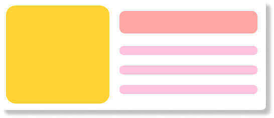
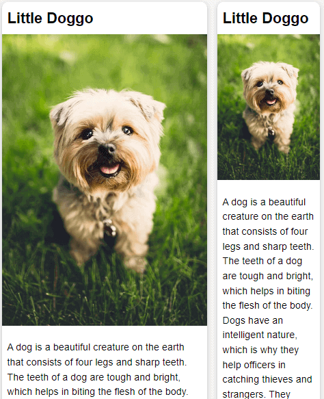
In our example, we started by building out how our card component would look when its parent container has the smallest width, which is any width less than 500px. We want it to look like this:

This would be our starting point for our card component. Since its parent container is now a container that can be queried, we can go ahead and start making changes to the layout and style at different breakpoints depending on the current width of the parent container.
We do that by setting breakpoints. Our breakpoint is when our parent container is at a min-width of 500px (500px or greater), and we start defining a new look for our card container. Here we want our container to look like this:
Code Example:
@container (min-width: 500px) {
    .card {
      grid-template-columns: 1fr 2fr;
      grid-template-rows: auto 1fr;
      align-items: start;
      column-gap: 20px;
    }

    .card h2 {
      padding: 0;
      margin: .5em 0 0 0;
    }

    .card header {
      grid-row: 1;
      grid-column: 2;
    }

    .card .image {
      grid-row: 1 / 3;
      grid-column: 1;
    }

    .card .Content {
      grid-column: 2;
      grid-row: 2;
      padding: 0 20px 20px 0;
    }
  }
If we want our card element to look slightly different at another breakpoint, we can simply follow the same process for every new breakpoint.
CSS Container Queries enable us to create more robust and reusable UI components that can adapt to nearly any layout and container, as shown in the above two examples. This would’ve been a lot more difficult with media query because it relies on the information of the entire viewport.
With container queries, the card component could be placed in a narrow or wide column on the webpage and still look good and responsive. Furthermore, if there is enough space in our container queries example, it displays as a two-column layout, otherwise, it has a block layout.
In our example above, container queries helped us achieve this:-
A block layout for smaller sections of the webpage:

A two-column layout for when we have more space:
The examples above show the power of CSS Container Queries and how vital they are in the component-driven development world. Now that we have a basic understanding of CSS Container Queries and how they function, let’s look at a more detailed code example.
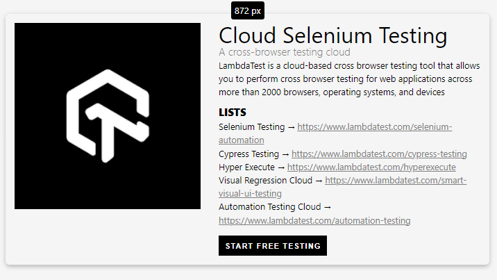
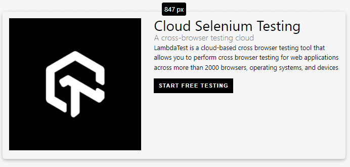
HTML:
<div class="page-container">
  <div class="card-container card-1" data-size="0">
    <div class="card">
      <figure>
        <img src="lamdatest.png" />
      </figure>
      <div>
        <div class="meta">
          <h2>Cloud Selenium Testing</h2>
          <span class="subtitle">A cross-browser testing platform</span>
        </div>

        <div class="notes">
          <p class="desc">
            In this episode we narrow our focus on user-preference-based media
            queries, which enable you to create personalized experiences based
            on your users custom settings and needs.
          </p>
          <div class="links">
            <h3>Lists</h3>
            <ul>
              <li>
                Selenium Testing →
                <a href="#">https://www.lambdatest.com/selenium-automation</a>
              </li>
              <li>
                Cypress Testing →
                <a href="#">https://www.lambdatest.com/cypress-testing</a>
              </li>
              <li>
                Hyper Execute<a href="#"
                  >https://www.lambdatest.com/hyperexecute</a
                >
              </li>
              <li>
                Visual Regression Cloud
                <a href="#"
                  >https://www.lambdatest.com/smart-visual-ui-testing</a
                >
              </li>
              <li>
                Automation Testing Cloud<a href="#"
                  >https://www.lambdatest.com/automation-testing</a
                >
              </li>
            </ul>
          </div>
        </div>

        <button>Start Free Testing</button>
      </div>
    </div>
  </div>
  <div class="card-container card-2" data-size="0">
    <div class="card">
      <figure>
        <img src="lamdatest.png" />
      </figure>
      <div>
        <div class="meta">
          <h2>Cloud Selenium Testing</h2>
          <span class="subtitle">A cross-browser testing cloud</span>
        </div>

        <div class="notes">
          <p class="desc">
            LambdaTest is a cloud-based cross browser testing tool that allows
            you to perform cross browser testing for web applications across
            more than 2000 browsers, operating systems, and devices
          </p>
          <div class="links">
            <h3>Lists</h3>
            <ul>
              <li>
                Selenium Testing →
                <a href="#">https://www.lambdatest.com/selenium-automation</a>
              </li>
              <li>
                Cypress Testing →
                <a href="#">https://www.lambdatest.com/cypress-testing</a>
              </li>
              <li>
                Hyper Execute →
                <a href="#">https://www.lambdatest.com/hyperexecute</a>
              </li>
              <li>
                Visual Regression Cloud →
                <a href="#"
                  >https://www.lambdatest.com/smart-visual-ui-testing</a
                >
              </li>
              <li>
                Automation Testing Cloud →
                <a href="#">https://www.lambdatest.com/automation-testing</a>
              </li>
            </ul>
          </div>
        </div>

        <button>Start Free Testing</button>
      </div>
    </div>
  </div>
</div>
CSS:
body {
  font-family: "Google Sans", system-ui, serif;
  line-height: 1.5;
  padding: 2rem 1rem;
  background: whitesmoke;
}

.page-container {
  display: grid;
  grid-template-columns: 35% 1fr;
  gap: 1rem;
}

img {
  width: 100%;
}

.card {
  display: grid;
  grid-template-columns: 40% auto;
  gap: 2rem;
  margin: 0 auto;
  box-shadow: rgba(0, 0, 0, 0.24) 0px 3px 8px;
  padding: 1rem;
  border-radius: 7px;
}

.card-container:before {
  Content: attr(data-size);
  position: absolute;
  padding: 4px;
  left: 0;
  right: 0;
  top: -1.4rem;
  width: 6ch;
  margin: 0 auto;
  text-align: center;
  display: inline-block;
  border-radius: 4px;
  background: black;
  color: white;
}

h2 {
  font-size: 2.5rem;
  font-weight: 400;
  line-height: 1;
}

h3 {
  font-size: 1.15rem;
  font-weight: 800;
  text-transform: uppercase;
  margin: 1rem 0 0.25rem;
  line-height: 1;
}

a {
  color: gray;
}

a:hover {
  color: black;
}

.subtitle {
  font-size: 1.2rem;
  line-height: 1.2;
  font-weight: 300;
  color: gray;
}

button {
  border: none;
  padding: 0.7rem;
  background: black;
  color: white;
  font-weight: 600;
  letter-spacing: 0.1rem;
  text-transform: uppercase;
  margin-top: 1rem;
}

/* Container Queries */

.card-container {
  container-type: inline-size;
}

@container (max-width: 850px) {
  .links {
    display: none;
  }

  .subtitle {
    font-size: 1.25rem;
  }

  h2 {
    font-size: 2.2rem;
  }
}

@container (max-width: 650px) {
  .desc {
    display: none;
  }

  h2 {
    font-size: 2rem;
  }

  .card {
    gap: 1rem;
  }
}

@container (max-width: 460px) {
  .card {
    grid-template-columns: 1fr;
    text-align: center;
    gap: 0.5rem;
  }

  button {
    display: block;
    margin: 1rem auto 0;
  }
}

@container (max-width: 300px) {
  h2 {
    font-size: 1.5rem;
  }

  .subtitle {
    display: none;
  }
}
See the Pen Component Query Card Demo by Aman Mandal (@aman-mandal)on CodePen.
We created two similar card components that can resize and adapt to fit in any container by using the CSS Container Queries. Now, we want our container to look slightly different at different breakpoints depending on its available space while remaining responsive. So as we can see in the above CSS code, we added 4 different breakpoints for four different layouts. Let’s have a look at them:
-
- For containers more than 850px:
-
- For containers less than 850px :
-
- For containers less than 650px:
-
- For containers less than 460px:
-
- For containers less than 300px:

As we’ve seen from the previous examples, CSS Container Queries are best used for highly reusable components with a layout that depends on the available container space and that can be used in various contexts and added to different containers on the page.
It’s a Wrap!
Once the spec has been implemented and widely supported by browsers, CSS Container Queries might become a game-changing feature. CSS Container Queries are an impending approach for moving beyond media queries tied to the viewport. For many years, developers have desired the ability to change an element’s width based on its container’s width. Therefore, it is only logical that elements have a way to be responsive based on their parent’s container meta information rather than the entire viewport.
As it stands, CSS Container Queries are still in an early experimental phase, and the implementation is prone to change. We hope to see the final draft specifications for this feature soon so we can all start using it. Until then, keep experimenting !!
Thank you for reading.
|
Published on Java Code Geeks with permission by Aman Mandal, partner at our JCG program. See the original article here: A Complete Guide To CSS Container Queries Opinions expressed by Java Code Geeks contributors are their own. |