What is the best way to plot memory and CPU usage data (mainly) in Clojure? I will compare gnuplot, Incanter with JFreeChart, and vega-lite (via Oz). (Spoiler: I like Oz/vega-lite most but still use Incanter to prepare the data.)
The data looks like this:
;; sec.ns | memory | CPU %
1541052937.882172509 59m 0.0
1541052981.122419892 78m 58.0
1541052981.625876498 199m 85.9
1541053011.489811184 1.2g 101.8
The data has been produced by monitor-usage.sh.
The tools
Gnuplot 5
Gnuplot is the simplest, with a lot available out of the box. But it is also somewhat archaic and little flexible.
Here is the code:
#!/usr/bin/env gnuplot --persist -c
# Plot memory and CPU usage over time. Usage:
#  usage-plot.gp <input file> [<output .png file>]
# where the input file has the columns `<unix time> <memory, with m/g suffix> <% cpu>`
# To create the input file, see https://gist.github.com/jakubholynet/931a3441982c833f5f8fcdcf54d05c91

# Arguments:
infile=ARG1
outfile=ARG2
set term x11
set title 'Memory, CPU usage from' . infile
set xdata time
set timefmt "%s"
set xlabel "Time [[hh:]mm:ss]"
set ylabel "Memory usage"
set format y '%.1s%cB'

set y2label 'CPU usage'
set format y2 '%.0s%%'
set y2tics nomirror
set tics out
set autoscale y
set autoscale y2

# Credit: Christoph @ https://stackoverflow.com/a/52822256/204205
resolveUnit(s)=(pos=strstrt("kmgtp",s[strlen(s):*]), real(s)*(1024**pos))

if (exists("outfile") && strlen(outfile) > 0) {
    print "Outputting to the file ", outfile
    set term png # 640,480
    set output outfile
}

# Styling
set style line 1 linewidth 2 linecolor 'blue'
set style line 2 linecolor 'light-green'
#set xtics font ", 10"
set tics font ", 10"
set xtics rotate 60 # put label every 60s, make vertical so they don't clash in .png if too many

plot infile u 1:3 with lp axes x1y2 title "cpu" linestyle 2, \
    infile using 1:(resolveUnit(stringcolumn(2))) with linespoints title "memory" linestyle 1
And here is an example output:
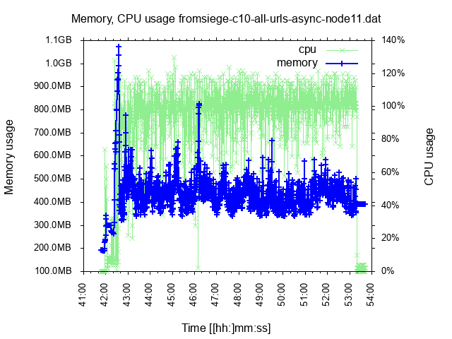
Pros: Feature-rich (support bytes axis, two Y axes, reading data).
Cons: Archaic language, less flexible; I couldn’t stop it from drawing X labels over each other when I had data for a longer period.
Incanter (JFreeChart)
Incanter is (was?) the go to tool for data analysis in Clojure and it includes the Java library JFreeChart for charting. There has been some development lately (integrating clojure.core.matrix) but otherwise it is quite stagnating. That’s why there have been newer community efforts.
Here is the first part of the code, that prepares the data for charting (also used for Oz):
(ns clj-charting.usage-chart-preparation
  (:require
    [incanter.core :refer :all]
    [incanter.stats :as s]
    [incanter.io :as io]))

(defn- resolve-unit-suffix
  "Replace values such as 333k, 800m, 1.2g with the corresponding value in bytes"
  [val-suffixed]
  (if-let [[_ val unit] (and
                          (string? val-suffixed)
                          (re-find #"(\d+)([kmg])" val-suffixed))]
    (let [order (case unit
                  "k" 1
                  "m" 2
                  "g" 3)
          scale (apply * (take order (repeat 1024)))]
      (* (Integer/parseInt val) scale))))

(defn read-usage-data
  "Read usage data in the form `sec.ns memory_with_scale_suffix CPU_percentage` into a dataset with
   `ms memory_in_bytes CPU_percentage`"
  [file]
  (let [data (io/read-dataset
               file
               :delim \space)]
    (-> data
        ;; Memory: from 300m or 1g to a number:
        (transform-col
          :col1
          resolve-unit-suffix)
        ;; CPU: From <sec>.<nano> to <ms>:
        (transform-col
          :col0
          #(long (* 1000 %))))))

(defn moving-window-means
  "Given very scattered data, produce a similar sequence of 'moving window mean' where we
   replace each point by the mean of it and the preceding/following `radius` points.
   "
  [radius col]
  (let [x' (concat (repeat radius nil) col)
        parts (drop-last radius (partition (inc (* 2 radius)) 1 x'))
        means (map #(-> (remove nil? %) s/mean long)
                   parts)]
    means))
And here is the code to format the chart (the most difficult part was to display kB / MB / GB values on the axis in a nice way; I really missed Gnuplot’s out-of-the-box support here):
(ns clj-charting.incanter
(:require
[incanter.core :refer :all]
[incanter.charts :refer :all]
[clj-charting.usage-chart-preparation :refer [read-usage-data moving-window-means]])
(:import
[org.jfree.chart JFreeChart]
[org.jfree.chart.plot XYPlot]
(org.jfree.chart.axis ValueAxis NumberAxis NumberTickUnit TickUnitSource TickUnit)
(java.text NumberFormat DecimalFormat FieldPosition)))
(defn merge-y-axis
"Merge the Y axis of two line / time series charts. The former chart will have
the left Y axis, and the latter will have the right. Incanter does not support 2 Y
axes out of the box.
Source: https://matthewdowney.github.io/clojure-incanter-plot-multiple-y-axis.html"
[^JFreeChart chart ^JFreeChart chart-to-merge]
(let [^XYPlot plot (.getPlot chart-to-merge)]
(doto ^XYPlot (.getPlot chart)
(.setRangeAxis 1 (.getRangeAxis plot))
(.setDataset 1 (.getDataset plot))
(.mapDatasetToRangeAxis 1 1)
(.setRenderer 1 (.getRenderer plot)))
(-> (.getPlot chart)
(.getLegendItems)
(.addAll (.getLegendItems plot)))
chart))
(defn byte-scale
"For the given number [in bytes] return [scale, scale suffix] so that we can divide it
by the scale and display with the corresponding suffix.
Example: 2333 -> [1024 \"kB\"]"
[num]
(let [k 1024
m (int (Math/pow 1024 2))
g (int (Math/pow 1024 3))]
(condp <= num
g [g "GB"]
m [m "MB"]
k [k "kB"]
[1 ""])))
(defn format-bytes
"For the given number [in bytes] return [the number scaled down, the scale suffix such as \"kB\"].
Example: 2333 -> [2.278 \"kB\"]"
[num]
(let [[scale unit] (byte-scale num)]
[(/ num scale) unit]))
;; Instance of NumberFormat that displays a byte number scaled down and with the scale suffix
;; Example: 2333 -> \"2.3kB\"]"
(def byteFmt (let [dec-fmt (java.text.DecimalFormat. "#.#")]
(proxy [java.text.NumberFormat] []
(format [^double number, ^StringBuffer toAppendTo, ^FieldPosition pos]
(let [[n u] (format-bytes number)]
(.append
(.format dec-fmt n toAppendTo pos)
u))))))
(defn nearest-byte-tick
"For the given byte number, find out what tick to show on the axis;
e.g. we would rather see a tick such as '800MB' than '783.5MB' on it."
([^double size tick-fn]
(let [[scale] (byte-scale size)]
(NumberTickUnit.
(* scale
;; FIXME if size = 1000 upgrade to 1024
(.getSize
(tick-fn
(NumberTickUnit. (/ size scale)))))
byteFmt))))
(def byte-tick-source
"TickUnitSource suitable for byte values spanning multiple of kB - MB - GB"
;; TODO Instead of reusing IntegerTickUnits, reimplement it to support powers of 2
(let [int-tick-units (NumberAxis/createIntegerTickUnits)]
(reify
TickUnitSource
(^TickUnit getLargerTickUnit [_ ^TickUnit unit]
(nearest-byte-tick
(.getSize unit)
#(.getLargerTickUnit int-tick-units %)))
(^TickUnit getCeilingTickUnit [me ^TickUnit unit]
(.getCeilingTickUnit me (.getSize unit)))
(^TickUnit getCeilingTickUnit [_ ^double size]
(nearest-byte-tick
size
#(.getCeilingTickUnit int-tick-units %))))))
(defn set-bytes-tick-unit [^JFreeChart chart]
(let [^XYPlot plot (.getPlot chart)
^NumberAxis axis (.getRangeAxis plot)]
(.setStandardTickUnits axis byte-tick-source)
chart))
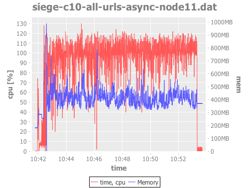
(defn plot-usage [file]
(let [data (read-usage-data file)
time (sel data :cols 0)
mem (sel data :cols 1)
cpu (sel data :cols 2)]
(->
(time-series-plot time cpu :title file :y-label "cpu [%]" :legend true)
(add-lines time (moving-window-means 60 cpu) :series-label "cpu (mean)")
(merge-y-axis
(set-bytes-tick-unit
(time-series-plot time mem :series-label "Memory")))
(view))))
(plot-usage "siege-c10-all-urls-async-node11.dat")That is quite insane amount of work, huh? And the result:
vega-lite via Oz
Vega and Vega-lite visualization grammars: Vega is a declarative format for creating, saving, and sharing visualization designs. With Vega, visualizations are described in JSON, and generate interactive views using either HTML5 Canvas or SVG.
Vega-lite (and Vega) is the new kid on the block. It has learned a lot from D3 and R’s ggplot2 and is intended for data exploration, interactive charts, and making it possible to combine multiple charts on the same page – while making this as simple as possible. It is based on the Grammar of Graphics so it is presumabely well thought-through.
Oz is a thin wrapper around vega/vega-lite that makes it possible to interact with the browser from Clojure REPL, with Clojure data.
(Note: Oz currently uses VL v2.6 while the latest VL is v3rc8, which fixes some limitations in v2.)
As mentioned above, we use the same usage-chart-preparation.clj as the pure-Incanter example to prepare the data for charting. Then, to plot them:
(ns clj-charting.oz
  (:require
    [oz.core :as oz]
    [incanter.core :refer :all]
    [clj-charting.usage-chart-preparation :refer [read-usage-data moving-window-means]]))

(defn dataset->map-list
  "Incanter dataset into a list of maps like
   {\"0\" 1541065398391, \"1\" 446693376, \"2\" 99.9, \"cpu_mean\" 89}"
  [ds]
  (let [rows (to-list ds)
        means (moving-window-means 60 (sel ds :cols 2))]
    (map
      #(assoc
         (zipmap (map str (range)) %1)
         "cpu_mean" %2)
      rows
      means)))

;;;;;;;;;;;;;;;;;;;;;;;;;;;;;;;;;;;;;;;;;;;;;;;;;;;;;;;;;;;;;;;;;;;;;;;;;;;;;;;;;;;;;;;;;;;;;;;;;;;;;;;;;;;;;;;;

(def gb4 (* 3 1024 1024 1024))

;; TODO Display legend - IMPOSSIBLE :-( until Datum
(def line-plot
  (let [data (dataset->map-list (read-usage-data "siege-c10-all-urls-async-node11.dat"))
        x-enc {:field "0"
               :type "temporal"
               :timeUnit "hoursminutesseconds" ; :aggregate "mean" l <- this kills points with same value
               :axis {:title "Time"}
               :scale {:zero false}}]
    {:width 700
     :data {:values data}

     ;;; ?? requires VL v3 until then we have to compute cpu_mean using Incanter
     ;:transform [{:window [{:op "mean"
     ;                       :field "1"
     ;                       :as "cpu_mean"}]
     ;             :frame [-10, 10]}]
     ; TODO VLv3: use this ?? instead of repeating the X on each plot
     ;:encoding {:x x-enc}
     :layer [{:mark {:type "line"
                     :clip true
                     :color "red"}
              :encoding {:x x-enc
                         :y {:field "1"
                             :type "quantitative"
                             :axis {:format ".1s" :title "Memory" :labelColor "red" #_"required VL 3"}
                             :scale {:domain [0 gb4]}}}}
             {:layer [
                      {:mark {:type "point"
                              :clip true}
                       :encoding {:x x-enc
                                  :y {:field "2"
                                      :type "quantitative"
                                      :axis {:title "CPU [%]" :labelColor "blue"}}}}
                      {:mark {:type "line"
                              :clip true
                              :color "blue"}
                       :encoding {:x x-enc
                                  :y {:field "cpu_mean"
                                      :type "quantitative"
                                      :title nil
                                      :axis nil}}}]}]
     :resolve {:scale {:y "independent"}}}))

(oz/start-plot-server!)
(oz/v! line-plot)
It is more work than in Gnuplot but it provides more value and is much more powerful.
Here is the output (generated with VL v3 so the labels have the same color as the lines):
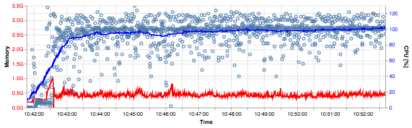
The awesome thing is that the chart and data can be encoded in an URL so that you can open in in the online Vega Editor and play with it.
Pros: Good and powerful design, modern, interactive, promising.
Cons: The community is very small so it is harder to get help, it isn’t so mature yet (e.g. it was impossible to add a legend to my multi-layer chart). You have to transform your data into JSON so it likely isn’t suitable for huge amounts of it.
Other options
Clojurewerkz/envision is “a small, easy to use Clojure library for data processing, cleanup and visualisation. [..] Main idea of this library is to make exploratory analysis more interactive and visual, although in programmer’s way.” ClojureWerkz is known for its commitment to project quality and maintenance so that is good, on the other hand the last code change has been 2 years ago.
Outside of Clojure, I would expect Python to have some very good charting libraries.
Conclusion
Nothing is optimal but vega-lite is very promising, I will continue to use it – and I will also still use Incanter to process and prepare the data.
| Published on Java Code Geeks with permission by Jakub Holy, partner at our JCG program. See the original article here: Clojure – comparison of gnuplot, Incanter, oz/vega-lite for plotting usage data Opinions expressed by Java Code Geeks contributors are their own. |