Material design is a set of rule built by google that guide how to develop an Android app. They can be applied not only on the Android app but also on web site design. In the process of development of an app, Android provides some libraries that help developers to implement the main material guide line rules. The most important libraries are:
- com.android.support:appcompat-v7:23.0.1
- com.android.support:design:23.0.1
After all, these two libraries are imported by default when a developer starts a new project using Android Studio.
One important aspect in an app is represented by color schema. Material design rules describes how to chose colours.
Let us suppose we create a simple Android project and let us follow the main step to implement a Android app following Material design rules.
Material design:Colours
The first step, is choosing the colour schema for our app. To this purpose there is a great website that can be used to create the colour schema according to material design rules.
After the colours are selected we can download colors.xml:
<resources>
    <color name="primary">#3F51B5</color>
    <color name="primary_dark">#303F9F</color>
    <color name="primary_light">#C5CAE9</color>
    <color name="accent">#03A9F4</color>
    <color name="primary_text">#212121</color>
    <color name="secondary_text">#727272</color>
    <color name="icons">#FFFFFF</color>
    <color name="divider">#B6B6B6</color>
</resources>
You can select the schema you like. The first result is shown in the picture below:
Now it is time to create our theme that uses the colours we selected before. The app should support the largest number of smart phones not only those running Lollipop or later.
For this reason it is necessary to create two themes one for the devices that run Android 5 or later and those that run pre-lollipop version.
So let us create two directory under values:
- style
- style-v21
The first one is used by all smart phones running pre-Lollipop version while the second folder is used by smart phones with OS starting from Lollipop.
In the first directory let us style.xml:
<resources>
    <style name="AppTheme" parent="Theme.AppCompat.Light.NoActionBar">
        <item name="colorPrimary">@color/primary</item>
        <item name="colorPrimaryDark">@color/primary_dark</item>
        <item name="colorAccent">@color/accent</item>
    </style>
    <style name="MyAppTheme" parent="@style/AppTheme" />
</resources>
while in the second directory we simply add:
<resources>
   <style name="MyAppTheme" parent="AppTheme">
     <item name="android:windowContentTransitions">true</item>
     <item name="android:windowAllowEnterTransitionOverlap">true</item>
     <item name="android:windowAllowReturnTransitionOverlap">true</item>
     <item name="android:windowSharedElementEnterTransition">@android:transition/move</item>
     <item name="android:windowSharedElementExitTransition">@android:transition/move</item>
  </style>
</resources>
Finally in the Manifest.xml modify the file:
<application
        android:theme="@style/MyAppTheme" >
        ...
   </application>
Android Toolbar
One of the most important component in developing an Android app is the Toolbar. The toolbar plays the role that was played before by Android action bar.The toolbar can be used to hold:
- Navigation button
- App tile and subtitle
- Action menu
- Brand logo
According to material design the Toolbar have the primary color we selected before. How to add it to Android app?
<RelativeLayout xmlns:android="http://schemas.android.com/apk/res/android"
    xmlns:tools="http://schemas.android.com/tools" android:layout_width="match_parent"
    android:layout_height="match_parent"
    tools:context=".MainActivity"
    android:id="@+id/layout">

   <include layout="@layout/toolbar" />

</RelativeLayout>
where toolbar layout is:
<android.support.v7.widget.Toolbar xmlns:android="http://schemas.android.com/apk/res/android"
xmlns:local="http://schemas.android.com/apk/res-auto"
android:id="@+id/toolbar"
android:layout_width="match_parent"
android:layout_height="?attr/actionBarSize"
android:background="@color/primary"
local:theme="@style/ThemeOverlay.AppCompat.Dark.ActionBar"
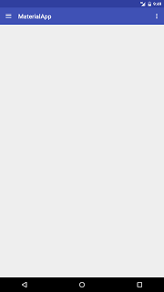
local:popupTheme="@style/ThemeOverlay.AppCompat.Light" />Notice at line 5 we set the default height of the toolbar using ?attr/actionBarSize and at line 6 the toolbar background.
In the activity it is necessary to set the toolbar:
@Override
protected void onCreate(Bundle savedInstanceState) {
   super.onCreate(savedInstanceState);
   setContentView(R.layout.activity_main);
   setToolBar();
}
...
private void setToolBar() {
    Toolbar tb = (Toolbar) findViewById(R.id.toolbar);
    setSupportActionBar(tb);
    ActionBar ab = getSupportActionBar();
    ab.setHomeAsUpIndicator(R.drawable.ic_menu_white_24dp);
    ab.setDisplayHomeAsUpEnabled(true);
}
Running the example we get:
Add action menu to Toolbar
Once the is configured correctly, it is possible to add action menu or menu items that appear on the Toolbar, to do it under res/menu add a file called main_menu.xml:
<?xml version="1.0" encoding="utf-8"?>
<menu xmlns:android="http://schemas.android.com/apk/res/android"
    xmlns:app="http://schemas.android.com/apk/res-auto">

    <item android:id="@+id/menu_settings"
          android:title="Settings"
          android:icon="@android:drawable/ic_menu_preferences"
          app:showAsAction="always"
          android:orderInCategory="100"/>

    <item android:id="@+id/menu_help"
        android:title="Help"
        android:icon="@android:drawable/ic_menu_help"
        app:showAsAction="ifRoom"
        android:orderInCategory="110" />

    <item android:id="@+id/menu_compass"
        android:title="Compass"
        android:icon="@android:drawable/ic_menu_compass"
        app:showAsAction="never"
        android:orderInCategory="105"/>

</menu>
Now in the activity there is:
@Override
public boolean onCreateOptionsMenu(Menu menu) {
  getMenuInflater().inflate(R.menu.main_menu, menu);
  return true;
}
Running the example the app looks like:
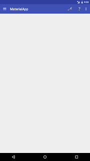
When user select one of this item the app should be detect it and take the right action, to do it it is necessary to override a method:
@Override
public boolean onOptionsItemSelected(MenuItem item) {
   int itemId = item.getItemId();
   String btnName = null;

   switch(itemId) {
     case R.id.menu_settings:
        btnName = "Settings";
        break;
     case R.id.menu_compass:
        btnName = "Compass";
        break;
    case R.id.menu_help:
        btnName = "Help";
        break;

  }

  Snackbar.make(layout, "Button " + btnName, Snackbar.LENGTH_SHORT).show();
  return true;
}
In this case we simply show a info message using a Snackbar.
Android Navigation drawer
Navigation drawer is one of the most import UI pattern introduced by Google in developing Android app. Navigation drawer is a side menu that helps to organise the navigation inside the app. It is a uniform way to access different pages and information inside the app. You can refer to official google page to know more. The implementation is very easy. The custom view that represents the navigation drawer must be the first element in the layout:
<?xml version="1.0" encoding="utf-8"?>
<android.support.v4.widget.DrawerLayout
xmlns:android="http://schemas.android.com/apk/res/android"
xmlns:app="http://schemas.android.com/apk/res-auto"
xmlns:tools="http://schemas.android.com/tools"
android:id="@+id/drawer_layout"
android:layout_width="match_parent"
android:layout_height="match_parent"
android:fitsSystemWindows="true"
tools:context=".MainActivity"
app:headerLayout="@layout/header">
<LinearLayout
android:layout_width="match_parent"
android:layout_height="match_parent"
android:orientation="vertical">
<include layout="@layout/toolbar" />
<!-- Let's add fragment -->
<FrameLayout
android:layout_width="match_parent"
android:layout_height="match_parent"
android:id="@+id/frame"/>
</LinearLayout>
<android.support.design.widget.NavigationView
android:id="@+id/navigation"
android:layout_width="wrap_content"
android:layout_height="match_parent"
android:layout_gravity="start"
app:menu="@menu/nav_items" />
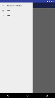
</android.support.v4.widget.DrawerLayout>In this case the toolbar is inside a LinearLayout but the way the app handles it is the same shown before. In this case there is a FrameLayout to hold the page content shown through fragments. The NavigationView is the “real” menu of our app. The menu items are written in nav_items.
<?xml version="1.0" encoding="utf-8"?>
<menu xmlns:android="http://schemas.android.com/apk/res/android">
    <group android:checkableBehavior="single">
        <item android:id="@+id/fab"
              android:title="Floating Action Button"
              android:icon="@drawable/ic_action_fab" />

        <item android:id="@+id/star"
            android:title="Star"
            android:icon="@drawable/ic_action_star" />

        <item android:id="@+id/uploadr"
            android:title="Star"
            android:icon="@drawable/ic_action_upload" />
    </group>
</menu>
To handle when user clicks on an item is very easy, it is necessary to write:
private void setNavigationDrawer() {
        dLayout = (DrawerLayout) findViewById(R.id.drawer_layout);
        NavigationView navView = (NavigationView) findViewById(R.id.navigation);
        navView.setNavigationItemSelectedListener(new NavigationView.OnNavigationItemSelectedListener() {
            @Override
            public boolean onNavigationItemSelected(MenuItem menuItem) {

                Fragment frag = null;
                int itemId = menuItem.getItemId();

                if (itemId == R.id.fab) {
                   frag = new Fragment1();
                }
                else if (itemId == R.id.star) {
                    frag = new Fragment2();
                }

                if (frag != null) {
                    FragmentTransaction transaction = getSupportFragmentManager().beginTransaction();

                    transaction.replace(R.id.frame, frag);
                    transaction.commit();
                    dLayout.closeDrawers();
                    return true;
                }

                return false;
            }
        });
    }
We simply add a listener to know when one of the menu item is pressed by user and then set the right fragment. The last step is opening the drawer when user clicks on the home icon, to do it:
@Override
   public boolean onOptionsItemSelected(MenuItem item) {
        int itemId = item.getItemId();
        String btnName = null;

        switch(itemId) {
            ...
            // Android home
            case android.R.id.home: {
                dLayout.openDrawer(GravityCompat.START);
                return true;
            }
        }
      .....
    }
Running the example app we have:
At the end in this post, you know how to use Android navigation drawer and toolbar according to material design guide lines
| Reference: | Getting started with Android app and material design: Toolbar and Navigation drawer from our JCG partner Francesco Azzola at the Surviving w/ Android blog. |
