This article is part of our Academy Course titled Android UI Design – Basics.
In this course, you will get a look at the fundamentals of Android UI design. You will understand user input, views and layouts, as well as adapters and fragments. Check it out here!
Table Of Contents
1. Introduction
In this last article about Android UI, we will build an Android app that uses almost all the concepts we talked about in the previous articles. We talked about the most important aspects we need to consider when developing an Android app. We saw how to create a UI structure using layout managers and how we can place widgets; we described some best practices, we should use, while developing an app. Well, the app we will build will be based on the topics covered previously, so have another look at them to refresh your memory.
As an example, we will build a To Do app: this is a simple app where we can add todo items and manage them. We will cover how to create the UI layout structure, how to add widgets so that we can show text messages to the user and how to accept user input. An important aspect we will consider is how to build an app that can be used on several devices with different screen size and resolutions.
2. App structure
Before digging into the code details, the first thing we should consider when building an app is making some sketches that help us to understand the app navigation and user interaction. There are several tools we can use, some of them are free. Moreover, these sketches help us to have an idea how our app will look like and we could show them to our customers so that they can realize if the app we want to build respects their needs.
Coming back to our To do app, we can image we have these requirements we have to satisfy:
- There should be a list of items (to do items).
- A user can add an item to the existing ones.
- Items should have a priority color.
- The app should run on smart phone and tablets.
In a real app, the requirements will be much more complex of course, but this is just a stepping stone. We can imagine a simple navigation like this one:
This is a very simple navigation: at the start up, the app shows the current items list and when the user clicks on “Add Item” on the action bar. the app will show the add item screen. To keep things simple and get focused on the UI aspects we can suppose that the app will not save the items. It could be an interesting exercise for the reader to extend the app so that it saves the items.
Now that we roughly know what the navigation will be and how the app user interface will look, we can start creating our app using our IDE. In this case we will use Eclipse + ADT. We create a new Android project that we can call Todo. We will not cover how to create an Android project using Eclipse so we assume you are already familiar with this IDE. Check out our “Android Hello World” example if you are not familiar with the process.
2.1. Item List with ListView and Object Model
Now we have our project structure, we can focus our mind on designing the model that stands behind the app. In this case the model is very simple, it is just a class that holds the information about a new todo item:
public class Item implements Serializable {
	private String name;
	private String descr;
	private Date date;
	private String note;
	private TagEnum tag;
            // Set and get methods
}
This will be the basic class that we will handle in our app. Looking at the Android project, we have just created, we can notice that under the layout directory there is a default layout called activity_main.xml. This is the default layout created by the tool.
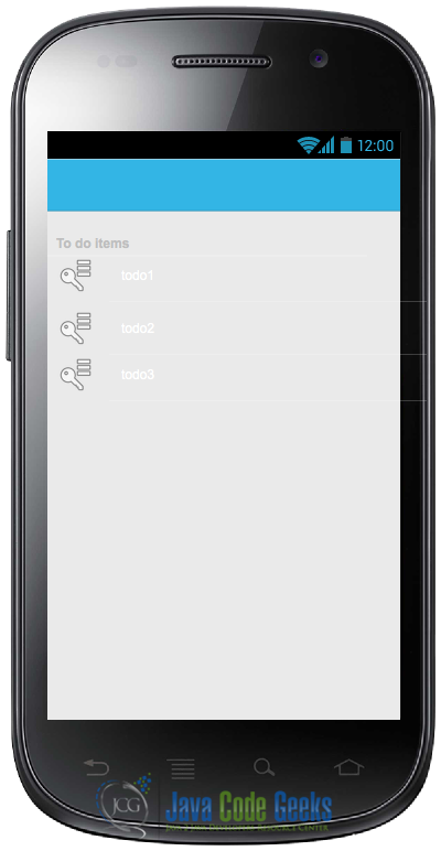
By now we can suppose we have just a list of items in this layout: this layout will be used just for smart phone and we will consider later when the app runs on a tablet. The list item layout is very simple, it is just built by a standard ListView widget:
<RelativeLayout xmlns:android="http://schemas.android.com/apk/res/android"
    xmlns:tools="http://schemas.android.com/tools"
    android:layout_width="match_parent"
    android:layout_height="match_parent"
    android:paddingBottom="@dimen/activity_vertical_margin"
    android:paddingLeft="@dimen/activity_horizontal_margin"
    android:paddingRight="@dimen/activity_horizontal_margin"
    android:paddingTop="@dimen/activity_vertical_margin"
    tools:context=".MainActivity" >

    <ListView
        android:id="@+id/listItmes"
        android:layout_width="wrap_content"
        android:layout_height="wrap_content" />

</RelativeLayout>
If you notice, we instructed Android to use just the space necessary to hold the items in the list. We know that to use a ListView we have to implement an adapter. We could use a standard adapter provided by Android, but in this case these standard adapters are not enough, we want to implement a custom adapter because we would like to show some information for each row in the list. We would like that a row in the list looks like:
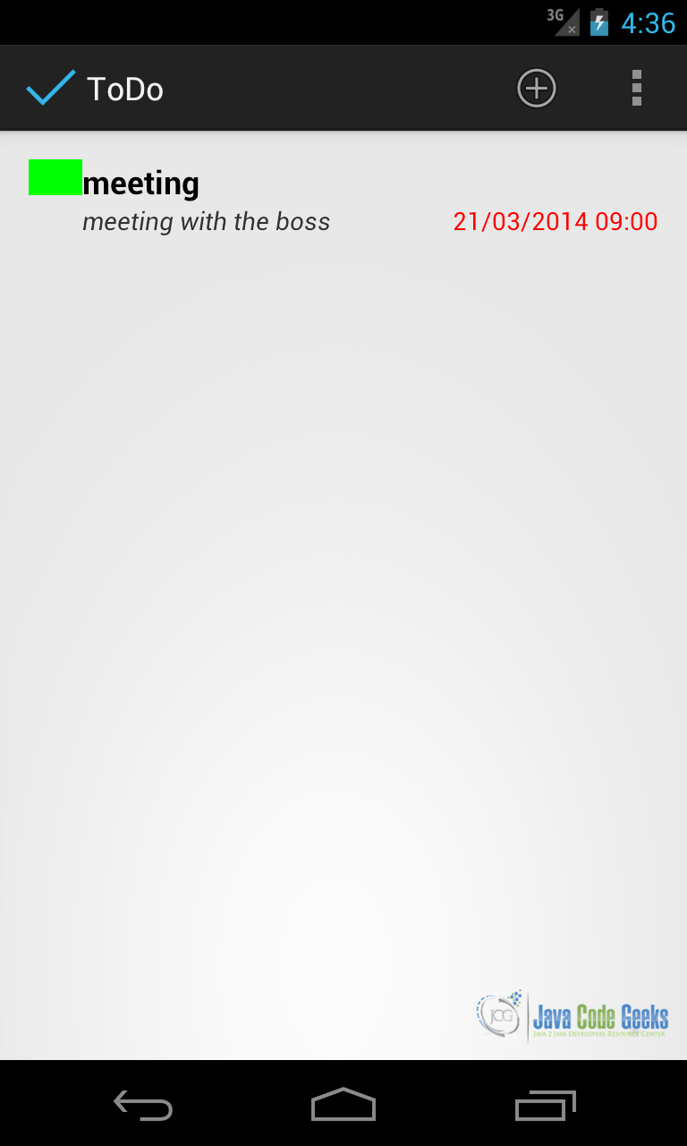
As you can notice, each row has an image on the left side that represents the todo priority and some information. By now we do not consider applying any style to our rows. To have a row in our ListView like that, we have to create a row layout that we will use in our custom adapter. So we can create a new file called item_layout.xml under layout directory. This file looks like this:
<RelativeLayout xmlns:android="http://schemas.android.com/apk/res/android"
    android:layout_width="match_parent"
    android:layout_height="match_parent" >

    <ImageView
        android:id="@+id/tagView"
        android:layout_width="30dp"
        android:layout_height="20dp"
        android:background="@color/red" />

    <TextView
        android:id="@+id/nameView"
        android:layout_width="wrap_content"
        android:layout_height="wrap_content"
        android:layout_alignParentTop="true"
        android:layout_toRightOf="@id/tagView" />

    <TextView
        android:id="@+id/descrView"
        android:layout_width="wrap_content"
        android:layout_height="wrap_content"
        android:layout_below="@id/nameView"
        android:layout_toRightOf="@id/tagView" />

    <TextView
        android:id="@+id/dateView"
        android:layout_width="wrap_content"
        android:layout_height="wrap_content"
        android:layout_alignParentBottom="true"
        android:layout_alignParentRight="true" />

</RelativeLayout>
In this layout, we use a RelativeLayout manager to place easily widgets where we want. As you can see in this layout manager, views are placed according to other view positions. For example we want our todo name to be placed just after the image, so we use the attribute:
android:layout_toRightOf="@id/tagView"
Moreover, we can place views respect to the parent, for example we want that the date information will be placed on the right side of the row and at the bottom:
android:layout_alignParentRight="true"
android:layout_alignParentBottom="true"
Now that we have the layout, we have to build the adapter. We will extend an ArrayAdapter and override some methods so we can handle our model data and the new layout. We call this adapter ToDoItemAdaper, so we have:
public class ToDoItemAdapter extends ArrayAdapter<Item> {
	private Context ctx;
	private List<Item> itemList;
	public ToDoItemAdapter(Context context, List<Item> itemList) {
		super(context, R.layout.item_layout);
		this.ctx = context;
		this.itemList = itemList;
	}
}
The constructor receives the Context and the itemList as parameters, the last one param holds the todo item list. You can notice that when we call the super method, we pass out custom layout called R.layout.item_layout. Now we have to override one of the most important method called getView, used to create the View and render the row layout:
	@Override
	public View getView(int position, View convertView, ViewGroup parent) {
		View v = convertView;
		ItemHolder h = null;
		if (v == null) {
			// Inflate row layout
			LayoutInflater inf = (LayoutInflater) ctx.getSystemService(Context.LAYOUT_INFLATER_SERVICE);
			v = inf.inflate(R.layout.item_layout, parent, false);
			// Look for Views in the layout
			ImageView iv = (ImageView) v.findViewById(R.id.tagView);
			TextView nameTv = (TextView) v.findViewById(R.id.nameView);
			TextView descrView = (TextView) v.findViewById(R.id.descrView);
			TextView dateView = (TextView) v.findViewById(R.id.dateView);
			h = new ItemHolder();
			h.tagView = iv;
			h.nameView = nameTv;
			h.descrView = descrView;
			h.dateView = dateView;
			v.setTag(h);
		}
		else
		   h = (ItemHolder) v.getTag();

		h.nameView.setText(itemList.get(position).getName());
		h.descrView.setText(itemList.get(position).getDescr());
		h.tagView.setBackgroundResource(itemList.get(position).getTag().getTagColor());
		h.dateView.setText(sdf.format(itemList.get(position).getDate()));

		return v;
	}
In this method, we check at the beginning if the View we receive as parameter is null. In this case, we have to inflate our layout. If you notice, we used the ViewHolder pattern to make the ListView scrolling smoother. We have created a small inner class called ItemHolder that holds the references to the View inside our custom layout:
// ViewHolder pattern
static class ItemHolder {
	ImageView tagView;
	TextView nameView;
	TextView descrView;
	TextView dateView;
}
One thing you should notice is how we handled the background color of the ImageView. We used setBackgroundResource to set the imageview background. This method accepts an int representing the resource id we want to use as background:
h.tagView.setBackgroundResource(itemList.get(position).getTag().getTagColor());
Looking at our model class we can notice that the getTag() method returns an instance of TagEnum class. This is an enumeration defined in this way:
public enum TagEnum {
	BLACK(R.color.black,"Black"), RED(R.color.red, "Red"),
	GREEN(R.color.green, "Green"), BLUE(R.color.blue, "Blue"),YELLOW(R.color.yellow,"Yellow");
	private int code;
	private String name;
	private TagEnum(int code, String name) {
		this.code = code;
		this.name = name;
	}
	public int getTagColor() {
		return this.code;
	}
}
In the enumeration we define the different colors we want to support and as first parameter we pass a resource id. If you remember in a previous article we talked about how to define resource color in XML format. We know, already, we have to create a XML file under res/values that we can call colors.xml:
<resources>

    <color name="red" >#FF0000
    </color>

    <color name="green" >#00FF00
    </color>

    <color name="blue" >#0000FF
    </color>

    <color name="black" >#000000
    </color>

    <color name="yellow" >#FFAA00
    </color>

</resources>
In the enumeration color definition we referenced this color using R.color.color_name, so that when we use getTagColor method in the custom adapter getView, we receive the resource id that will be used by the image background. An important aspect to understand is that we did not hard-code the colors in the constructor: for example, we could use directly the color hex code like #FF0000 for red and so on.
Even if the result would be the same, it is not recommended to use hard-coded values in the source code. For example, if we want to change the red color to another one, we will have to find the hex color in the source code and change it, but if we had used resources to define colors, we would go directly to the file holding the color definitions and change the color we like.
Notice that in the enumeration, we used a bad practice: we wrote directly the color name. We used it purposely to show to you something you should not do. In this case, if we want to support multi-language app, we have to change the way we initialize the enumeration using name written in a string resource file.
2.2. Multi-device support and layout considerations
Remember that one of our requirements is that we have to build an app that supports both smart phones and tablets. Thinking about tablet screen dimensions, we realize that the screen is too big to hold just a list of items, so we could consider splitting the screen in two areas: one that holds the list and another one that we can use to show item details or even to show the user interface to add a new item. This is true if we use tablets, but if we have a smart phone the screen dimensions are not big enough to be divided in two areas.
At the same time, we do not want to develop two different code branches: one for smart phone and one for tablet. We would rewrite the same code changing just some details and dimensions. Android helps us to solve this problem: we talked about Fragment in a previous article. So we could create a fragment that handles the user interface to add a new item to the list. A fragment encapsulates a set of components and activity behaviors so that we can reuse this piece of code in different activities. The figures below depict the situation we have to handle:
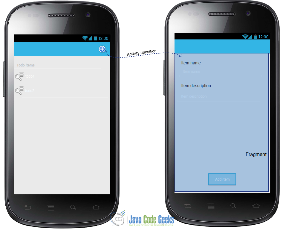
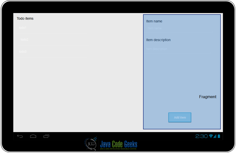
When the app runs in a smart phone we have to handle two activities one for the list item and another that handles the user input, while in a tablet we can have only one activity.
We can suppose that the screen size is at least 600dp so we want to split the screen in a different areas and we define a new layout under res/layout-sw600dp:
<LinearLayout xmlns:android="http://schemas.android.com/apk/res/android"
    xmlns:tools="http://schemas.android.com/tools"
    android:layout_width="match_parent"
    android:layout_height="match_parent"
    android:paddingBottom="@dimen/activity_vertical_margin"
    android:paddingLeft="@dimen/activity_horizontal_margin"
    android:paddingRight="@dimen/activity_horizontal_margin"
    android:paddingTop="@dimen/activity_vertical_margin"
    tools:context=".MainActivity" >

    <ListView
        android:id="@+id/listItmes"
        android:layout_width="wrap_content"
        android:layout_height="wrap_content"
        android:layout_weight="1" />

    <FrameLayout
        android:id="@+id/frm1"
        android:layout_width="wrap_content"
        android:layout_height="wrap_content"
        android:layout_weight="1" />

</LinearLayout>
where the FrameLayout will be “filled” dynamically depending on the navigation flow.
Of course, we can customize the layout in more details, according to the different screen sizes. In this case, we can simply create different layouts in different directories under res.
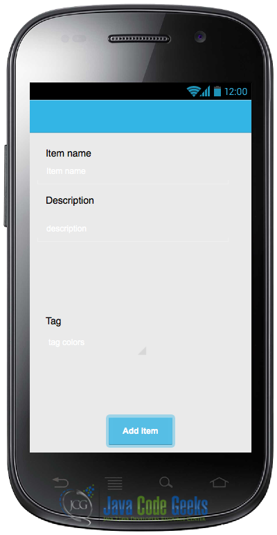
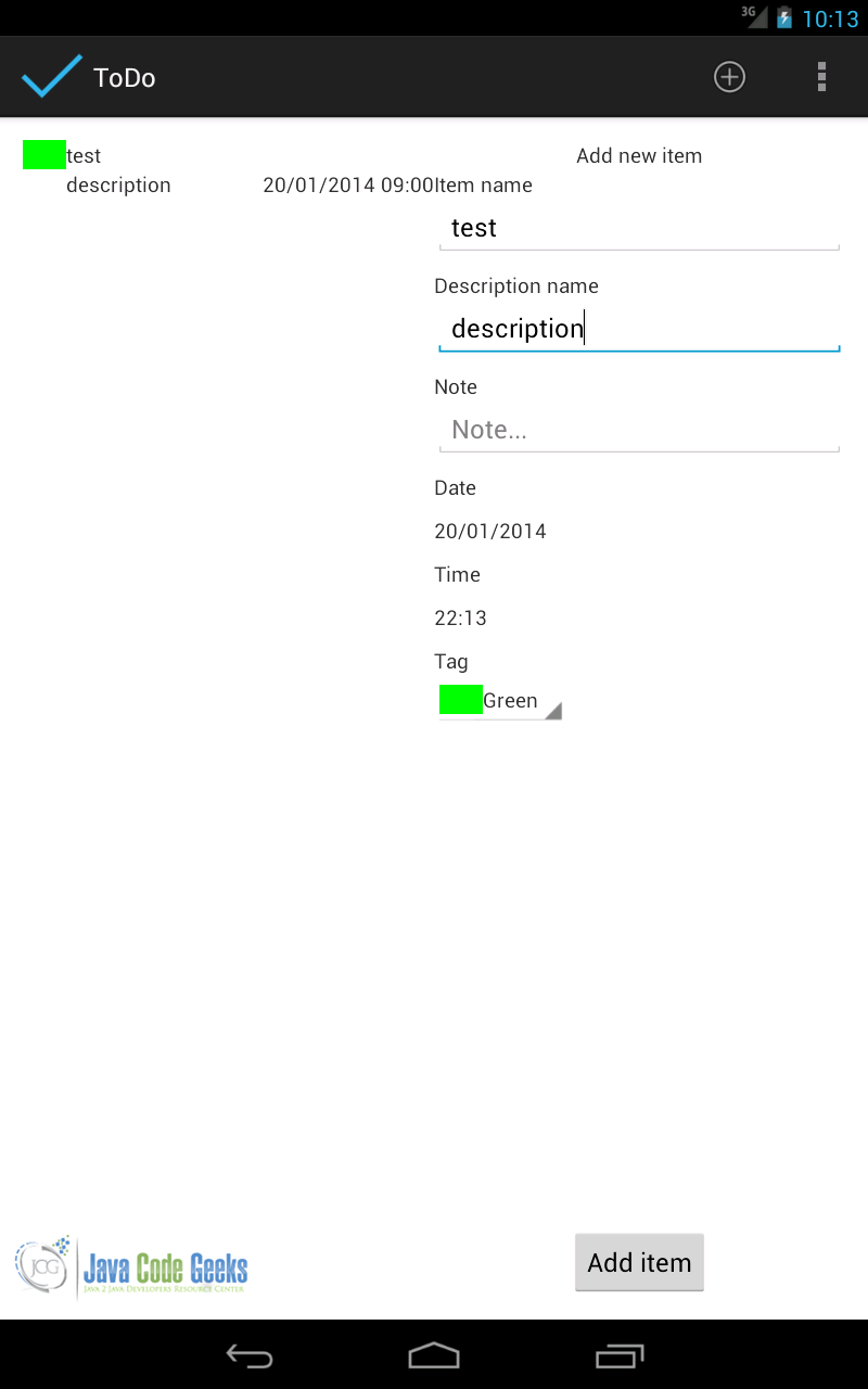
2.3. Add item user interface layout
If we run the app we have as a result an empty list with no items. We have to create a new user interface. So keeping in mind the considerations we made before, we create a Fragment that handles the add item functionality, calling it as NewItemFragment. A fragment has a complex life cycle but for this purpose we can override just onCreateView method. This method is responsible for creating the user interface. As always, we have to create the layout first. In our IDE under res/layout we create another xml file that we call add_item_layout.xml:
<RelativeLayout xmlns:android="http://schemas.android.com/apk/res/android"
    android:layout_width="match_parent"
    android:layout_height="match_parent" >

    <TextView
        android:id="@+id/txtTitle"
        android:layout_width="wrap_content"
        android:layout_height="wrap_content"
        android:layout_centerHorizontal="true"
        android:text="@string/addItem" />

    <TextView
        android:id="@+id/itemName"
        android:layout_width="wrap_content"
        android:layout_height="wrap_content"
        android:layout_below="@id/txtTitle"
        android:layout_marginStart="10dp"
        android:text="@string/addItemName" />

    <EditText
        android:id="@+id/edtName"
        android:layout_width="match_parent"
        android:layout_height="wrap_content"
        android:layout_alignParentLeft="true"
        android:layout_below="@id/itemName"
        android:hint="@string/addItemNameHint" />

    <TextView
        android:id="@+id/itemDescr"
        android:layout_width="wrap_content"
        android:layout_height="wrap_content"
        android:layout_alignParentLeft="true"
        android:layout_below="@id/edtName"
        android:layout_marginTop="10dp"
        android:text="@string/addItemDescr" />

    <EditText
        android:id="@+id/edtDescr"
        android:layout_width="match_parent"
        android:layout_height="wrap_content"
        android:layout_alignParentLeft="true"
        android:layout_below="@id/itemDescr"
        android:hint="@string/addItemDescrHint" />

    <TextView
        android:id="@+id/itemNote"
        android:layout_width="wrap_content"
        android:layout_height="wrap_content"
        android:layout_alignParentLeft="true"
        android:layout_below="@id/edtDescr"
        android:layout_marginTop="10dp"
        android:text="@string/addItemNote" />

    <EditText
        android:id="@+id/edtNote"
        android:layout_width="match_parent"
        android:layout_height="wrap_content"
        android:layout_alignParentLeft="true"
        android:layout_below="@id/itemNote"
        android:hint="@string/addItemNoteHint" />

    <TextView
        android:id="@+id/itemDate"
        android:layout_width="wrap_content"
        android:layout_height="wrap_content"
        android:layout_alignParentLeft="true"
        android:layout_below="@id/edtNote"
        android:layout_marginTop="10dp"
        android:text="@string/addItemDate" />

    <TextView
        android:id="@+id/inDate"
        android:layout_width="wrap_content"
        android:layout_height="wrap_content"
        android:layout_alignParentLeft="true"
        android:layout_below="@id/itemDate"
        android:layout_marginTop="10dp" />

    <TextView
        android:id="@+id/itemTime"
        android:layout_width="wrap_content"
        android:layout_height="wrap_content"
        android:layout_alignParentLeft="true"
        android:layout_below="@id/inDate"
        android:layout_marginTop="10dp"
        android:text="@string/addItemTime" />

    <TextView
        android:id="@+id/inTime"
        android:layout_width="wrap_content"
        android:layout_height="wrap_content"
        android:layout_alignParentLeft="true"
        android:layout_below="@id/itemTime"
        android:layout_marginTop="10dp" />

    <TextView
        android:id="@+id/itemTag"
        android:layout_width="wrap_content"
        android:layout_height="wrap_content"
        android:layout_alignParentLeft="true"
        android:layout_below="@id/inTime"
        android:layout_marginTop="10dp"
        android:text="@string/addItemTag" />

    <Spinner
        android:id="@+id/tagSpinner"
        android:layout_width="wrap_content"
        android:layout_height="wrap_content"
        android:layout_alignParentLeft="true"
        android:layout_below="@id/itemTag" />

    <!-- ADD button -->

    <Button
        android:id="@+id/addBtn"
        android:layout_width="wrap_content"
        android:layout_height="wrap_content"
        android:layout_alignParentBottom="true"
        android:layout_centerHorizontal="true"
        android:text="@string/addButton" />

</RelativeLayout>
It is a very simple layout made by TextView and EditText: the first one is used to show text messages on the user interface and the other one is used to accept user inputs. There are two components that are important in this layout: the Spinner and the Date/Time picker.
A spinner is a UI component that shows only one item at time and lets the user to select one item among them. We use this component to show different tag colors/priorities. It suits perfectly our purpose, in fact we want the user to select one color among a color list.
2.4. Tag Color/Priority Spinner
To work correctly, a Spinner needs an array adapter behind it. Android provides a list of adapters we can use, but we want to customize them because we want to show an image with a color. Then, we have to create a custom adapter in the same way we did for the ListView. First we create the row layout called spinner_tag_layout.xml:
<RelativeLayout xmlns:android="http://schemas.android.com/apk/res/android"
    android:layout_width="match_parent"
    android:layout_height="match_parent" >

    <ImageView
        android:id="@+id/tagSpinnerImage"
        android:layout_width="30dp"
        android:layout_height="20dp" />

    <TextView
        android:id="@+id/tagNameSpinner"
        android:layout_width="wrap_content"
        android:layout_height="wrap_content"
        android:layout_toRightOf="@id/tagSpinnerImage" />

</RelativeLayout>
and finally we create our adapter:
public class TagSpinnerAdapter extends ArrayAdapter<TagEnum> {

	private Context ctx;
	private List<TagEnum> tagList;

	public TagSpinnerAdapter(Context ctx, List<TagEnum> tagList) {
		super(ctx, R.layout.spinner_tag_layout);
		this.ctx = ctx;
		this.tagList = tagList;
	}


	@Override
	public View getDropDownView(int position, View convertView, ViewGroup parent) {
		return _getView(position, convertView, parent);
	}

	@Override
	public View getView(int position, View convertView, ViewGroup parent) {
		return _getView(position, convertView, parent);
	}

	private View _getView(int position, View convertView, ViewGroup parent) {
		View v = convertView;
		if (v == null) {
			// Inflate spinner layout
			LayoutInflater inf = (LayoutInflater) ctx.getSystemService(Context.LAYOUT_INFLATER_SERVICE);
			v = inf.inflate(R.layout.spinner_tag_layout, parent, false);
		}

		// We should use ViewHolder pattern
		ImageView iv = (ImageView) v.findViewById(R.id.tagSpinnerImage);
		TextView tv = (TextView) v.findViewById(R.id.tagNameSpinner);

		TagEnum t = tagList.get(position);
		iv.setBackgroundResource(t.getTagColor());
		tv.setText(t.getName());
		return v;
	}

}
Analyzing the code above, we notice that this adapter handles TagEnum objects and we override two methods getView and getDropDownView. We handle these methods in the same way. As you can notice we did almost the same things already done for the ListView.
In the fragment that holds this UI components, we have to find the reference to the Spinner and set the custom layout we defined above:
Spinner sp = (Spinner) v.findViewById(R.id.tagSpinner);
TagSpinnerAdapter tsa = new TagSpinnerAdapter(getActivity(), tagList);
sp.setAdapter(tsa);
When user selects one item in the Spinner, we have to find a way to know which one item was selected.
As you remember, we can use listener to be informed when some events occur in a component. In this case we are interested on item selection event, so we create a listener for it:
sp.setOnItemSelectedListener(new AdapterView.OnItemSelectedListener() {
	@Override
	public void onItemSelected(AdapterView<?> adptView, View view,
		int pos, long id) {
		currentTag = (TagEnum) adptView.getItemAtPosition(pos);
	}

	@Override
	public void onNothingSelected(AdapterView<?> arg0) {
		// TODO Auto-generated method stub

		}
	});
and we store the result in a class attribute.
2.5. Date and Time picker
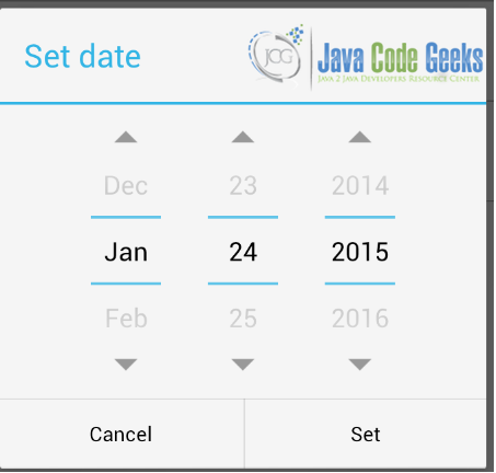
When we add a new todo item to the list, we want the user to select the date and the time. Android provides two components called DatePickerDialog and TimePickerDialog. As the name implies, these are two dialogs that can be opened to select the date and the time.
We are using fragments so we have to create two inner class that present to the user the date and time pickers. In this case we extend for both pickers the DialogFragment class and override the onCreateDialog method. In this method, we simply initialize the Date picker and return it as result:
public static class DatePickerFragment extends DialogFragment implements DatePickerDialog.OnDateSetListener {
	@Override
	    public Dialog onCreateDialog(Bundle savedInstanceState) {
	        // Use the current date as the default date in the picker
	        final Calendar c = Calendar.getInstance();
	        c.setTime(selDate);
	        int year = c.get(Calendar.YEAR);
	        int month = c.get(Calendar.MONTH);
	        int day = c.get(Calendar.DAY_OF_MONTH);

	        // Create a new instance of DatePickerDialog and return it
	        return new DatePickerDialog(getActivity(), this, year, month, day);
	    }

	@Override
	public void onDateSet(DatePicker view, int year, int monthOfYear,
				int dayOfMonth) {

		Calendar c = Calendar.getInstance();
		c.set(year, monthOfYear, dayOfMonth, 9, 0);
		selDate = c.getTime();
		tvDate.setText(sdfDate.format(selDate));
	}
}
From the code above you can notice that we simply set the current date to the DatePickerDialog in the onCreateDialog. We implement the DatePickerDialog.OnDateSetListener to be notified when user selects the date. In the callback method of this interface we simply store the date selected by the user.
In the same way, we handle the TimePickerFragment, but in this case we extend TimePickerDialog:
public static class TimePickerFragment extends DialogFragment implements TimePickerDialog.OnTimeSetListener {
	@Override
	 public Dialog onCreateDialog(Bundle savedInstanceState) {
	        // Use the current date as the default date in the picker
	        final Calendar c = Calendar.getInstance();
	        c.setTime(selDate);
	        int hour = c.get(Calendar.HOUR_OF_DAY);
	        int minute = c.get(Calendar.MINUTE);
	    // Create a new instance of TimePickerDialog and return it
	     return new TimePickerDialog(getActivity(), this, hour, minute,
		                DateFormat.is24HourFormat(getActivity()));
            }

          @Override
          public void onTimeSet(TimePicker view, int hourOfDay, int minute) {
		Calendar c = Calendar.getInstance();
		c.setTime(selDate);
		c.set(Calendar.HOUR_OF_DAY, hourOfDay);
		c.set(Calendar.MINUTE, minute);
		selDate = c.getTime();
		// We set the hour
		tvTime.setText(sdfTime.format(selDate));
	}
}
These are two dialogs that they do not appear by themselves, but we have to check if the user clicks on a date/time textview to open these dialogs, so we have:
tvDate = (TextView) v.findViewById(R.id.inDate);
tvTime = (TextView) v.findViewById(R.id.inTime);
to get the reference to the TextView and then we have simply implement a listener:
tvDate.setOnClickListener(new View.OnClickListener() {
	@Override
	public void onClick(View v) {
		DatePickerFragment dpf = new DatePickerFragment();
		dpf.show(getFragmentManager(), "datepicker");
	}
});
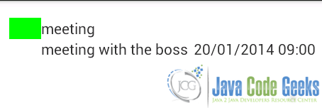
As result we have:
The last part in developing this fragment is dedicated to handling the event when the user clicks on the add button. When this event occurs, the fragment should create an instance of Item class holding the data inserted by user and send it back to the activity that holds the fragment. The best practice suggests to use an interface and callback methods.
We can define this interface in the fragment class:
public interface AddItemListener {
	public void onAddItem(Item item);
}
It is a very simple interface made by just only one method. Now we have:
Button addBtn = (Button) v.findViewById(R.id.addBtn);
addBtn.setOnClickListener(new View.OnClickListener() {
	@Override
	public void onClick(View v) {
		// We retrieve data inserted
		Item i = new Item();
		i.setName(edtName.getText().toString());
		i.setDescr(edtDescr.getText().toString());
		i.setNote(edtNote.getText().toString());
		i.setTag(currentTag);
		i.setDate(selDate);
		// Safe cast
		( (AddItemListener) getActivity()).onAddItem(i);
	}
});
By using an interface we decouple the fragment from the activity that holds it and this will be very useful as we will see later.
Coming back to the note made regarding smart phones and tablets and remembering the picture shown above, we know that if the app runs in a smart phone we have to use two activities so we create another one called NewItemActivity that will hold the fragment described above. This activity is very simple because it acts as a fragment container.
public class NewItemActivity extends Activity implements NewItemFragment.AddItemListener{
	@Override
	protected void onCreate(Bundle savedInstanceState) {
		super.onCreate(savedInstanceState);
		NewItemFragment nif = new NewItemFragment();
		getFragmentManager().beginTransaction().add(android.R.id.content, nif).commit();
	}

	@Override
	public void onAddItem(Item item) {
		// We get the item and return to the main activity
		Log.d("TODO", "onAddItem");
		Intent i = new Intent();
		i.putExtra("item", item);
		setResult(RESULT_OK,i);
		finish();
	}
}
In the onCreate method, we create a new instance of our fragment class and the using FragmentManager we show the fragment on the screen.
Notice that this activity implements the interface defined in the fragment because it has to be notified when the user wants to add a new item, so it implements the onAddItem method. We will cover the functionality of this method later.
2.6. Main Activity
The main activity is the heart of the app, it is the activity that is called at the start up. It sets up the initial layout and shows the item list that we previously described:
itemListView = (ListView) findViewById(R.id.listItmes);
adpt = new ToDoItemAdapter(this, itemList);
itemListView.setAdapter(adpt);
Now we have to check if our app runs on a smart phone or a tablet so that we can change the activity behavior. We can do it by verifying if there is a FrameLayout component in the layout definition:
if (findViewById(R.id.frm1) != null)
   isTablet = true;
2.7. Action bar
In this activity we add a action bar (a well-known Android pattern) with an action: add new item. To define it, we create (if not exists) a XML file under res/menu:
<menu xmlns:android="http://schemas.android.com/apk/res/android" >

    <item
        android:id="@+id/action_add"
        android:icon="@android:drawable/ic_menu_add"
        android:orderInCategory="0"
        android:showAsAction="always"/>

</menu>
As a result we obtain:
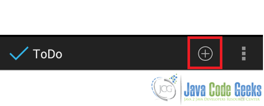
As a user clicks on the plus sign, we should show the user interface for adding a new item. The first thing we have to handle is the event when user clicks on ‘plus’ icon so we have to override a method in the activity class:
@Override
public boolean onOptionsItemSelected(MenuItem item) {
	int menuId = item.getItemId();
	switch (menuId) {
		case R.id.action_add: {
			if (!isTablet) {
				Intent i = new Intent(this, NewItemActivity.class);
				startActivityForResult(i, ADD_ITEM);
				break;
			}
			else {
				Log.d("TODO", "Tablet");
				FragmentTransaction ft = getFragmentManager().beginTransaction();
				NewItemFragment nif = new NewItemFragment();
				ft.replace(R.id.frm1, nif);
				ft.commit();
			}
		}
	}
}
This method is very important because we define how our activity should behave. If the button clicked by the user is our add button, we first verify if our app is running on a smart phone. In this case, we know we have to start another activity and we start it waiting for a result.
If we start an activity waiting for its result in the called activity we should return the result and we do it in the NewItemActivity in this way:
@Override
public void onAddItem(Item item) {
	// We get the item and return to the main activity
	Log.d("TODO", "onAddItem");
	Intent i = new Intent();
	i.putExtra("item", item);
	setResult(RESULT_OK,i);
	finish();
}
In this method we create an Intent that holds the result and pass it back to the calling activity (MainActivity) and we finish the activity. In the MainActivity, then, we have to be ready to handle the result:
protected void onActivityResult(int requestCode, int resultCode, Intent data) {
	Log.d("TODO", "OnResult");
	if (requestCode == ADD_ITEM) {
		if (resultCode == RESULT_OK) {
			Log.d("TODO", "OK");
			Item i = (Item) data.getExtras().getSerializable("item");
			itemList.add(i);
			adpt.notifyDataSetChanged();
		}
	}
}
In this activity we extract the item object stored inside the Intent that we receive as result and add it to the item list. When we finish we call notifyDataSetChange method so that the ListView can be updated.
If our app is running on a tablet we simply “fill” the FrameLayout with the NewItemFragment described above. In this case we start a transaction and replace the FrameLayout with the fragment and at the end we commit the transaction. In this case, we do not need to start another activity because we use the FrameLayout to show the fragment that handles the user interface for adding a new item. So we have:
In this case, we have to simply implement the interface specified by the fragment as we did before:
@Override
public void onAddItem(Item item) {
	itemList.add(item);
	adpt.notifyDataSetChanged();
	NewItemFragment nif = (NewItemFragment) getFragmentManager().findFragmentById(R.id.frm1);
	getFragmentManager().beginTransaction().remove(nif).commit();
}
Notice in the last part that we removed the fragment at the end.
3. Styling the app
By now we have not considered the application’s style, but we know we can apply style to every UI component. We can modify all the UI colors and looks, implementing our style and branding the app. For example we want to apply a style to the listView row making them a little more appealing. We create (if it does not already exist), a file called style.xml under res/values and here we can define our style as we discussed in a previous article:
<style name="dateStyle">
        <item name="android:textAppearance">?android:textAppearanceSmall</item>
        <item name="android:textColor">@color/red</item>
    </style>

     <style name="descrStyle">
        <item name="android:textStyle">italic</item>
        <item name="android:textAppearance">?android:textAppearanceSmall</item>
    </style>

     <style name="nameStyle">
         <item name="android:textAppearance">?android:textAppearanceMedium</item>
         <item name="android:textStyle">bold</item>
     </style>
We defined three different styles and we want to apply them to our listview row:
<TextView
    android:id="@+id/nameView"
    style="@style/nameStyle"
    android:layout_width="wrap_content"
    android:layout_height="wrap_content"
    android:layout_alignParentTop="true"
    android:layout_toRightOf="@id/tagView" />
<TextView
    android:id="@+id/descrView"
    style="@style/descrStyle"
    android:layout_width="wrap_content"
    android:layout_height="wrap_content"
    android:layout_below="@id/nameView"
    android:layout_toRightOf="@id/tagView" />
<TextView
    android:id="@+id/dateView"
    style="@style/dateStyle"
    android:layout_width="wrap_content"
    android:layout_height="wrap_content"
    android:layout_alignParentBottom="true"
    android:layout_alignParentRight="true" />
Running the app with this style we have:
4. Conclusion
In this Android UI course we covered some important UI aspects, concepts and best practices we should follow when developing an Android app. In this last article we saw how to apply all this knowledge to build a real app using all the topics covered in the previous articles. Of course, this simple app can be improved and you can have it as an exercise to try to add new functionalities. For example, we did not cover how to modify or delete the items in the list. In this case we could listen when a user clicks on an item and you could show a menu with several options, or we could use the action bar changing it according to the user actions. For example we could create a multiple selection list view and when user clicks on “trash” icon in the action bar we remove all the items selected.
There are different aspects we can improve in this app and it will be a good exercise if you want to go deeper in Android development aspects.
5. Download the Source Code
This was a lesson on how to create an Android app UI from scratch. You may download the source code here: AndroidApp.zip
