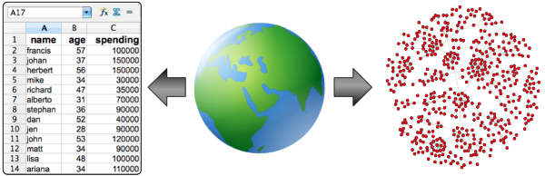
Organizations make use of data to drive their decision making, enhance their product features, and to increase the efficiency of their everyday operations. Data by itself is not useful. However, with data analysis, patterns such as trends, clusters, predictions, etc. can be distilled. The way in which data is analyzed is predicated on the way in which data is structured. The table format popularized by spreadsheets and relational databases is useful for particular types of processing. However, the primary purpose of this post is to examine a relatively less exploited structure that can be leveraged when analyzing an organization’s data — the graph/network.
The Table Perspective
Before discussing graphs, a short review of the table data structure is presented using a toy example containing a 12 person population. For each individual person, their name, age, and total spending for the year is gathered. The R Statistics code snippet below loads the population data into a table.
> people <- read.table(file='people.txt', sep='\t', header=TRUE)
> people
   id    name age spending
1   0 francis  57   100000
2   1   johan  37   150000
3   2 herbert  56   150000
4   3    mike  34    30000
5   4 richard  47    35000
6   5 alberto  31    70000
7   6 stephan  36    90000
8   7     dan  52    40000
9   8     jen  28    90000
10  9    john  53   120000
11 10    matt  34    90000
12 11    lisa  48   100000
13 12  ariana  34   110000
Each row represents the information of a particular individual. Each column represents the values of a property of all individuals. Finally, each entry represents a single value for a single property for a single individual. Given the person table above, various descriptive statistics can be calculated? Simple examples include:
- the average, median, and standard deviation of age (line 1),
- the average, median, and standard deviation of spending (line 3),
- the correlation between age and spending (i.e. do older people tend to spend more? — line 5),
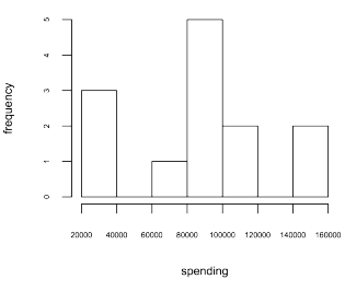
- the distribution of spending (i.e. a histogram of spending — line 8).
> c(mean(people$age), median(people$age), sd(people$age))
[1] 42.07692 37.00000 10.29937
>  c(mean(people$spending), median(people$spending), sd(people$spending))
[1] 90384.62 90000.00 38969.09
> cor.test(people$spending, people$age)$e
      cor
0.1753667
> hist(people$spending, xlab='spending', ylab='frequency', cex.axis=0.5, cex.lab=0.75, main=NA)
In general, a table representation is useful for aggregate statistics such as those used when analyzing data cubes. However, when the relationships between modeled entities is complex/recursive, then graph analysis techniques can be leveraged.
The Graph Perspective
A graph (or network) is a structure composed of vertices (i.e. nodes, dots) and edges (i.e. links, lines). Assume that along with the people data presented previously, there exists a dataset which includes the friendship patterns between the people. In this way, people are vertices and friendship relationships are edges. Moreover, the features of a person (e.g. their name, age, and spending) are properties on the vertices. This structure is commonly known as a property graph. Using iGraph in R, it is possible to represent and process this graph data.
- Load the friendship relationships as a two column numeric table (line 1-2).
- Generate an undirected graph from the two column table (line 3).
- Attach the person properties as metadata on the vertices (line 4-6).
> friendships <- read.table(file='friendships.txt',sep='\t')
> friendships <- cbind(lapply(friendships, as.numeric)$V1, lapply(friendships, as.numeric)$V2)
> g <- graph.edgelist(as.matrix(friendships), directed=FALSE)
> V(g)$name <- as.character(people$name)
> V(g)$spending <- people$spending
> V(g)$age <- people$age
> g
Vertices: 13
Edges: 25
Directed: FALSE
Edges:
[0] 'francis' -- 'johan'
[1] 'francis' -- 'jen'
[2] 'johan' -- 'herbert'
[3] 'johan' -- 'alberto'
[4] 'johan' -- 'stephan'
[5] 'johan' -- 'jen'
[6] 'johan' -- 'lisa'
[7] 'herbert' -- 'alberto'
[8] 'herbert' -- 'stephan'
[9] 'herbert' -- 'jen'
[10] 'herbert' -- 'lisa'
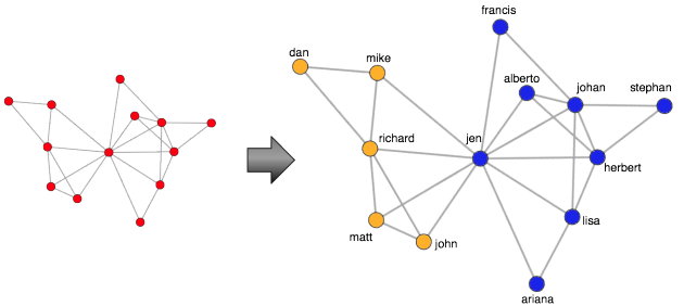
...One simple technique for analyzing graph data is to visualize it so as to take advantage of the human’s visual processing system. Interestingly enough, the human eye is excellent at finding patterns. The code example below makes use of the Fruchterman-Reingold layout algorithm to display the graph on a 2D plane.
> layout <- layout.fruchterman.reingold(g)
> plot(g, vertex.color='red',layout=layout, vertex.size=10, edge.arrow.size=0.5, edge.width=0.75, vertex.label.cex=0.75, vertex.label=V(g)$name, vertex.label.cex=0.5, vertex.label.dist=0.7, vertex.label.color='black')
For large graphs (those beyond the toy example presented), the human eye can become lost in the mass of edges between vertices. Fortunately, there exist numerous community detection algorithms. These algorithms leverage the connectivity patterns in a graph in order to identify structural subgroups. The edge betweenness community detection algorithm used below identifies two structural communities in the toy graph (one colored orange and one colored blue — lines 1-2). With this derived community information, it is possible to extract one of the communities and analyze it in isolation (line 19).
> V(g)$community = community.to.membership(g, edge.betweenness.community(g)$merges, steps=11)$membership+1
> data.frame(name=V(g)$name, community=V(g)$community)
      name community
1  francis         1
2    johan         1
3  herbert         1
4     mike         2
5  richard         2
6  alberto         1
7  stephan         1
8      dan         2
9      jen         1
10    john         2
11    matt         2
12    lisa         1
13  ariana         1
> color <- c(colors()[631], colors()[498])
> plot(g, vertex.color=color[V(g)$community],layout=layout, vertex.size=10, edge.arrow.size=0.5, edge.width=0.75, vertex.label.cex=0.75, vertex.label=V(g)$name, vertex.label.cex=0.5, vertex.label.dist=0.7, vertex.label.color='black')
> h <- delete.vertices(g, V(g)[V(g)$community == 2])
> plot(h, vertex.color="red",layout=layout.fruchterman.reingold, vertex.size=10, edge.arrow.size=0.5, edge.width=0.75, vertex.label.cex=0.75, vertex.label=V(h)$name, vertex.label.cex=0.5, vertex.label.dist=0.7, vertex.label.color='black')
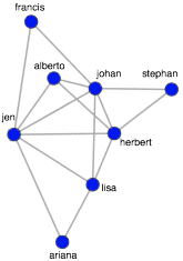
The isolated subgraph can be subjected to a centrality algorithm in order to determine the most central/important/influential people in the community. With centrality algorithms, importance is defined by a person’s connectivity in the graph and in this example, the popular PageRank algorithm is used (line 1). The algorithm outputs a score for each vertex, where the higher the score, the more central the vertex. The vertices can then be sorted (lines 2-3). In practice, such techniques may be used for designing a marketing campaign. For example, as seen below, it is possible to ask questions such as “which person is both influential in their community and a high spender?” In general, the graphical perspective on data lends itself to novel statistical techniques that, when combined with table techniques, provides the analyst a rich toolkit for exploring and exploiting an organization’s data.
> V(h)$page.rank <- page.rank(h)$vector
> scores <- data.frame(name=V(h)$name, centrality=V(h)$page.rank, spending=V(h)$spending)
> scores[order(-centrality, spending),]
     name centrality spending
6     jen 0.19269343    90000
2   johan 0.19241727   150000
3 herbert 0.16112886   150000
7    lisa 0.13220997   100000
4 alberto 0.10069925    70000
8  ariana 0.07414285   110000
5 stephan 0.07340102    90000
1 francis 0.07330735   100000
It is important to realize that for large-scale graph analysis there exists various technologies. Many of these technologies are found in the graph database space. Examples include transactional, persistence engines such as Neo4j and the Hadoop-based batch processing engines such as Giraph and Pegasus. Finally, exploratory analysis with the R language can be used for in-memory, single-machine graph analysis as well as in cluster-based environments using technologies such as RHadoop and RHIPE. All these technologies can be brought together (along with table-based technologies) to aid an organization in understanding the patterns that exist in their data.
Resources
- Newman, M.E.J., “The Structure and Function of Complex Networks“, SIAM Review, 45, 167–256, 2003.
- Rodriguez, M.A., Pepe, A., “On the Relationship Between the Structural and Socioacademic Communities of a Coauthorship Network,” Journal of Informetrics, 2(3), 195–201, July 2008.
| Reference: | Understanding the World using Tables and Graphs from our JCG partner Marko Rodriguez at the AURELIUS blog. |